What is DeciFood.
A decision support tool for teachers and students.
The tool aims to help teachers and students find reliable sources on food education based on the criteria you set. The client collected more than 350 tools and resources from countries across Europe (UK, Italy, Israel, Iceland, Finland, Spain and Poland). It is a project managed by WeValueFood, funded by EIT, the European Institute of Innovation and Technology. And yes, with cooperation from the EU, they might become our biggest customer.
The question
When this brief landed in our inbox, it was already fully developed, but the design was very basic and text-only. They were looking for someone to give it a major visual design upgrade, and spoiler alert: that’s exactly what we ended up doing.
By the way, this is not a public site. Upon request, we can provide a private demo.
It was an open brief, but they suggested we could submit a proposal if we wanted. They said our style and experience would be a good fit and our values matched theirs.
Our pitch
We knew long ago that we were not the only ones who had submitted a proposal or even received a suggestion. Still, it felt a bit like it was meant to be. We value education, but food education is special to us. One of our Pixili members is both a food designer and bakery teacher.
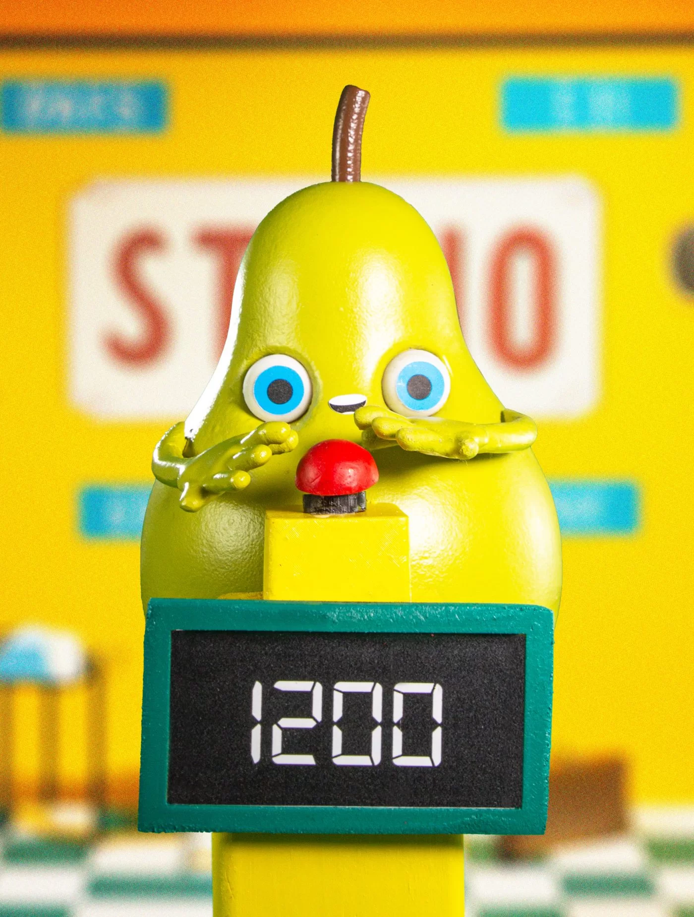
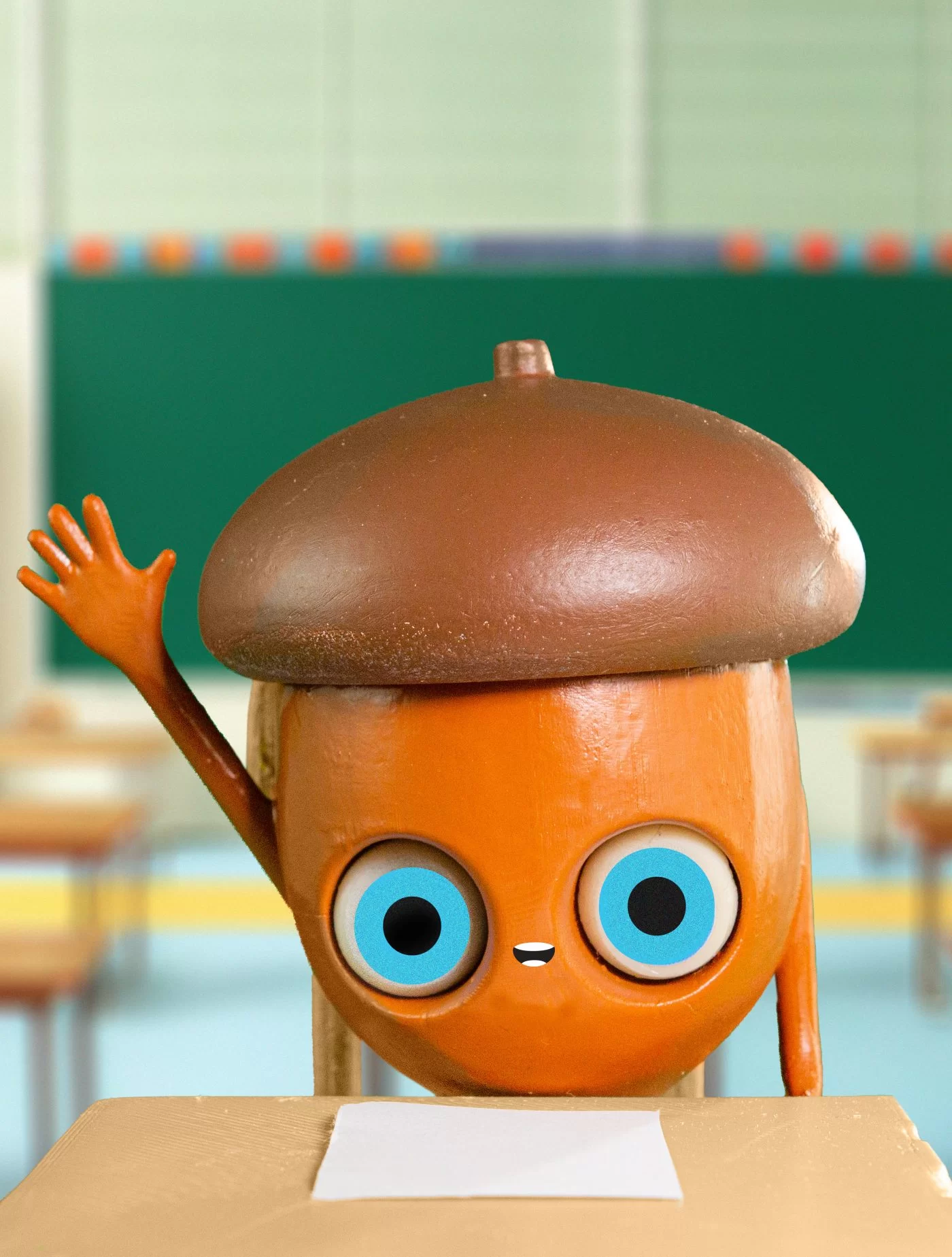
So we spent a lot of time making our pitch, which we were very passionate about. We focused very much on the visual design there, creating custom graphics with a series of unique 3D characters.
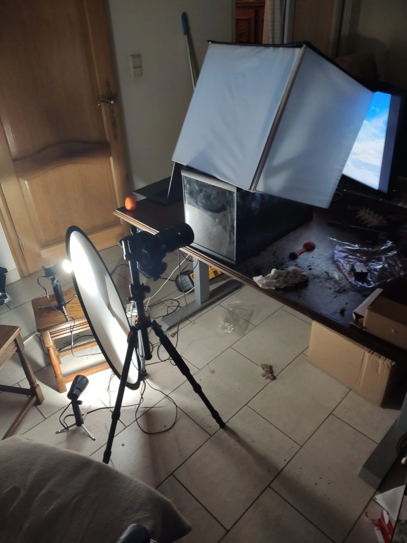
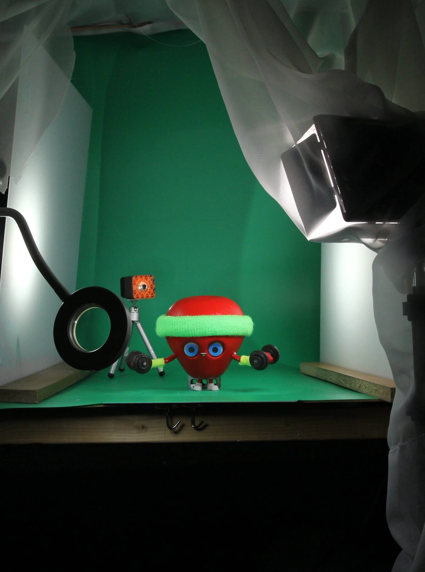
To make sure our idea was unique, we would do it in real life, meaning we would not only design, but also print, paint and photograph all the assets. Creating unique and authentic-feeling illustrations and photos inspired by stop-motion films, miniature construction and others. It was a big job but we were ready for it.
And now you’re reading this, so it worked – we were chosen.
What they needed?
A beautifully designed, user-friendly web experience on which users could select an educational tool based on a questionnaire.
What the clients brief said is simple on the surface, but it is also quite difficult to solve when you dig deeper. The audience consisted of primary and secondary school teachers and educators from across Europe. This means a younger audience and is used by countries where English is not the native language. As a compromise, the app is in English because it is the most popular second language in most EU countries.
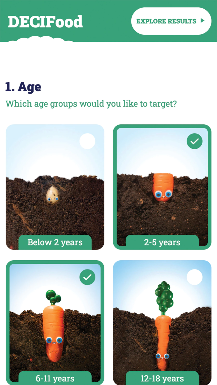
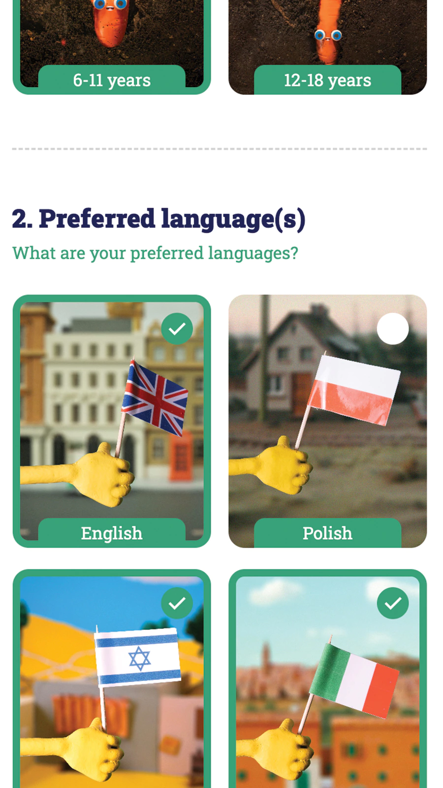
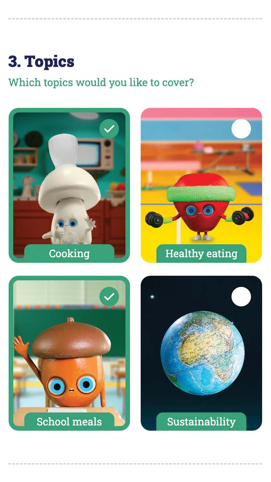
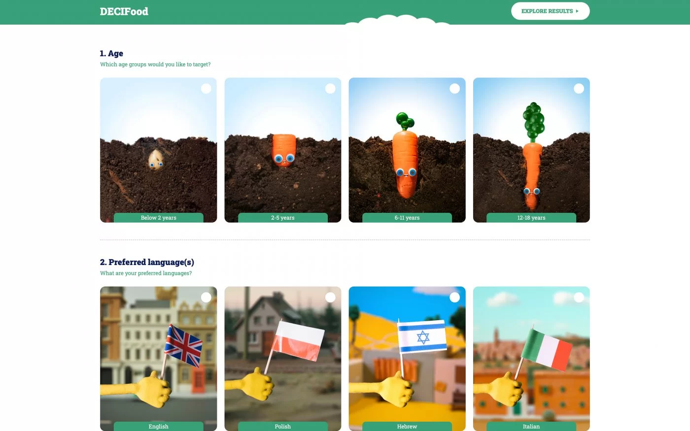
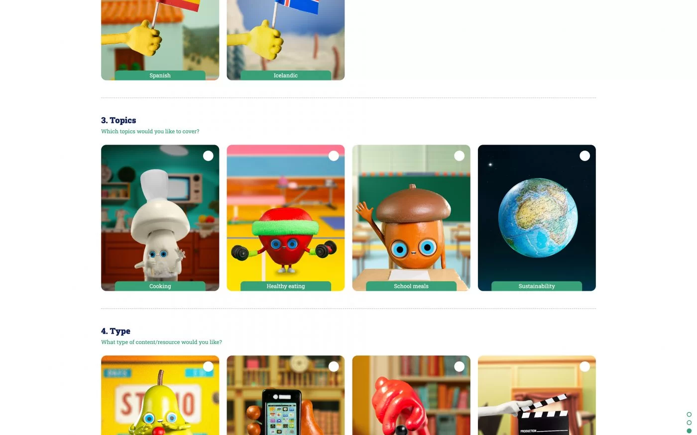
They knew this could be a problem. When we designed the layout, we tried to solve this. With checkbox buttons that look like playing cards and work great on any device. We also shortened some answers and made the visuals the main event.
Visual language is universal and we are counting on it bridging the language gap. So solving the language problem with visual design, not technology. And a great trick we found to achieve this was thinking about which picture we should draw in a game of Pictionary to make them guess the word.
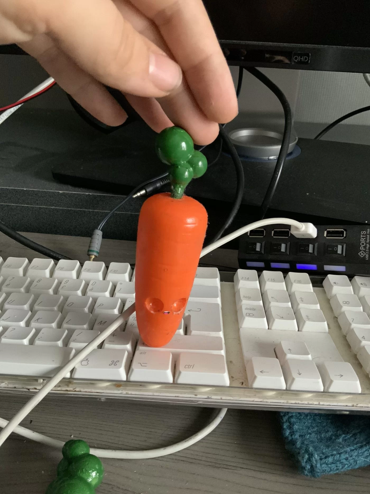
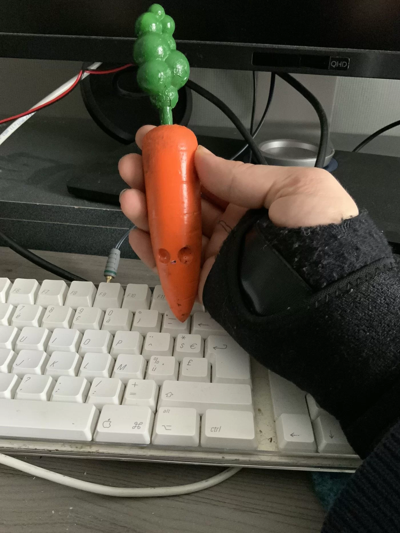
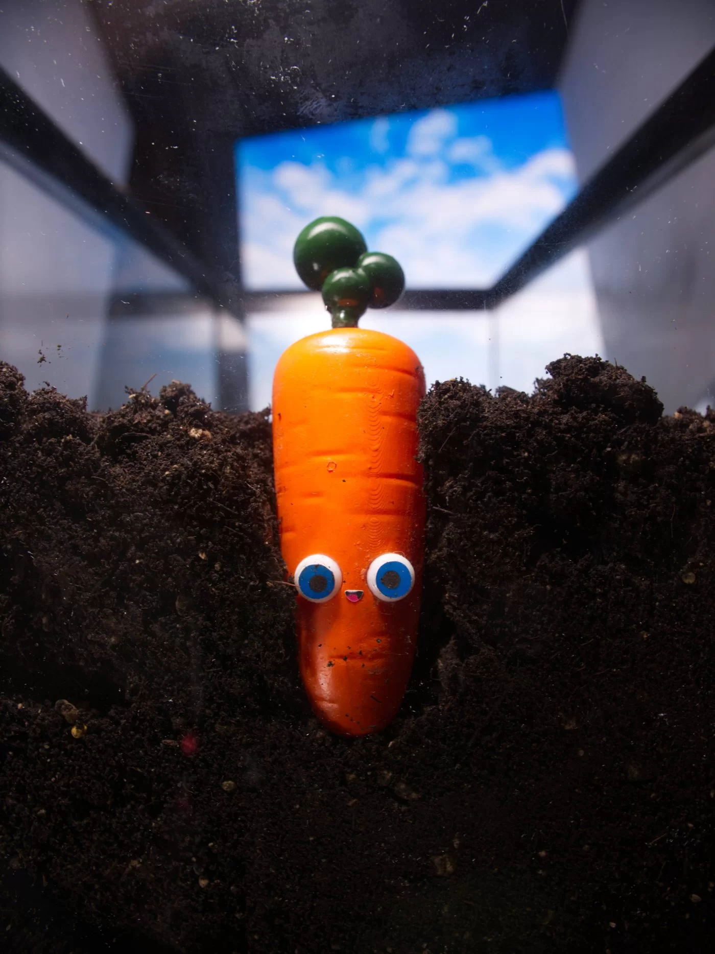
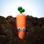
Also, we created little stories within one question, like that of the carrot growing up from a seed to a baby carrot, to the less popular but our favorite, the teenage carrot, to a full-grown carrot.
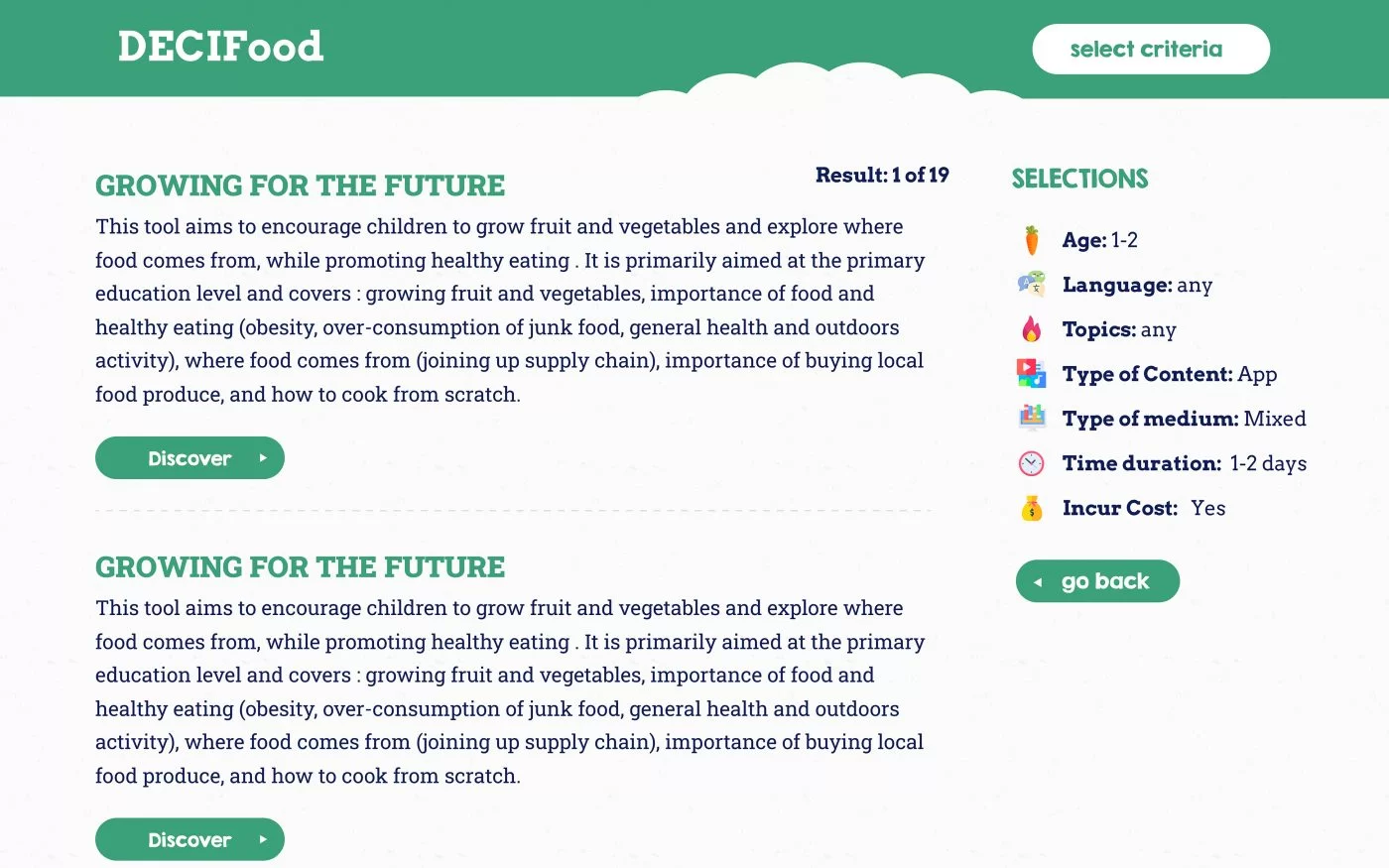
We have also tried to make an attractive results page. At this stage, the language problem is solved in a natural way. With the second question in the questionnaire, we know the language the user knows in a very natural, almost invisible way. Due to the nature of the filtering system developed for this app and the international database, the filtered results are in their preferred language. Having chosen these languages themselves, they are most likely to know and understand these language(s). On the results page, we have maintained the same trend of keeping the text to a minimum and providing smaller visual design cues. The suggested tools should obviously be the focus here.
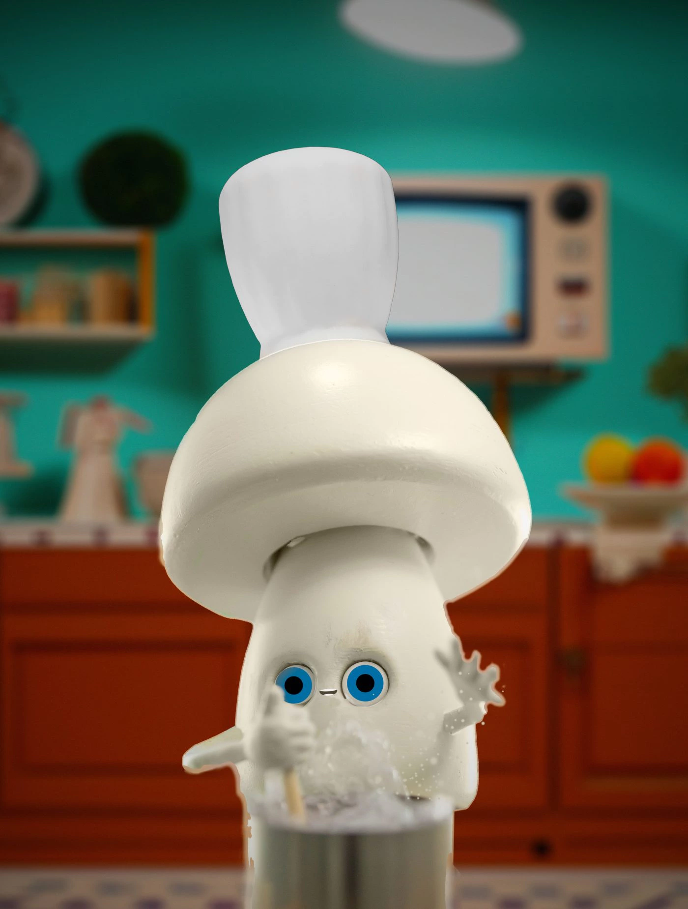
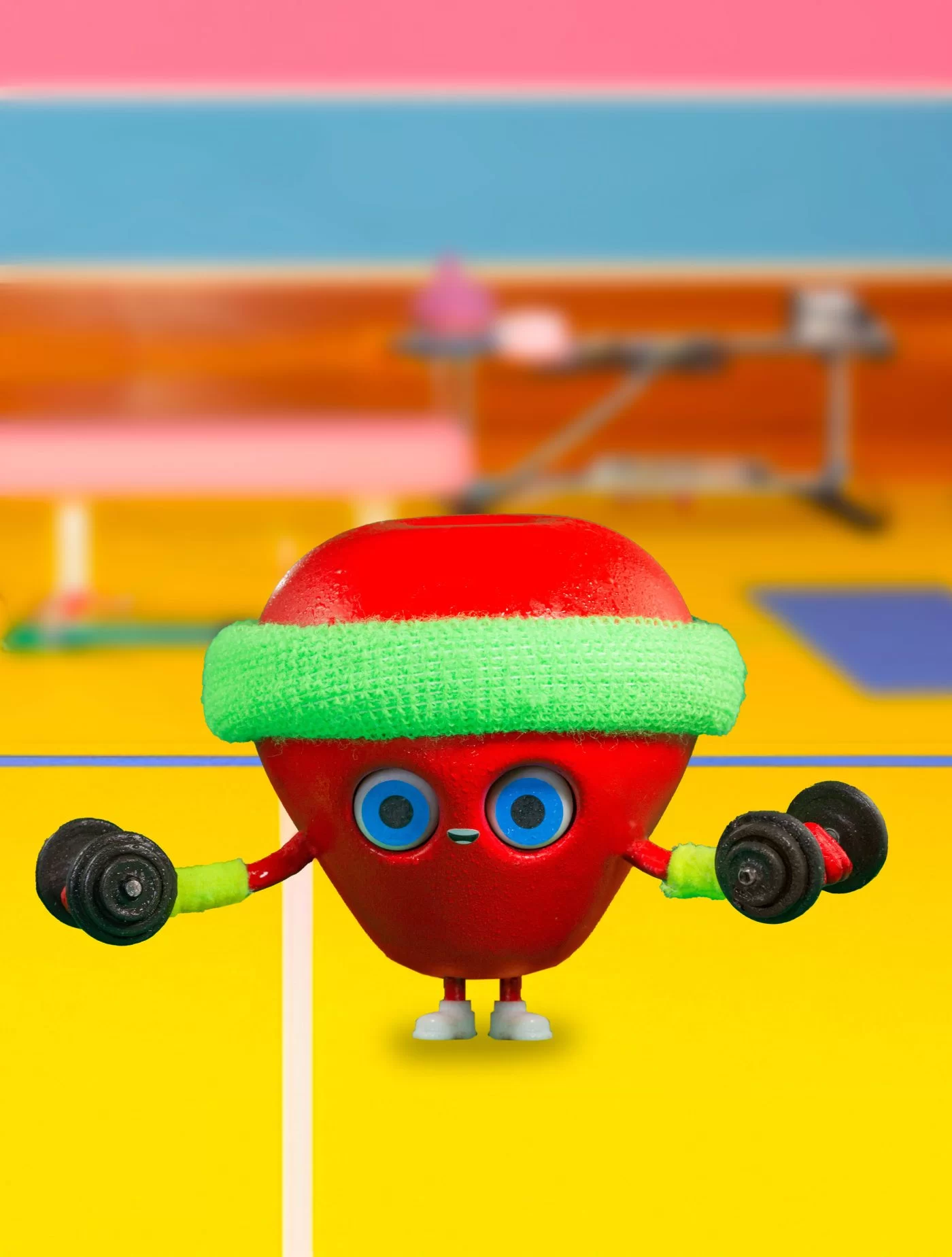
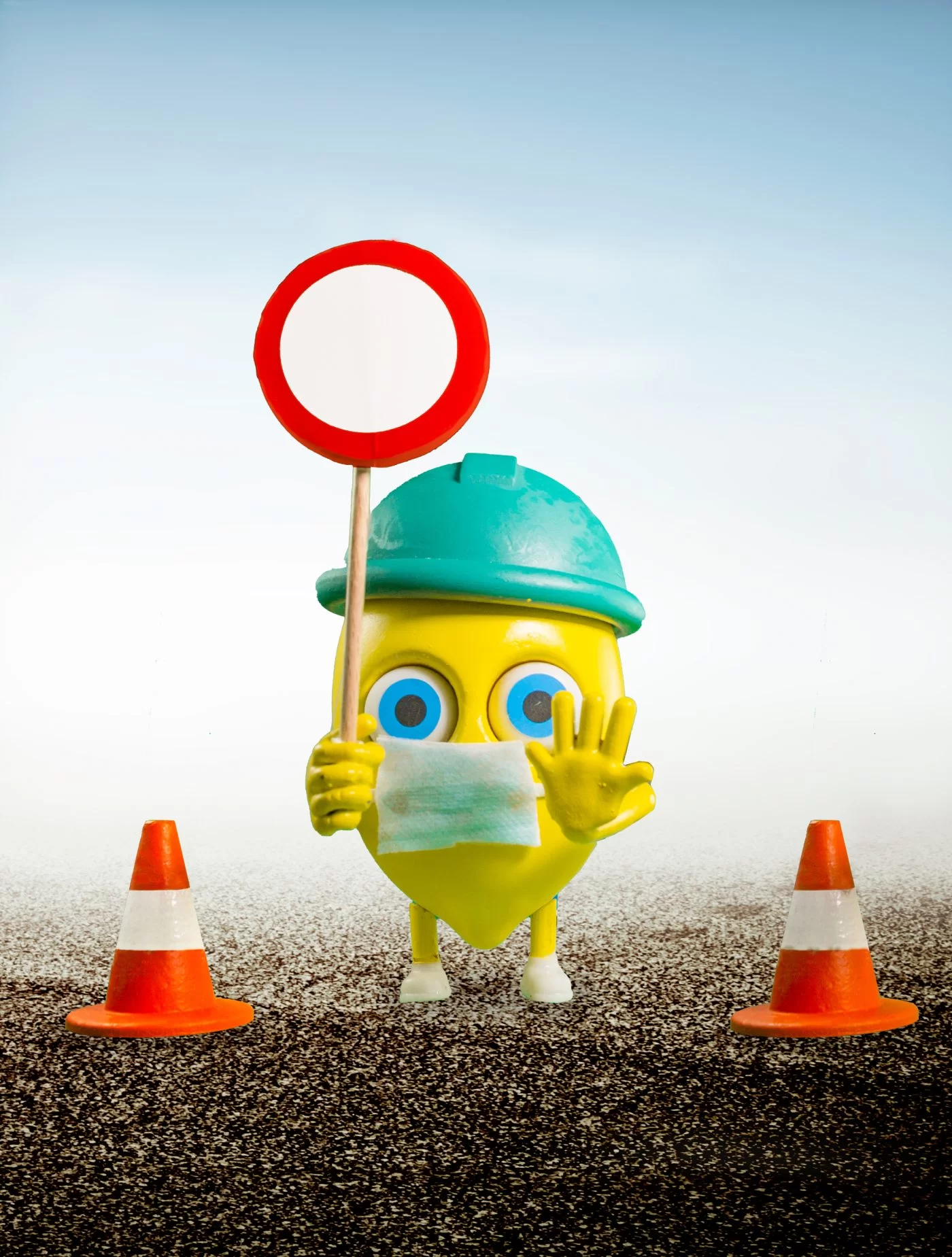
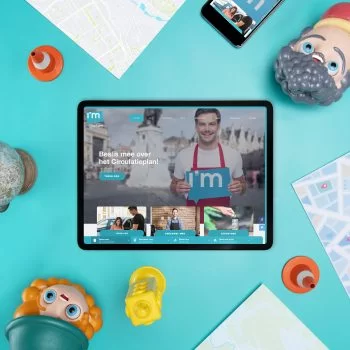
So the app and tools it proposes are aimed at a younger audience, primary and secondary school students and their teachers. Pixipop is for everyone, but we know that younger people and parents in particular love our little creatures. That’s why we created a whole family of Pixipop inspired by food, mainly fruits and vegetables.
We made it real?!
As we said, we designed all the visuals ourselves. First, we created digital prototypes with mostly rough 3D design renderings to pitch the ideas to the client.
They loved it and approved the majority of designs at the first round, asking for only a few mostly contextual changes. It could have stopped there by just making some nicer renders. But no, we made it real.
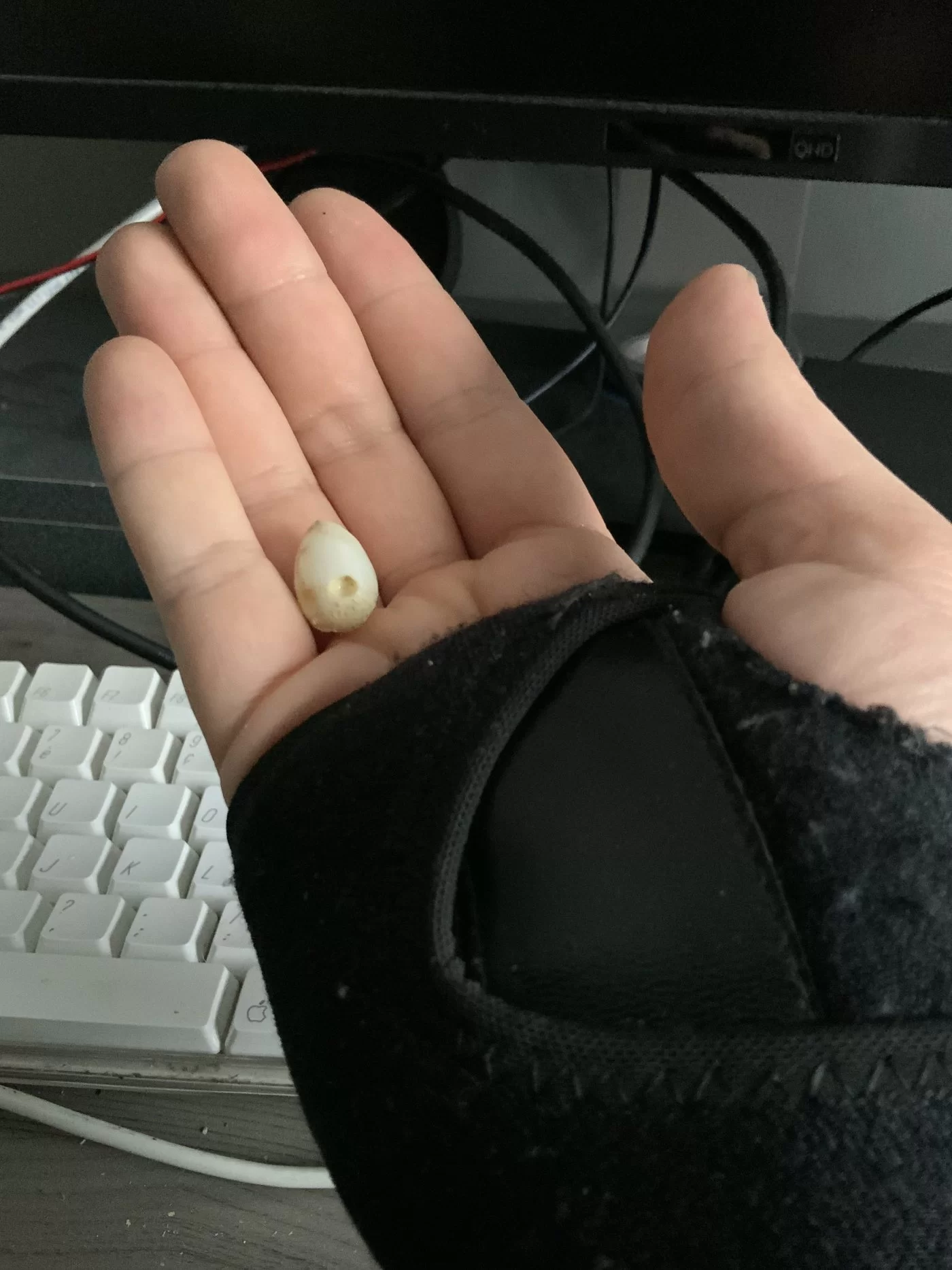
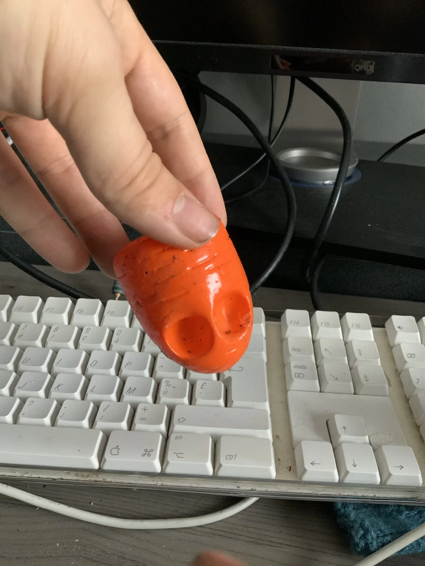
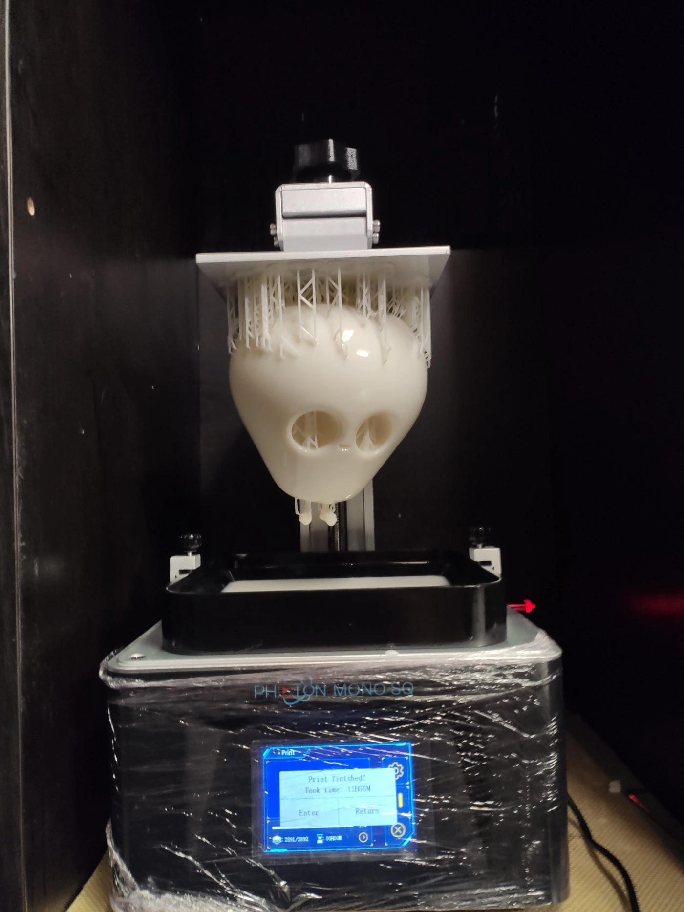
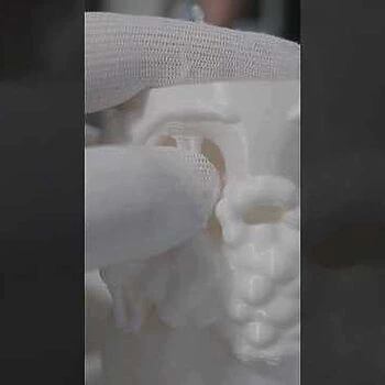
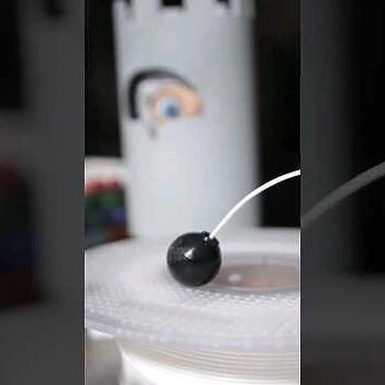
We love making things real. For this project, we used 3D printers to create models and then post-processed, primed, painted and photographed them. The final images are photos, not 3D renders! The process was kind of time-consuming, but the results are absolutely worth it!

