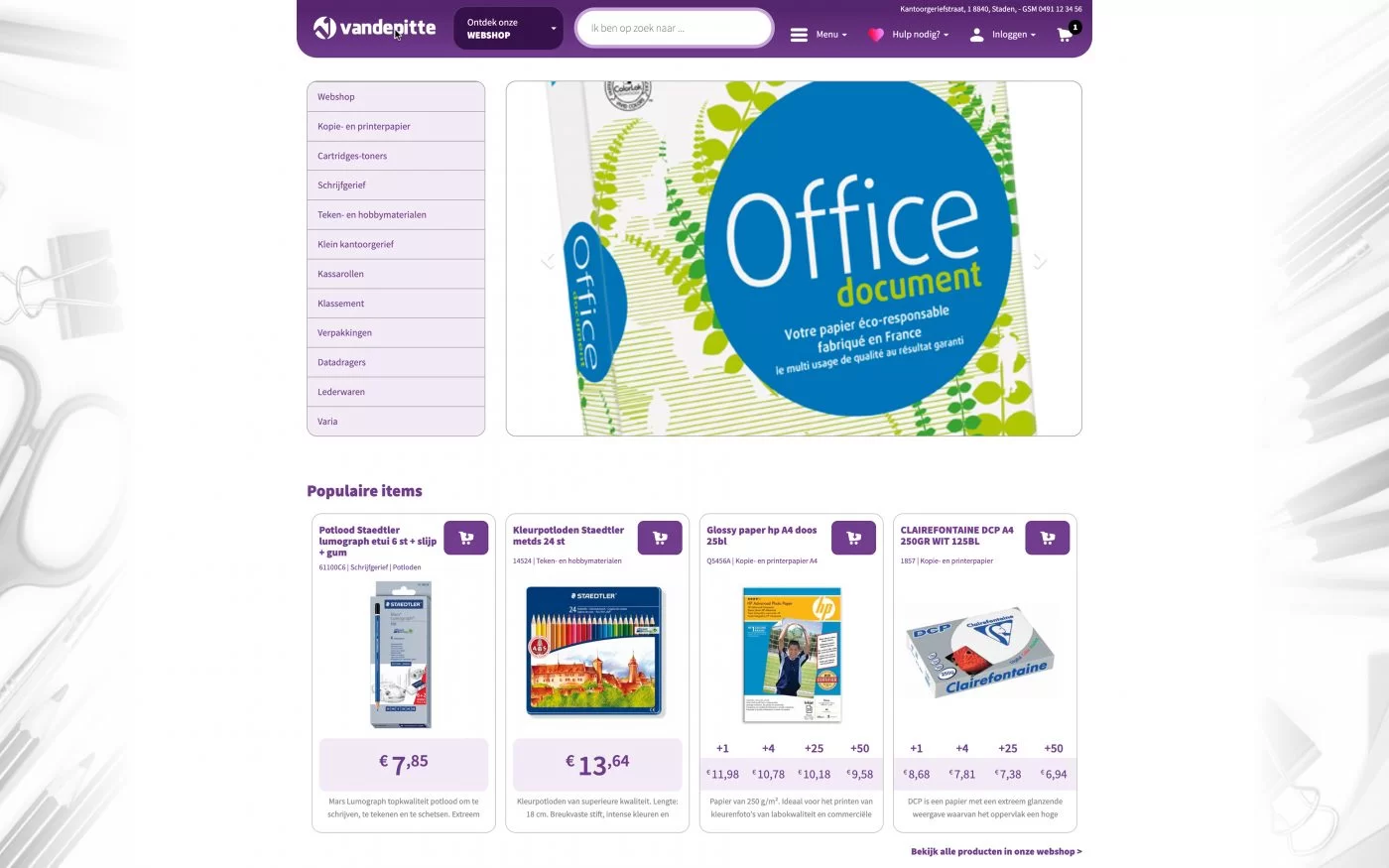
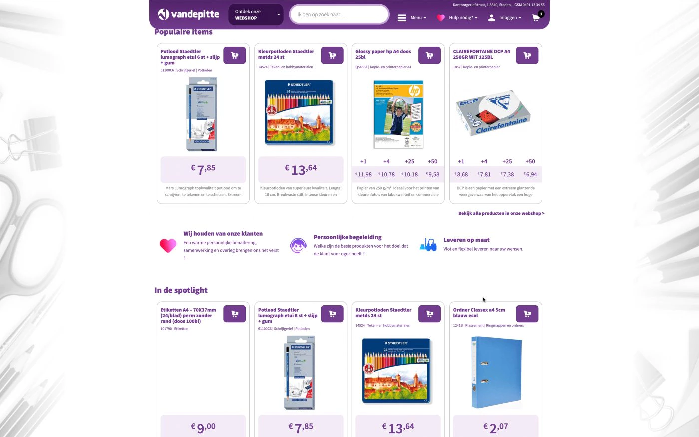
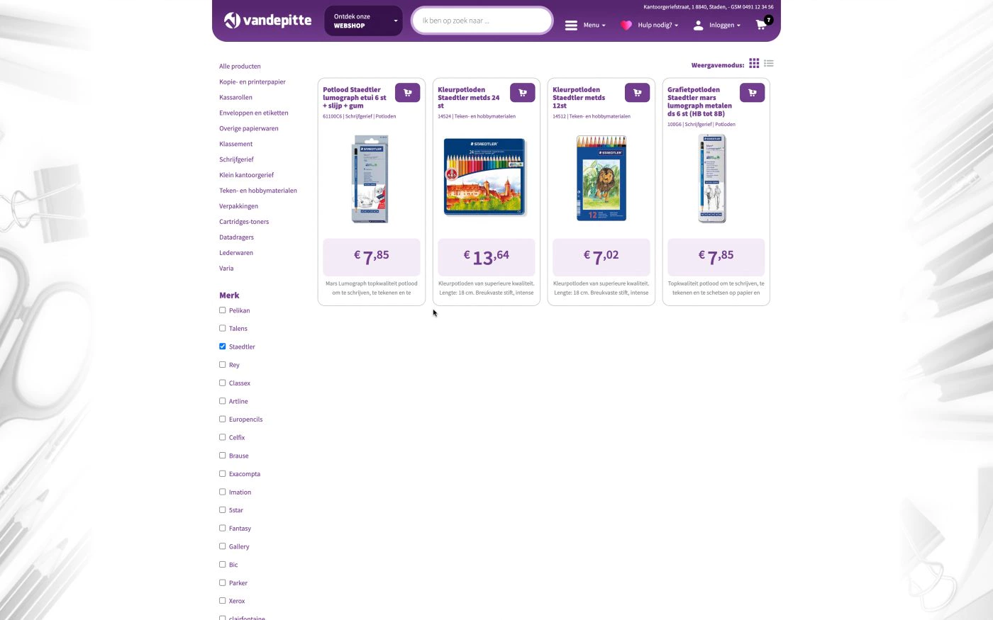
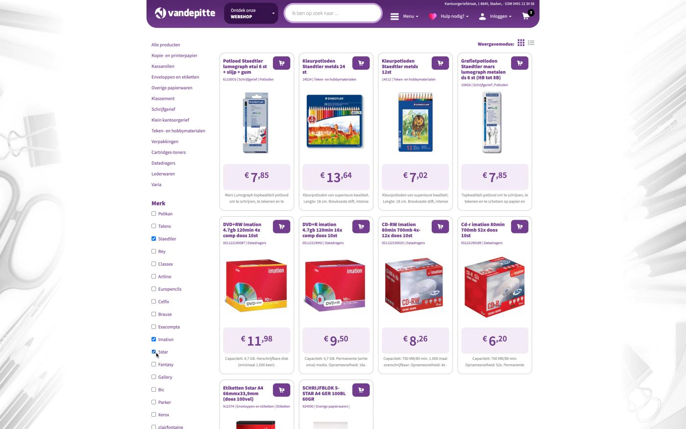
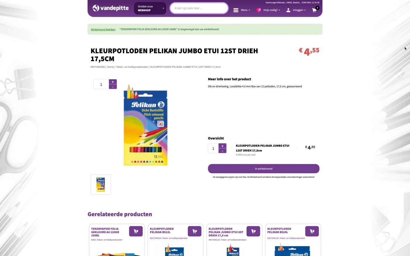
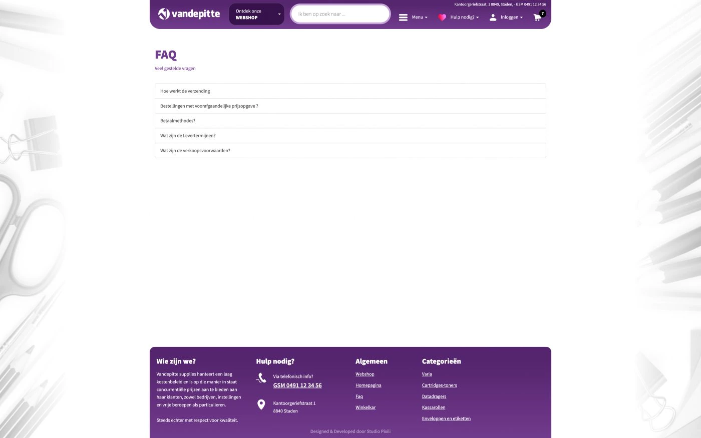
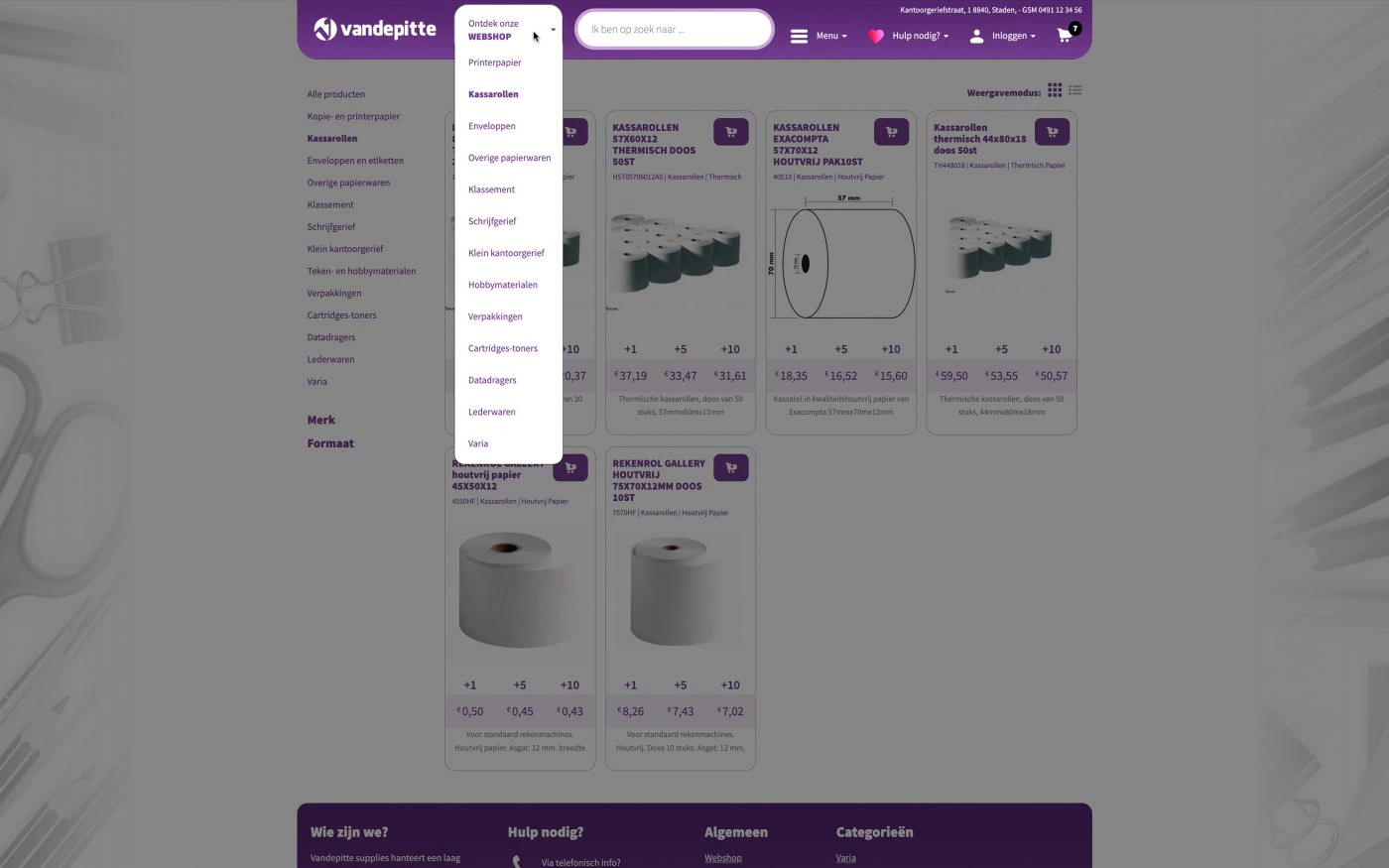
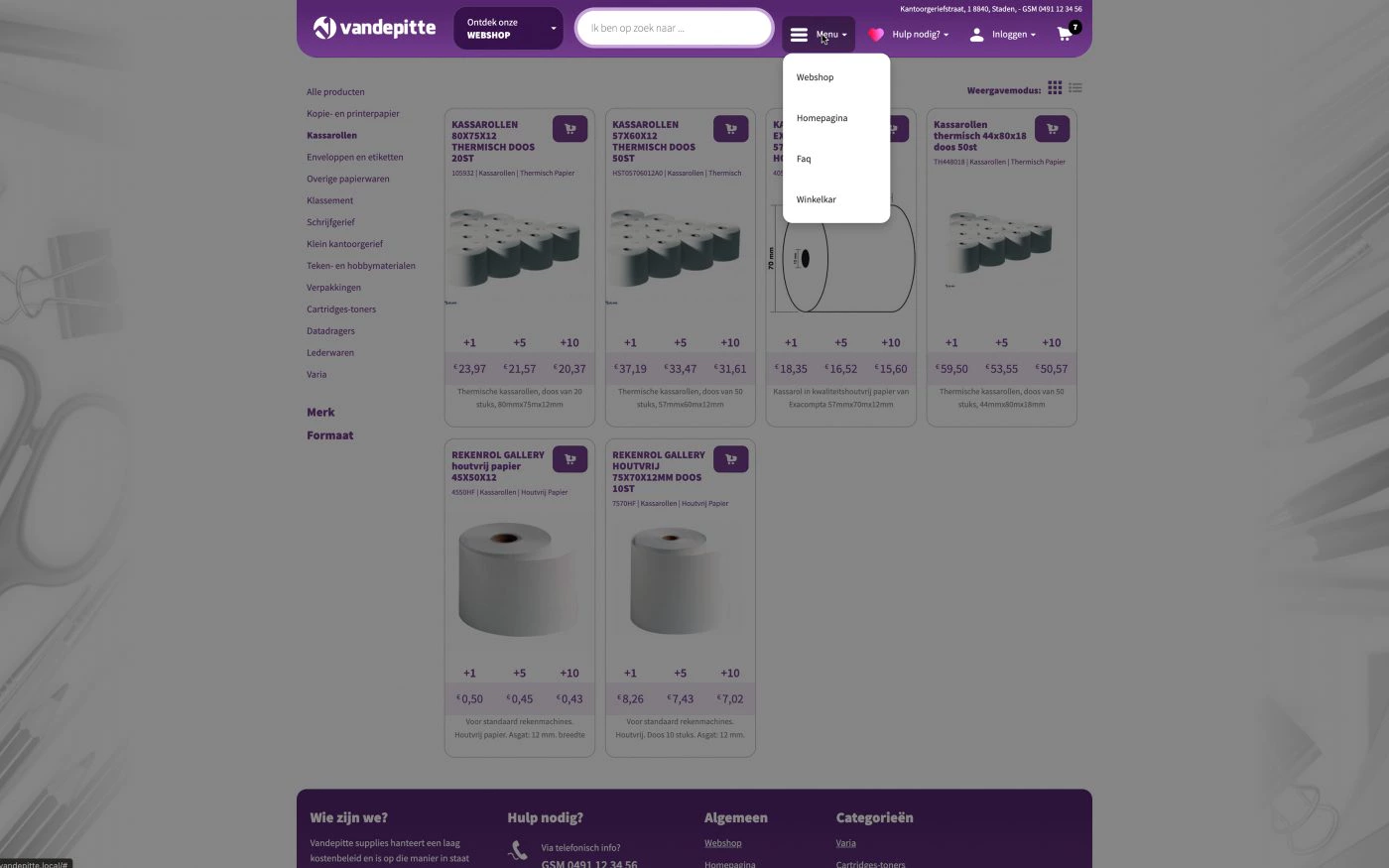
The customer asked for a web catalogue, but after an initial discussion it turned out to be a rather customised B2B webshop, with a good search function and ordering system. But then with some peculiarities that you are less likely to encounter in the everyday webshop
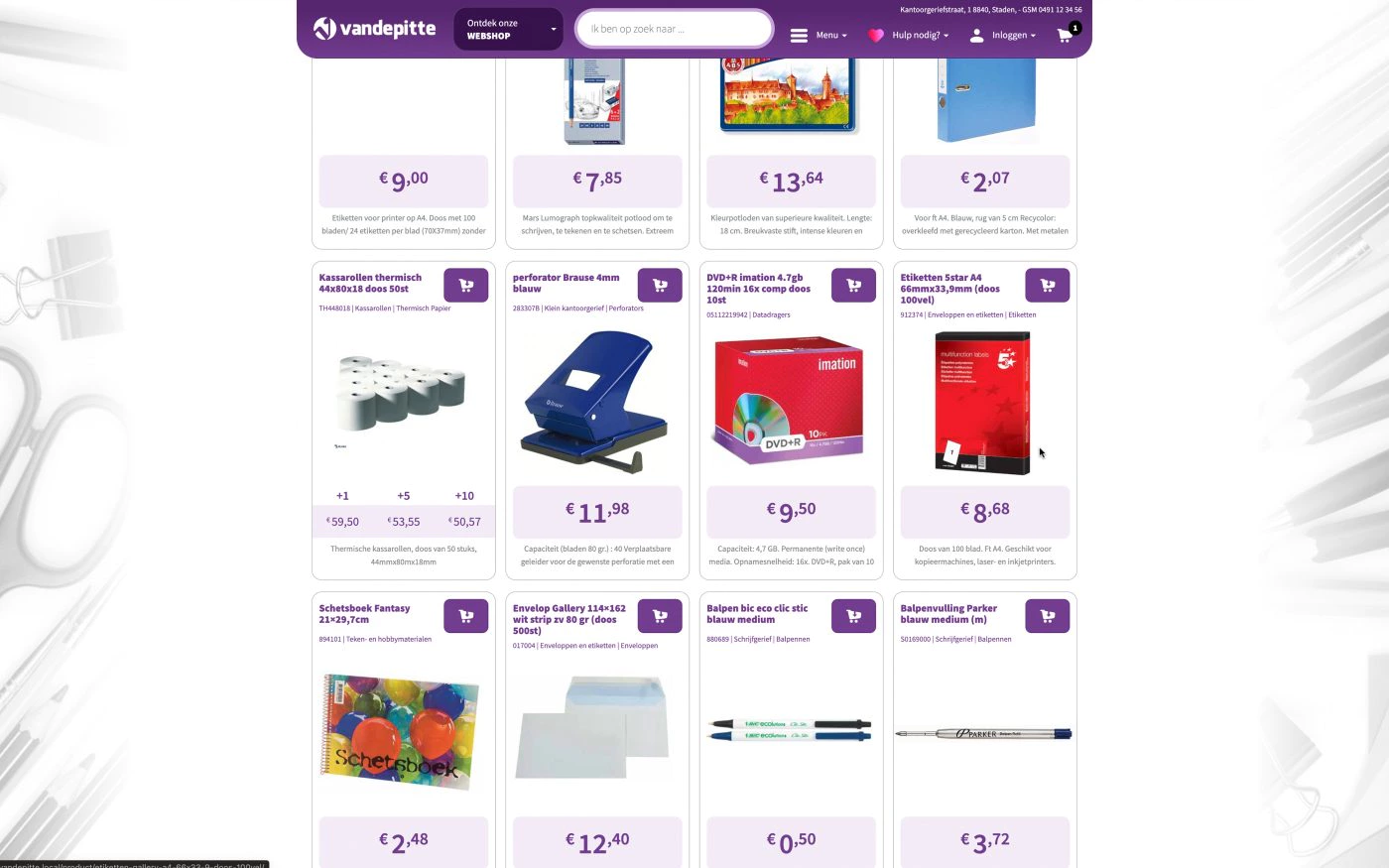
Taking discounts into account when buying bulk goods Large stocks are made easy to manage
Customers are encouraged to communicate with the company by phone instead of via e-mail or a chat system.
A B2B website that is not publicly accessible so that only existing customers can order and new customers are invited. This company does not sell to individuals and delivers itself, as the quantities of material cannot be transported through the traditional postal system.
The Challenge
The original question was not an online shop, but rather a digital catalogue. The intention was to replace the paper catalogue, but the features they described were more like those of an online shop.
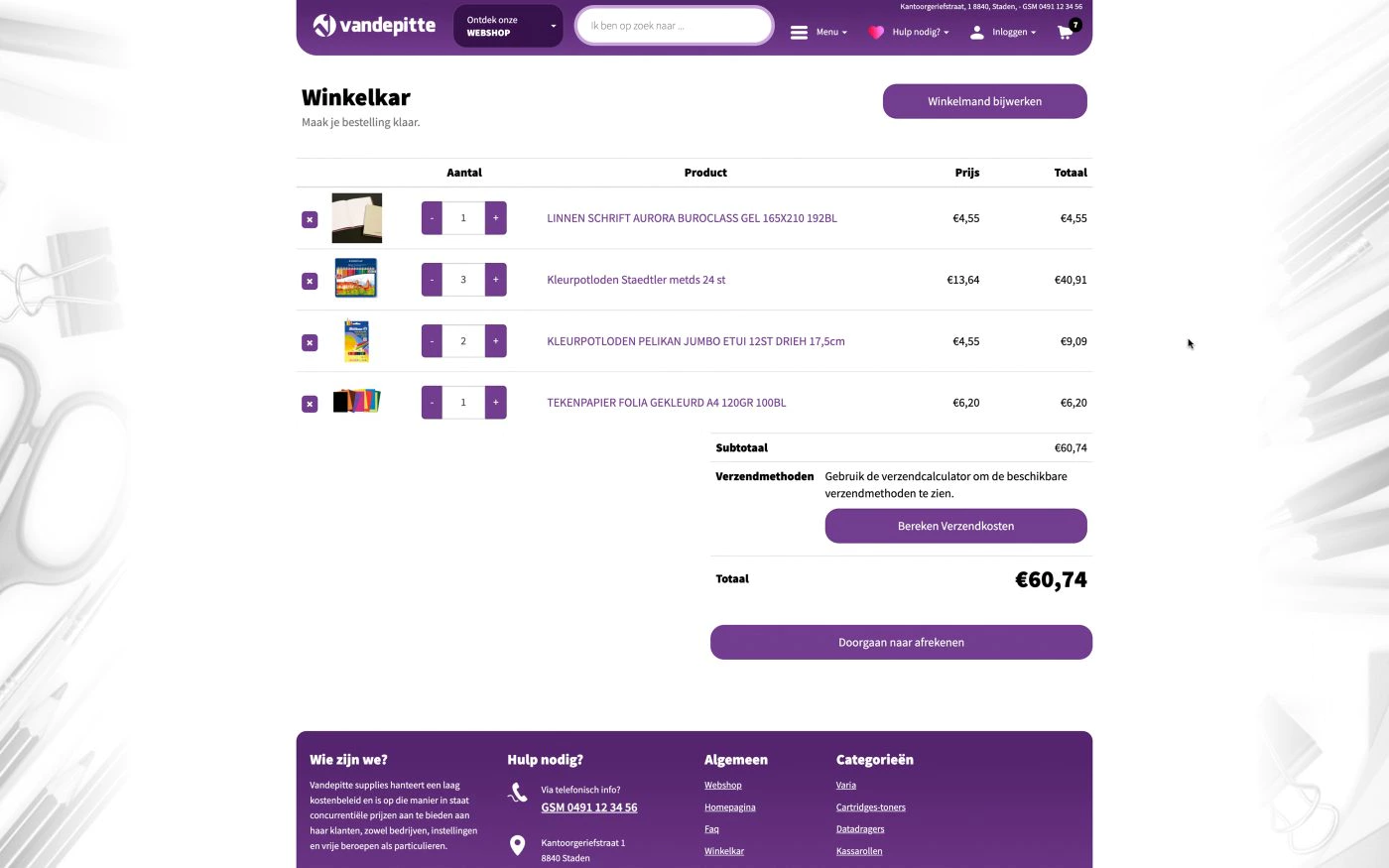
Products had to be easy to find and the whole thing had to be clear. Customers had to be able to make an order list, know how much they would cost including bulk discounts and then order. All this was very much like a b2b webshop.
Now webshop was a bit of a scary word for that customer, and they understandably had a lot of questions and concerns. The client didn’t want to lose the personal connection with his customers. It would also be difficult for him to get orders from far away that he could not deliver, or deliver to a customer he did not know.
They also did not want all communication, such as questions about products, to be digital and preferred customers to call, so that the personal aspect was maintained. When it came to ordering, they preferred it to be done digitally. In their current way of doing things, it was almost always by e-mail anyway, the way being somewhat awkward.
The customer had a traditional webshop in mind, which is perfectly normal. We do a lot of customisation, and explained that the webshop could be completely customised to his wishes.
Any concerns one had could be solved perfectly with the right approach. In the end, we were warmly thanked for thinking with us. This is something Studio Pixili is often told and always tries to do.
The approach
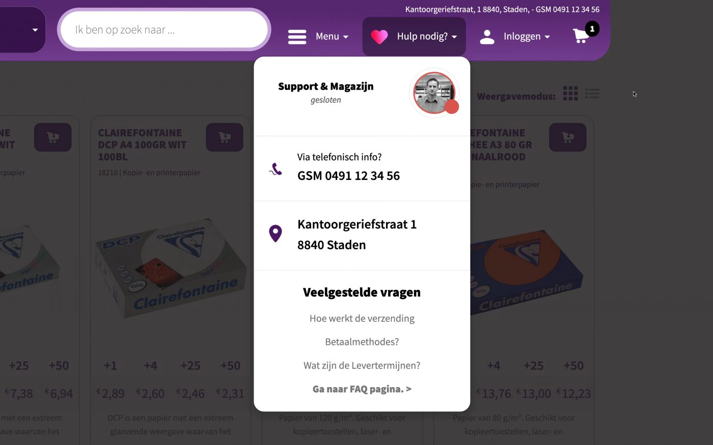
One challenge with order enquiries was that the customer preferred to be called at certain hours.
We therefore developed a clear module in which the case phone number is central with visible hours of availability.
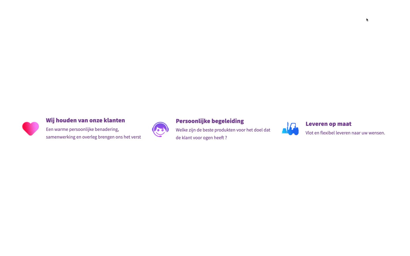
In addition, we clarified this through three call-to-actions that emphasised personal contact and customer-business relations.
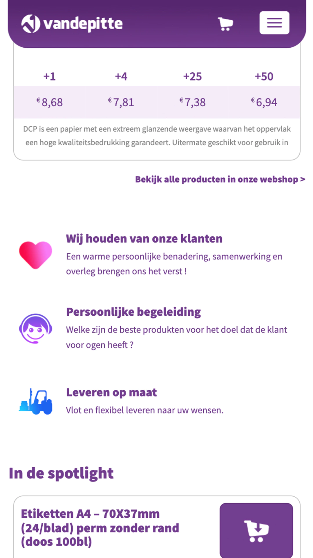
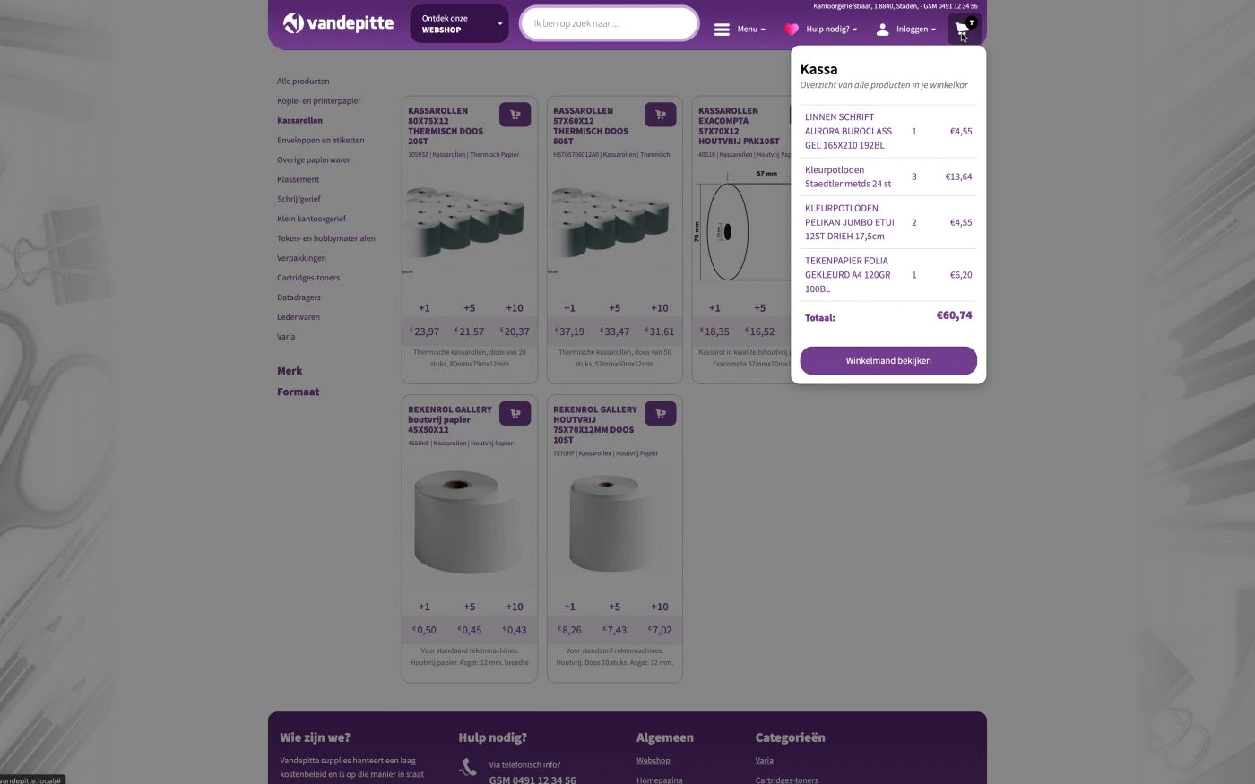
We created a digital version of the price table that shows how much discount you get when you buy big. In a familiar way, the price is updated and highlighted live, so it is clear which part of the price table the price comes from.
The website itself is private and only accessible using a private URL. Their customers can only order if they have an account that was customer activated.

