The client asked for a complete rebranding of Track. The website had a simple, cheap layout and Pixili needed to transform this into a stylish real estate brand; a company that would look elegant, luxurious and reliable, yet feel approachable.
Track is a unique real estate company that focuses on real estate investing and not housing. The site has a selective range of properties that meet their strict criteria for real estate investment.
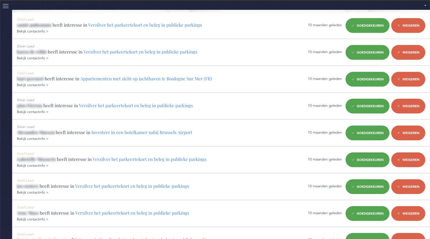
Besides optimising the site for conversion, the client also wanted a customised dashboard to make following up real estate leads as fast and effective as possible.
Color
Colour plays a major role in defining a luxurious and elegant atmosphere.
Accessible luxury also came into play at Wauters and Partners. Gold was the most obvious colour for both companies. The link between gold and luxury is made without thinking. At Track, we used it as an accent colour because the site had to remain accessible.
The main colour was less obvious. We chose the color blue, which is usually seen as a “cheap” color. Blue is widely used by budget companies like Action, Aldi, and Ikea. Since Track needs to be a more luxurious brand, it may seem like the wrong choice. But the fact is, saying blue is a cheap color is far too simplistic.
Dark Royal Blue
#021945
Burlywood
#deb990
Colour, like many things, is very contextual and culturally bound. Dark blue, for instance, is a kind of blue that feels royal and important. Partly because of its use by authorities, such as e.g. the police and navy. Blue is also a prominent colour in many flags.
Textures
Besides colour, using the right textures was an important part of creating a sense of elegance. Like colours, textures have associations;
Marble, for example, is expensive but not unattainable. Wood, in turn, is rather accessible and is often considered cheaper, but certain types of wood can be very expensive.
The wood species we have chosen, maple wood has a grain with a natural, also almost marble-like pattern but with then blonde, almost gold-like hues.
and in terms of price is usually somewhere in the middle. Often, it is the slightly more expensive piece of wood found in larger home improvements stores.


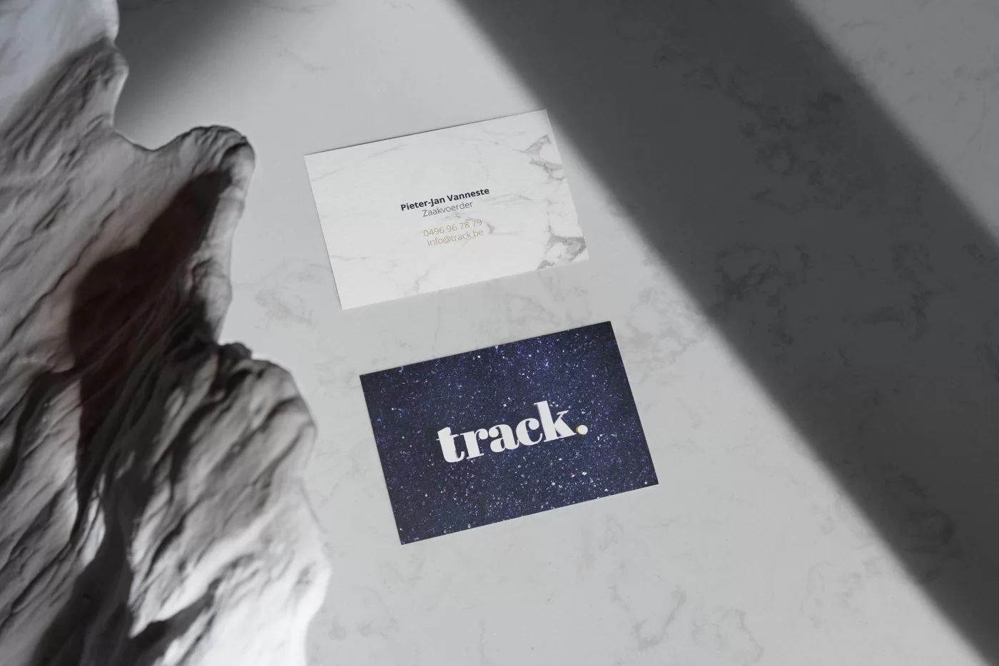
Business card
What was not mentioned under the heading ‘textures’ is that a third, dark blue texture was also chosen in the beginning.
Ultimately this latter texture was not used very often on the website because unlike the marble and wood texture it had no contrast against the background colour.
But this texture deliberately had the background colour because the intention was to have a texture for each brand colour of track.
And for this dark blue diamond texture, there were other plans from the beginning. Since besides a website, they also asked for a lot of other branding elements like e.g. a business card.
This dark blue diamond texture with all its little reflections, almost looks like a starry sky from a certain distance and with the logo in the middle, the client thought this was a great idea as a front for his business cards.
In practice, the business card was created by 3D printing the company logo and placing it in a box of crystals, which was then photographed. It is also ironic that this appears to be the most expensive background, while the crystals themselves were the cheapest element we purchased for creating the textures.
The 3D prints of the logo were later given as gifts to the client, which they found a very nice touch.
Logo
A new company logo also had to be designed. After the first conversation, it was already clear that the client wanted a simpler, stylish and textbased logo.
So, preferably, the logo was made using a beautiful typeface.
After conducting an extensive search for the perfect font, we ultimately decided on this stylish option. Additionally, we were able to find a complementary font for titles and headings.

Photography
Pixili also created original visuals for this client. After all, good visual communication is one of our commandments.
So for Track, we created a series of photos, explaining and visually displaying very specific concepts.
These could then be used in their marketing material such as, among others, the real estate e-book that Track gave as a gift to everyone who subscribed to their track+ newsletter. Both the e-book and the newsletter were also designed by Pixili.
But also throughout the interface and content, this image material was used constantly and an overview of our favourite images can be found below.
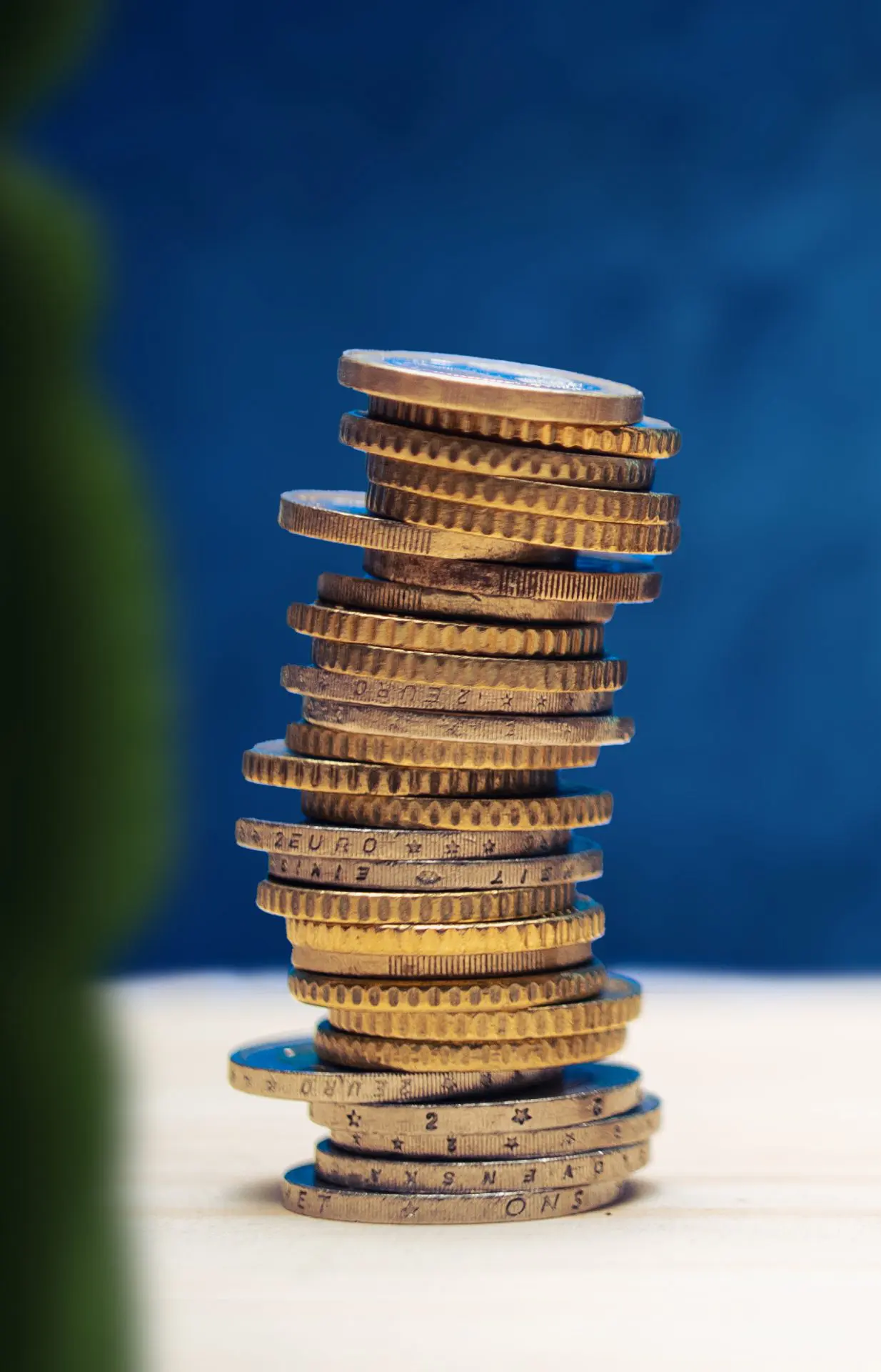
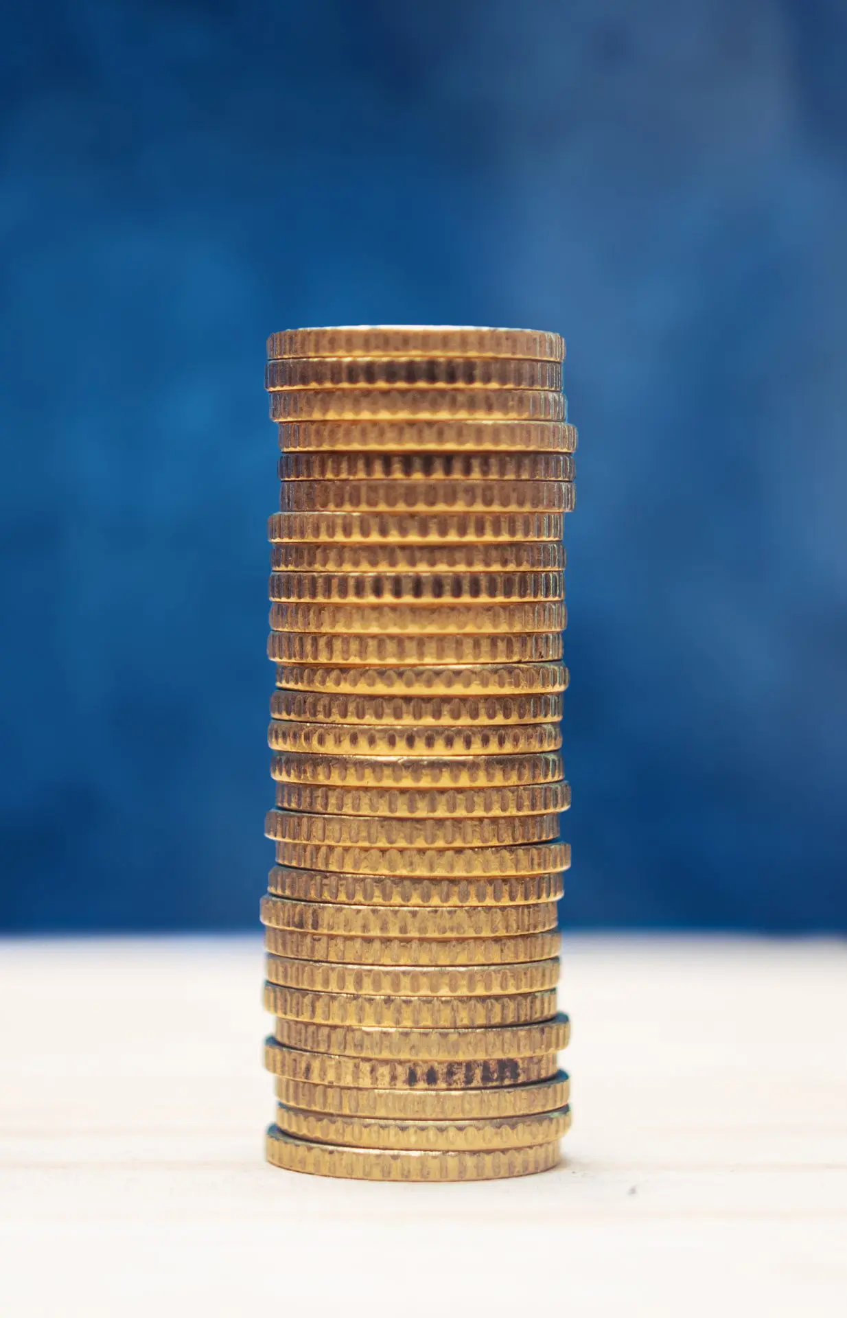
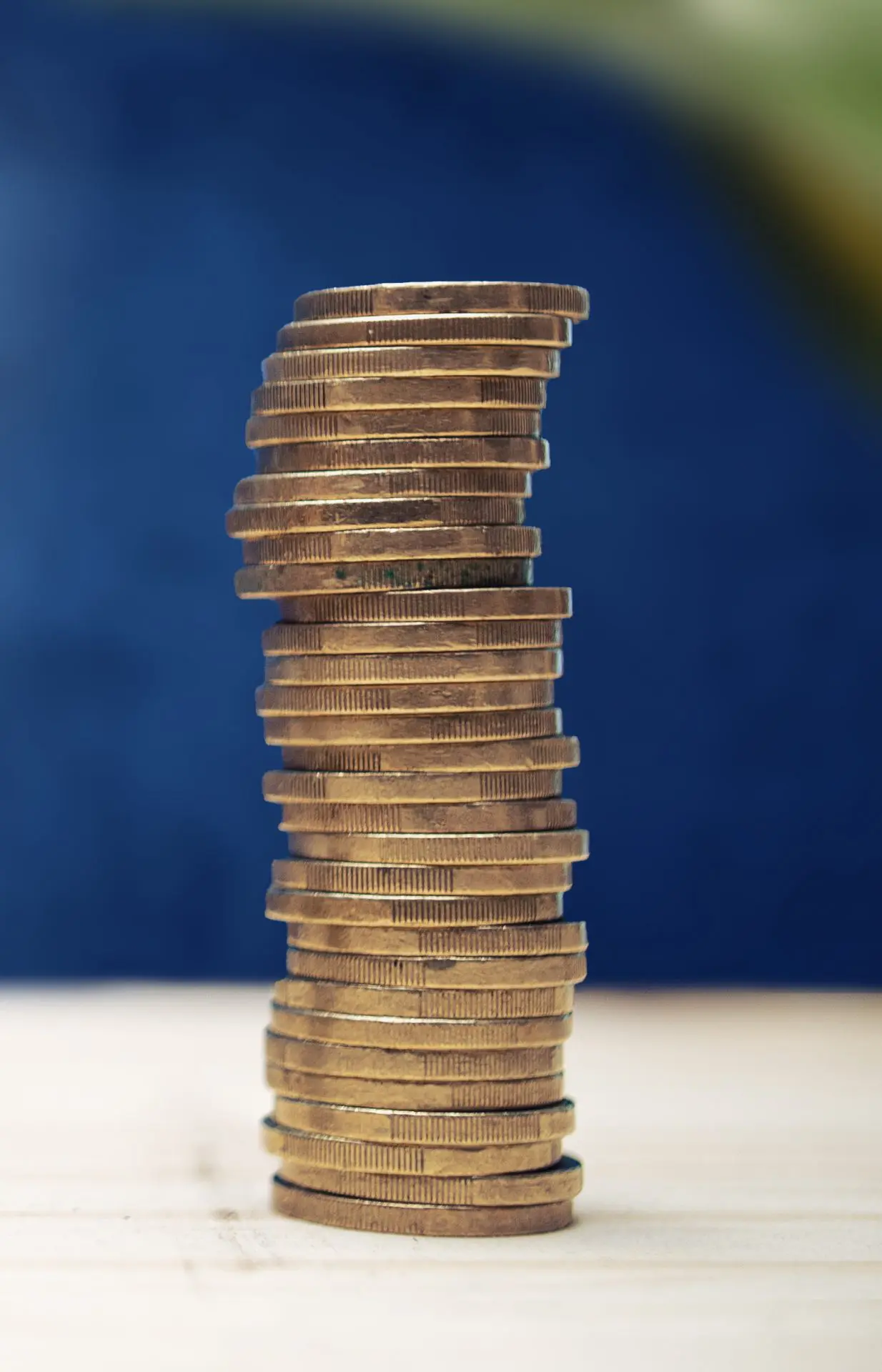
These pictures show e.g. the stability versus income of the investments on offer. Based on towers of coins.
The least stable tower has the most 2 euro pieces but also a lot of 50 cent and 1 euro pieces. The most stable is almost completely straight but is 100 per cent made up of 50-cent pieces, visually showing that completely risk-free investments often bring in a lot less. The low-risk investment is made up of 1 euro pieces, and the tower is slightly less stable but a lot more stable than the first tower.
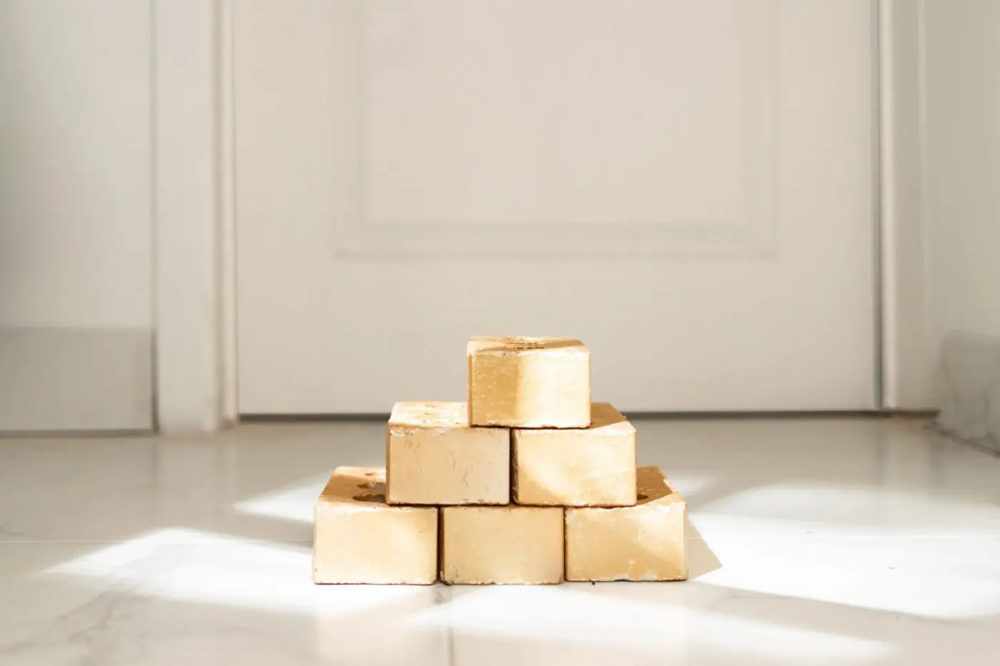
We have also created another series of photos that we would like to quickly highlight. This series of images was created under the slogan “Building Wealth”.
We took bricks and painted them gold, so that they resemble the gold bars we all know from film and television. Variants of this image (with more and less bricks) were also used in the interface to show budget levels. 1 brick was for the cheapest investments under 100000 euro and the image below was for the most expensive category real estate costing more than 300000 euro.
Development
Besides designing a stylish real estate brand, Pixili also developed this website.
The entire site was developed using Vue, a framework that loads only the latest data instead of the entire page. The website was also pre-rendered based on Wender 1, a more complex but modern way of creating websites.
As a result, we added unique features such as: An invisible infinite scroll.
A filtering system that not only looks good, but also instantly filters and displays data not yet loaded on the page
Calculators that instantly display gross and net returns
A customised backend where it is easy to sort real estate leads

Disclaimer
Some screenshots have been censored to protect privacy of the clients and its customers. Track was also sold in 2020.
This case is a record of our work for track at the time. The website has new owners with its own team. We no longer work for track and the current website is not our work.