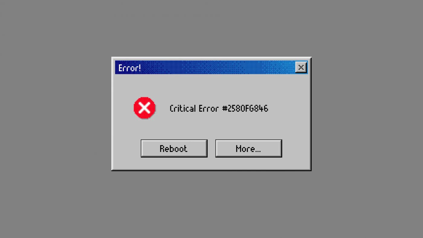
This is a unique brand and web site/app design inspired by pixel art design from retro games but also the first graphical user interfaces. Like e.g. those of windows 95, and fuses them with contemporary design principles.
“That’s why I’m broke” is a website that responds to internet culture and showcases the craziest gadgets, retro games and gifts.
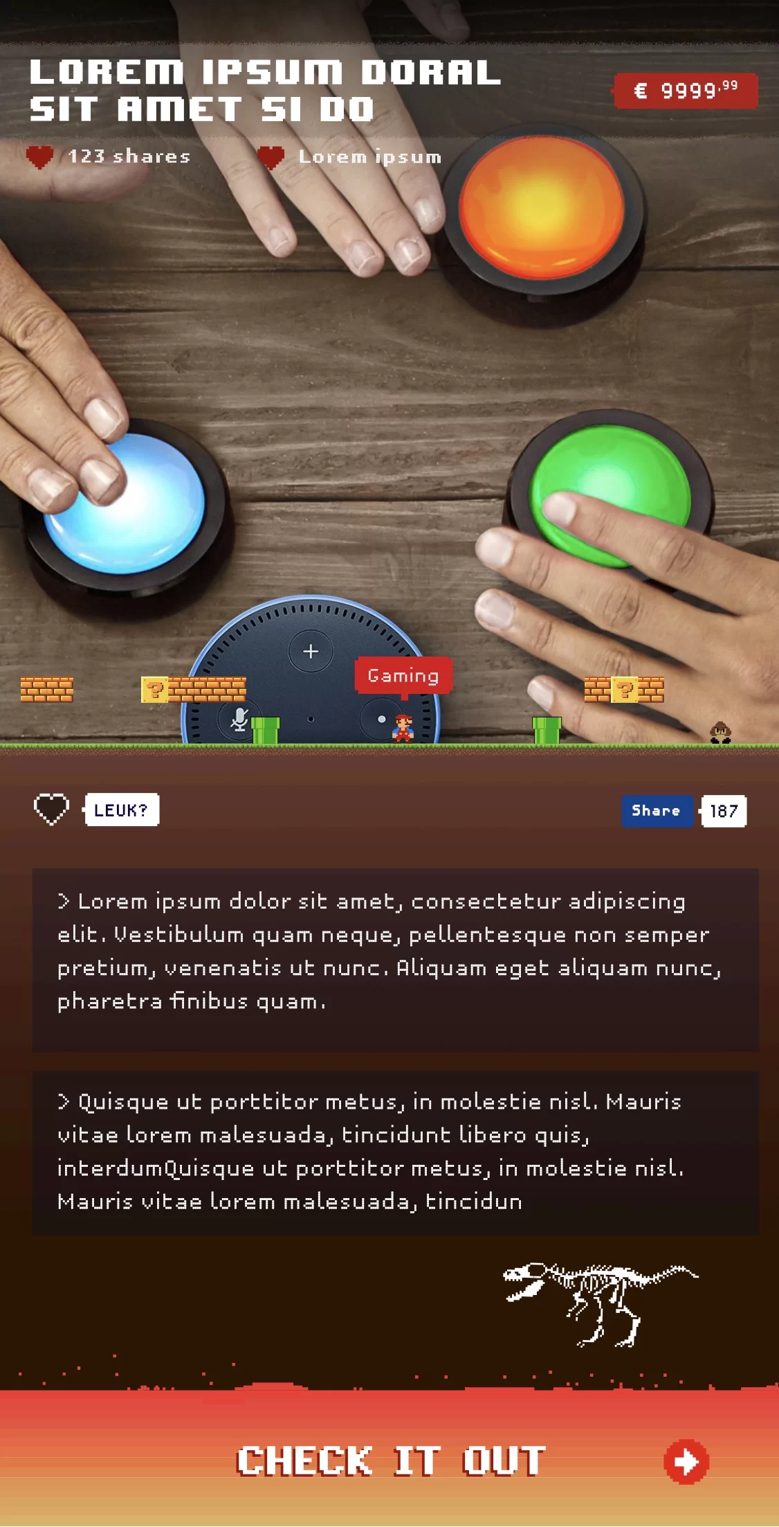
The client wanted Pixili to develop a website that advertises products that are both crazy and useful, and also have the potential to go viral.
The client wanted an offbeat website that would stand out and appeal to their target audience of gamers, gadget lovers and pop culture fanatics and be unique.
Logo
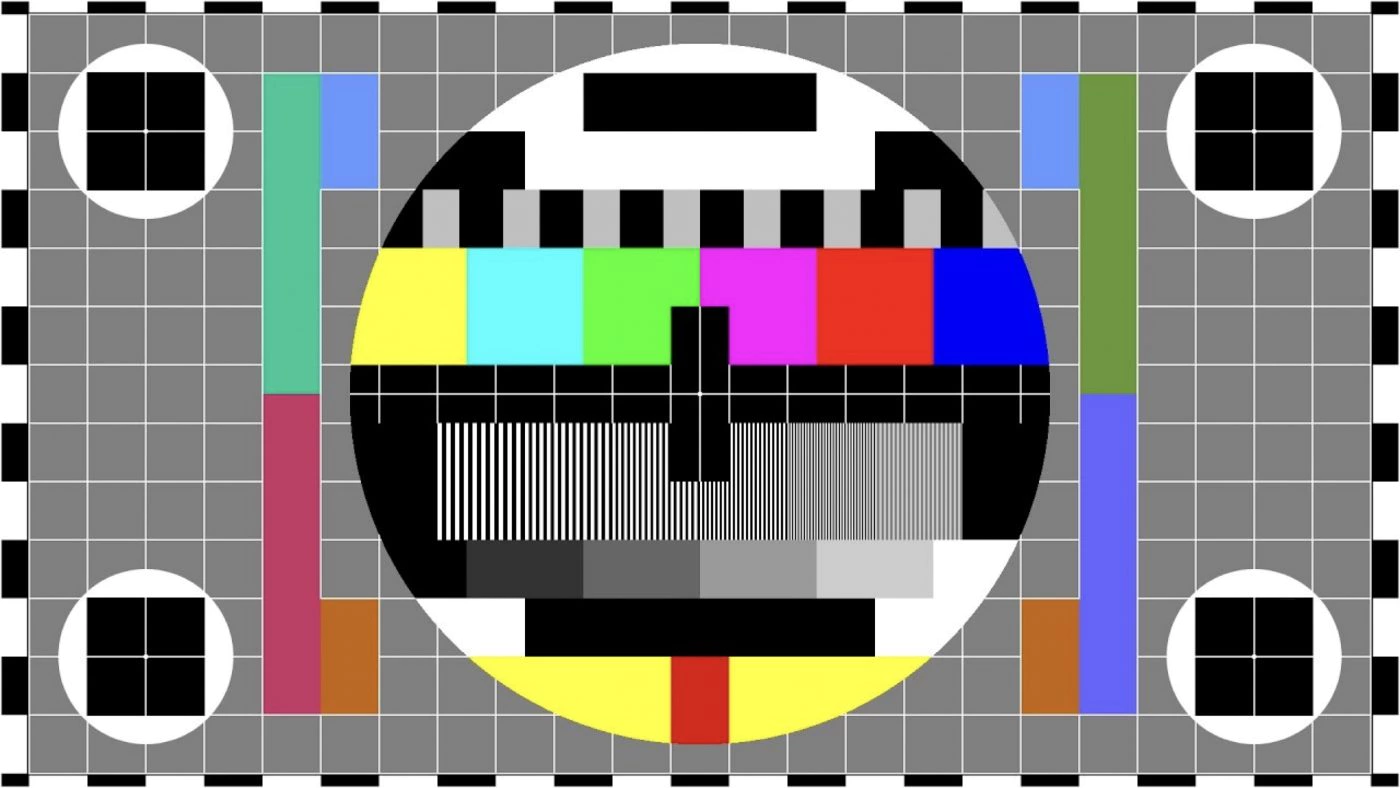
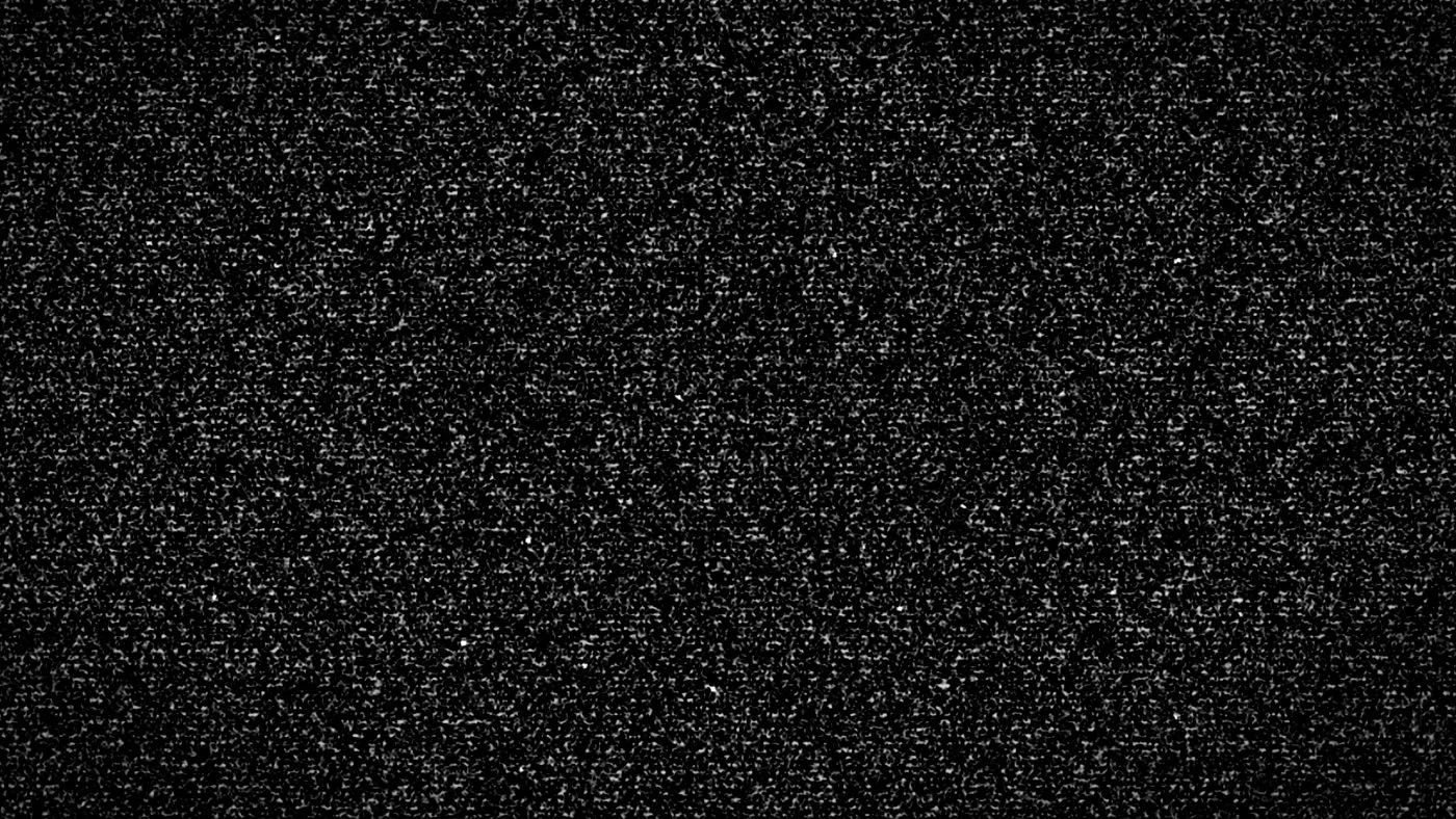
The logo is inspired by a test image and TV noise a combination of glitch art and pixel art design. The name “That’s why I’m broke” suggests that something has gone wrong, and we wanted the website design to reflect that.
Although “broke” has a negative connotation, it is used here in a humorous way. When something goes wrong on tv, a test image is often displayed, which was originally real but is now used for comic effect.
Colour palette
The core colour palette uses bright, bold and pure colours to make elements stand out.
Yellow
#FFFF00
Aqua
#00FEFF
E-Green
01FF02
Fuchsia
FF00FE
Red
FD0000
Blue
0000FE
The pallet was inspired by the test image used on old TV’s. Since this both conceptually and visually fitted the brand.
We also make great use of black, white and grey to balance them out.
These colours are then derived from TV noise and old user interfaces, such as Windows 95.
Black
#000000
Chinese Silver
#cccccc
White
#FFFFFF
Layout
We were inspired by retro games and early user interfaces. At first, the choice of pixel art seemed a bit unusual. But the client wanted an atypical site. The more we analyzed it, the more we realized that this style would resonate with the website’s target audience.
The slightly older gamers have fond nostalgic memories of pixelart and the games they played with it, while the slightly younger gamers are familiar with the mega-popular Minecraft, which draws huge inspiration from pixelart.
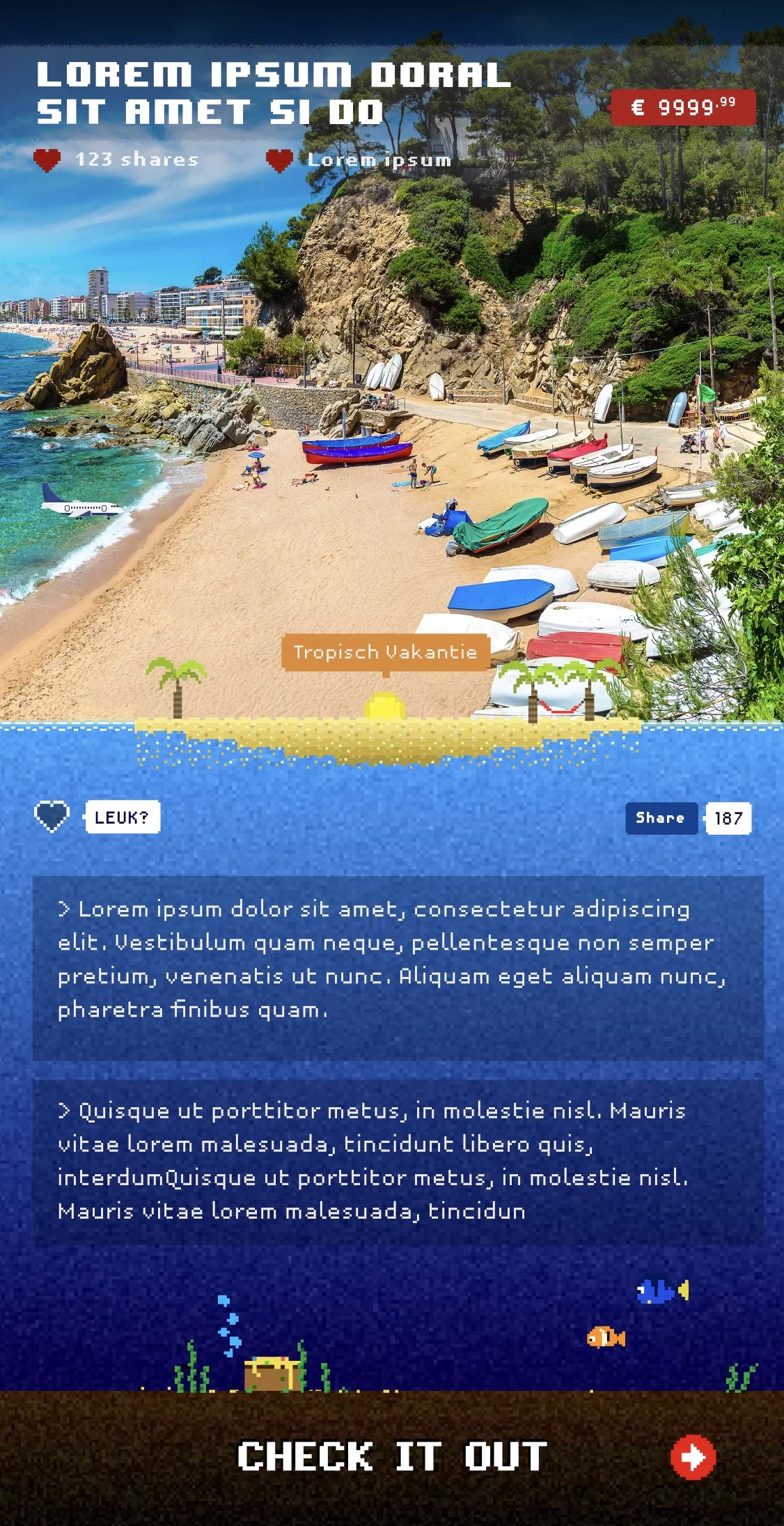
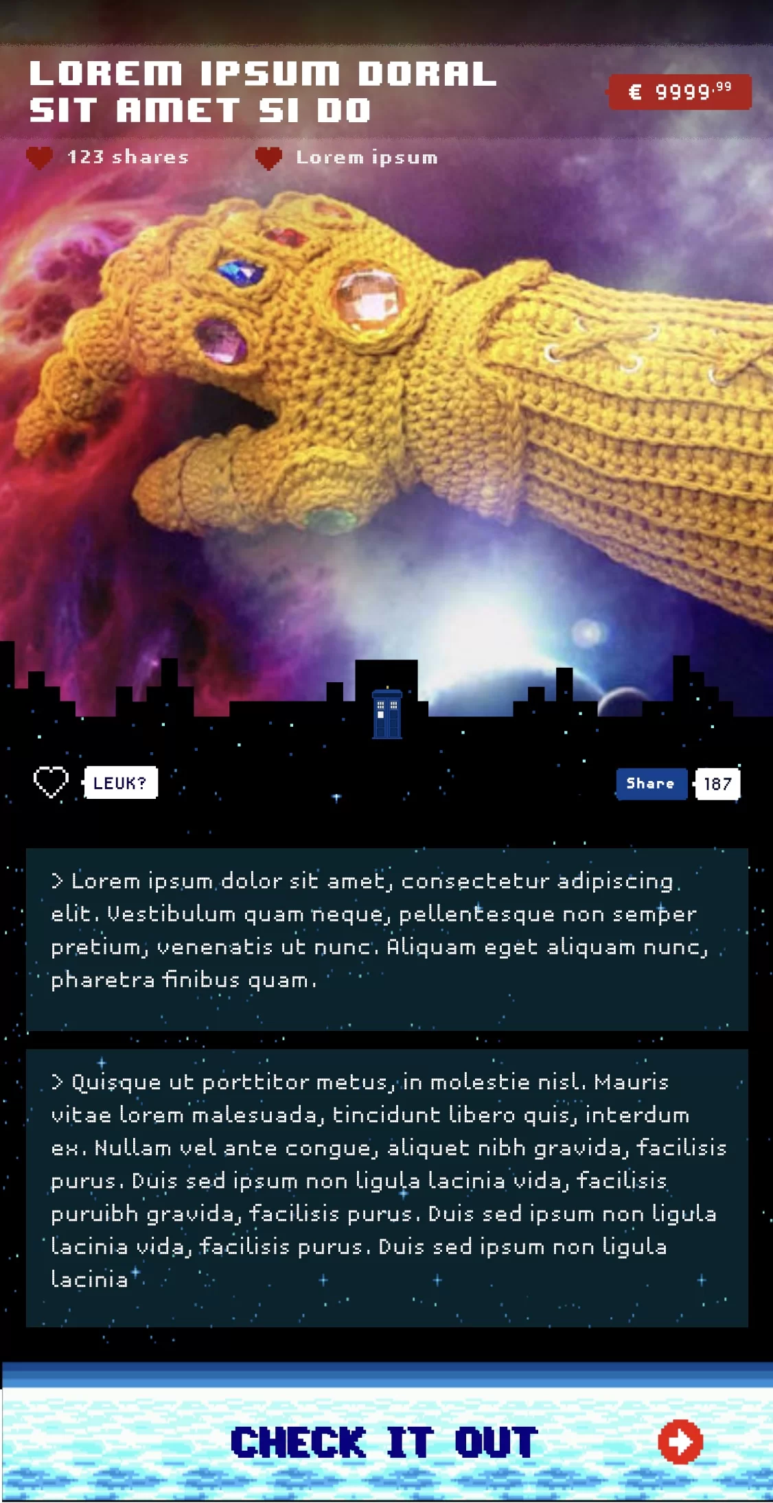
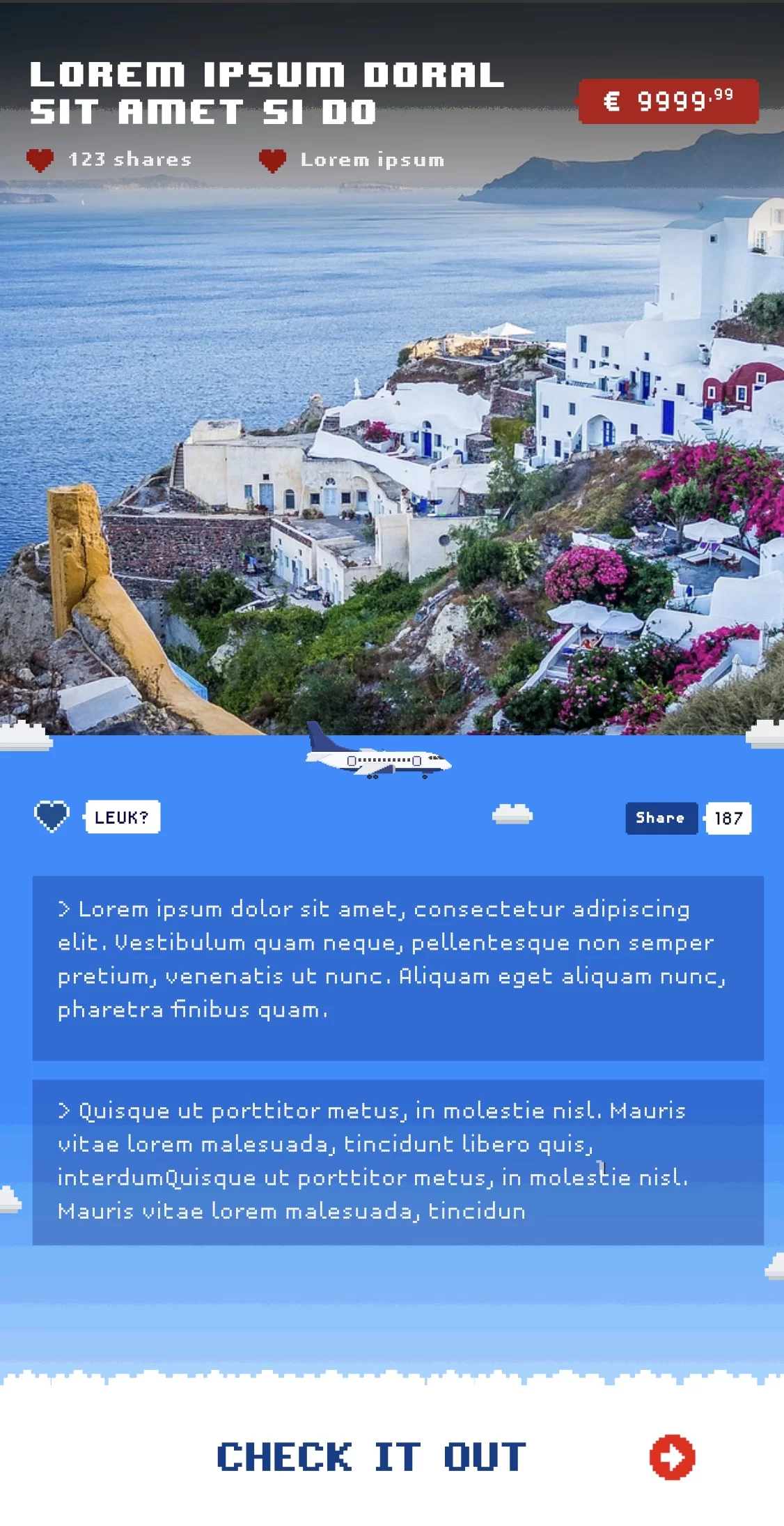
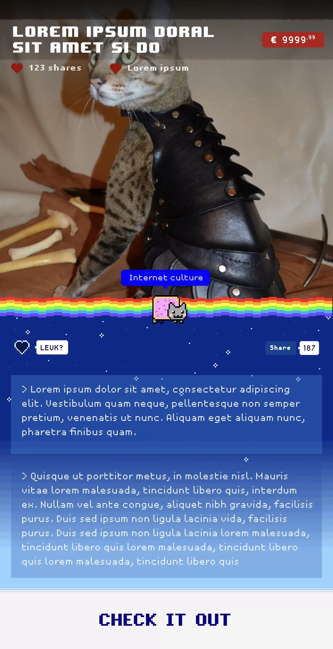
If you choose pixel art, you choose a style that can’t be excuted half-heartedly. That is why we have created a series of pixelart illustrations to match each major product category they will feature.
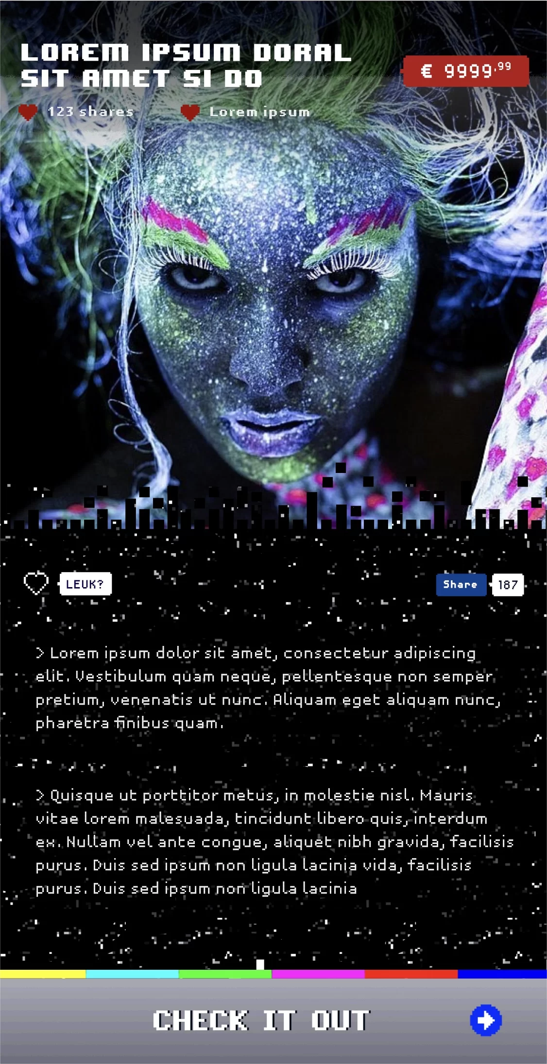
The experimental nature of glitch and pixel art is more than offset by the fact that this style was used in user interfaces. You could say it is not experimental at all, but rather uses years-old, tried-and-tested UI principles and styles.
Now, of course, we also use modern UI elements like hamburger menus, buttons and pop-ups, but we always combine these with the pixelart style that runs throughout the website. That’s how old and new come together, and it works!
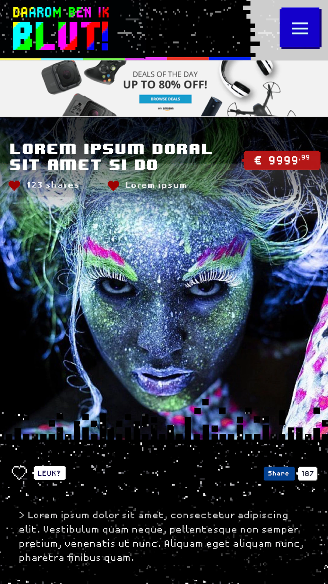
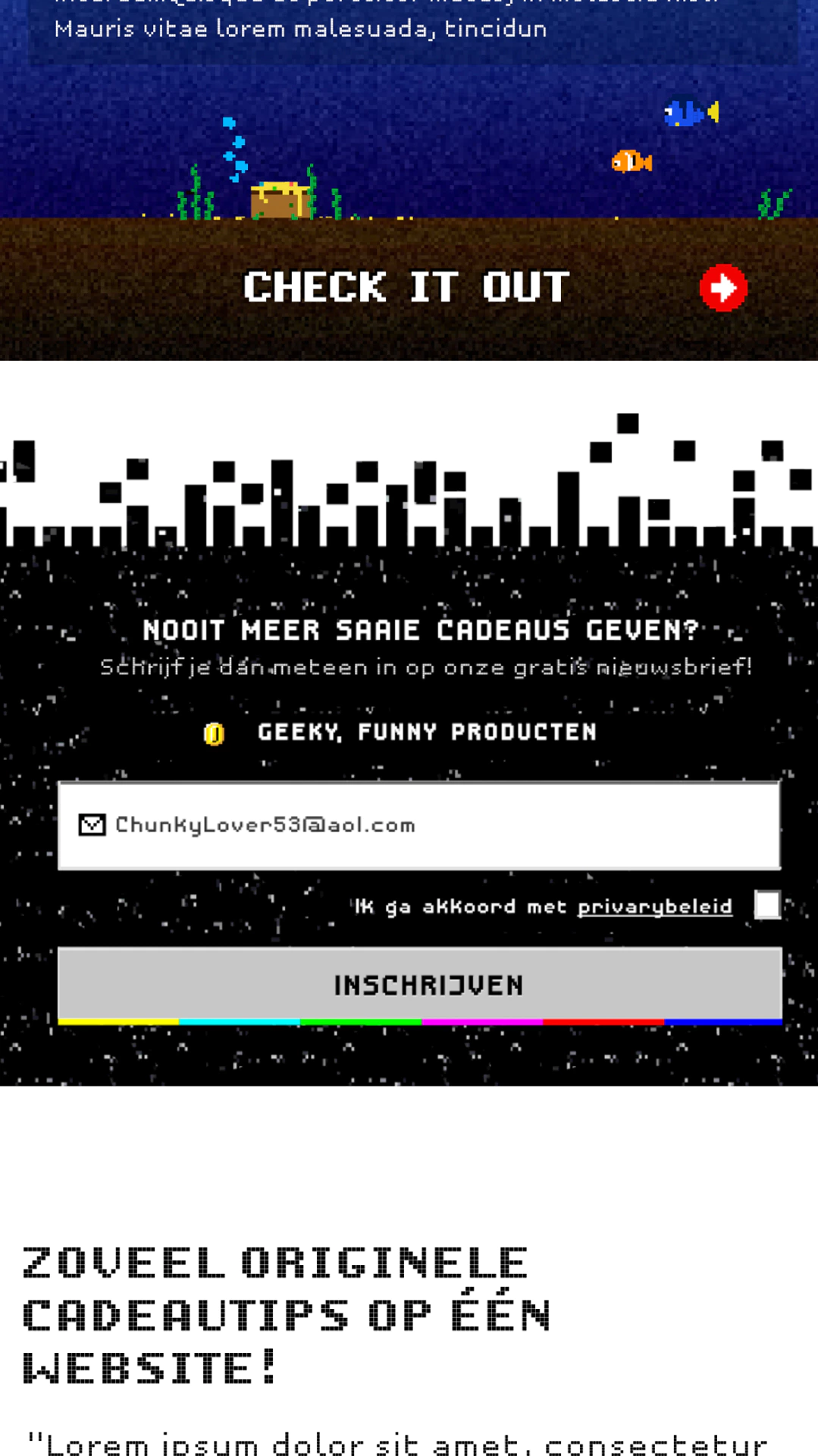

We also made sure that pixel art always works with photos by using different visual transition effects.