App design with gamification elements for a facebook group that has more than 300,000 members – promojagers
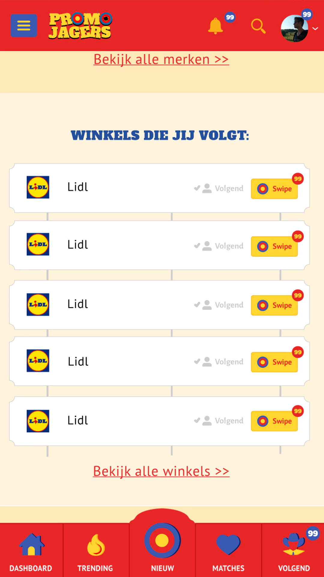
The main idea was a dating app like Tinder, but for promotions.
The community must be able to add their promotions and gamification elements must be present.
Everything has to integrate flawlessly with the Facebook network because their community originated there and continues to grow.
promojagers is a private Facebook group with over 300000 members. In this group, members collect the best promotions, coupons, and discount codes.
The Approach
I started looking for a suitable theme for the app. This would then serve as the hook for the design of the app. The name “promojagers,” which is “Promo Hunters” in English, reminded me of the shooting booth at a fair, Westerns, but with the bright colors also often used in promotions.
Lust
#e52625
Sunglow
#ffd52e
Ultramarine
#2e468d
The briefing therefore emphasized that the app had to be fun and supported by game elements.
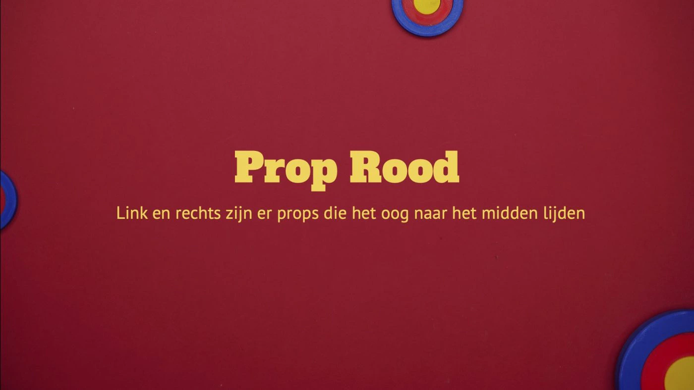
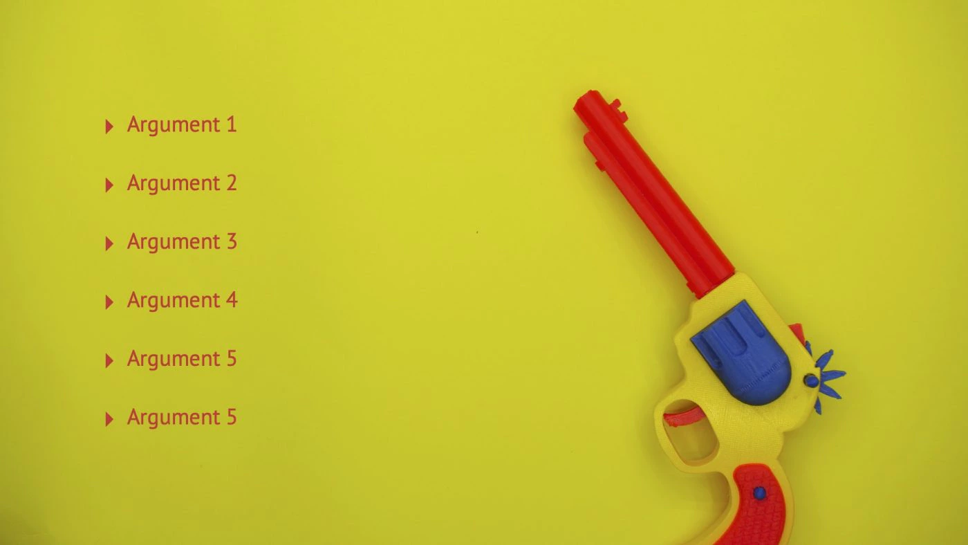
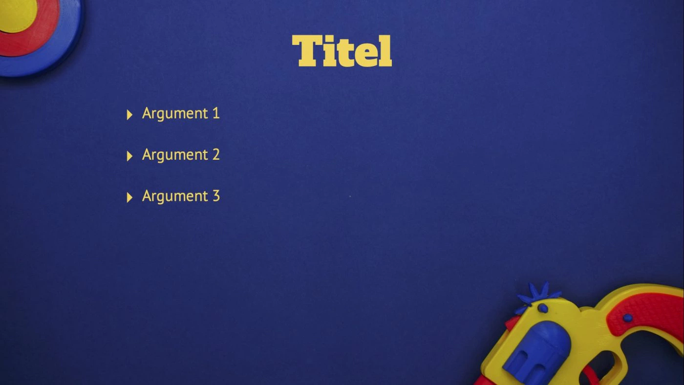
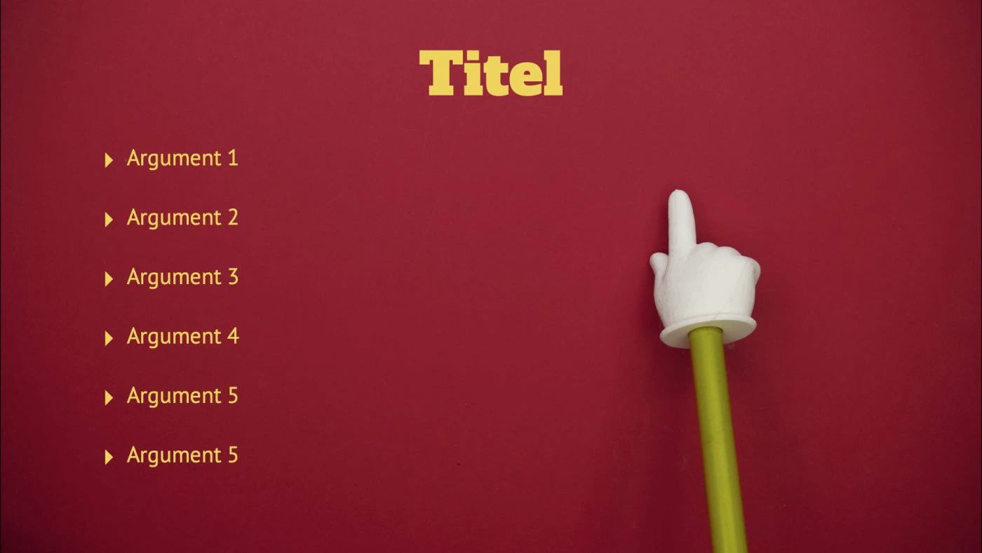
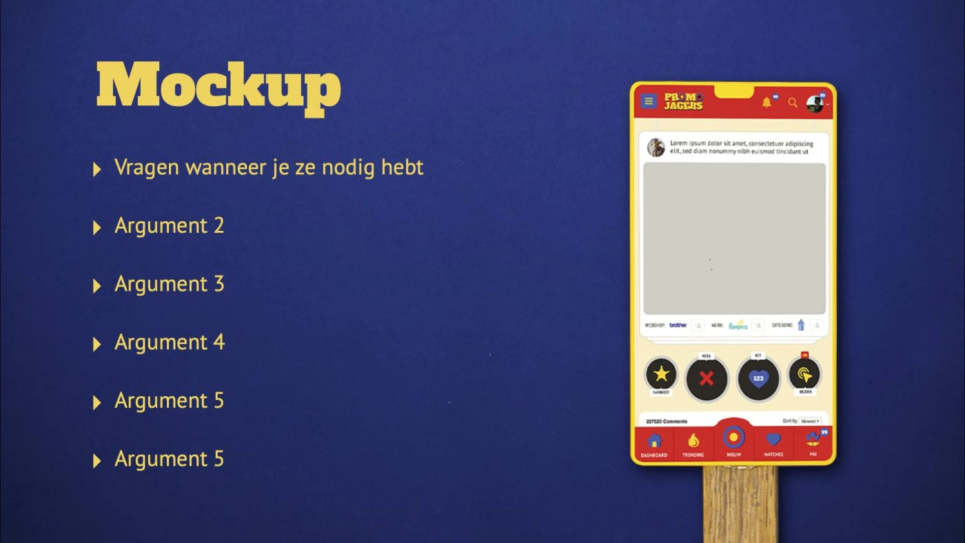
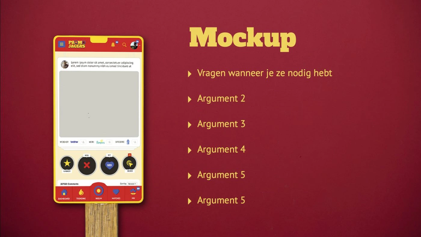
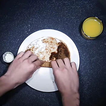
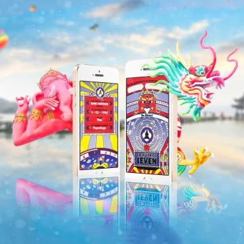
That’s where our passion for stop-motion animation came to the foreground. As well as the then still young love with 3D printing. You can see the series of the props we made in these presentation templates.
But with the same props, we also created a series of unique user interface animations that are fun.
Like this wanted poster, which at first glance seems to be a photo but when the user waits a bit suddenly moves.
And this messenger themed call to action animation, which we made a making off of that you can find on our social media
These two are more the category of a playful, non-educational animation, but that’s okay.
Animations can also be very instructive, such as those on the introduction screen. This seems like a simple animation, but is very effective because before using the app, without realizing it, the user has already seen a tutorial on the basic mechanism of the app.
Illusion
For this interface we have also developed a suitable magic trick to always be ahead of the user.
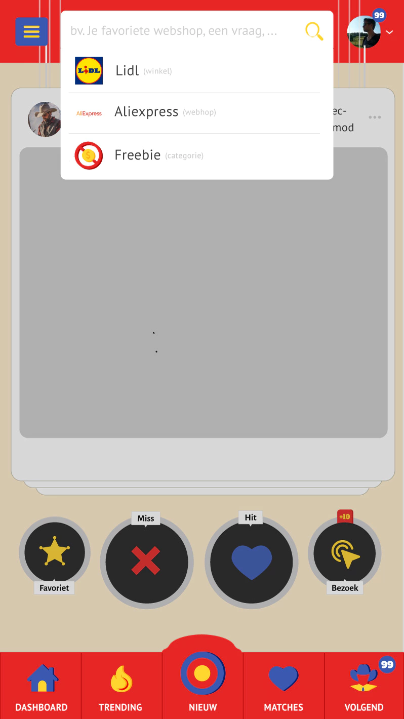
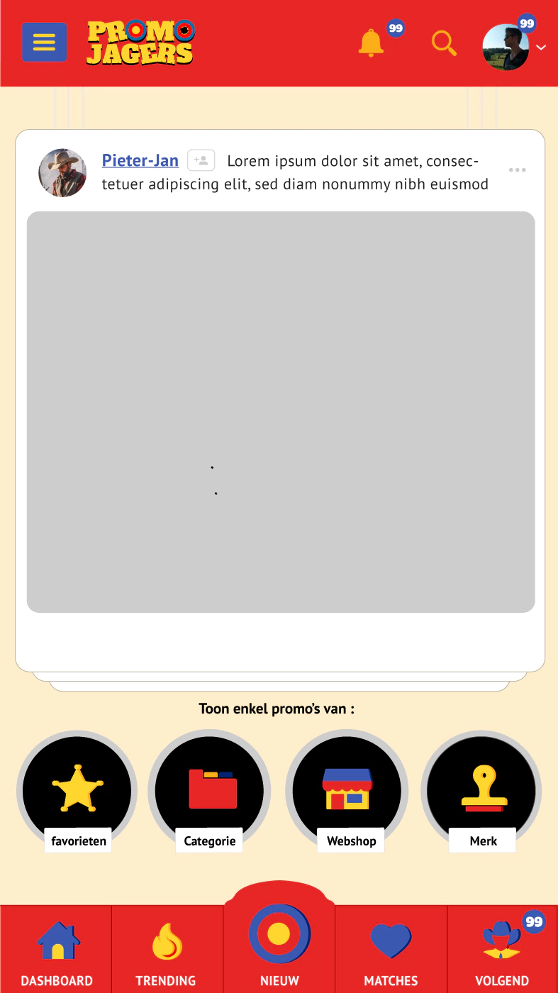
How many cards do you see here? Three? We would say the same,
But actually there are at least four and sometimes even more.
As with any good magic trick, the fourth card is simply hidden.
In this way we created the illusion that there are an infinite number of cards.
But with each swipe, the first card just becomes the fourth hidden card. Clever isn’t it?
Making Registration Fun
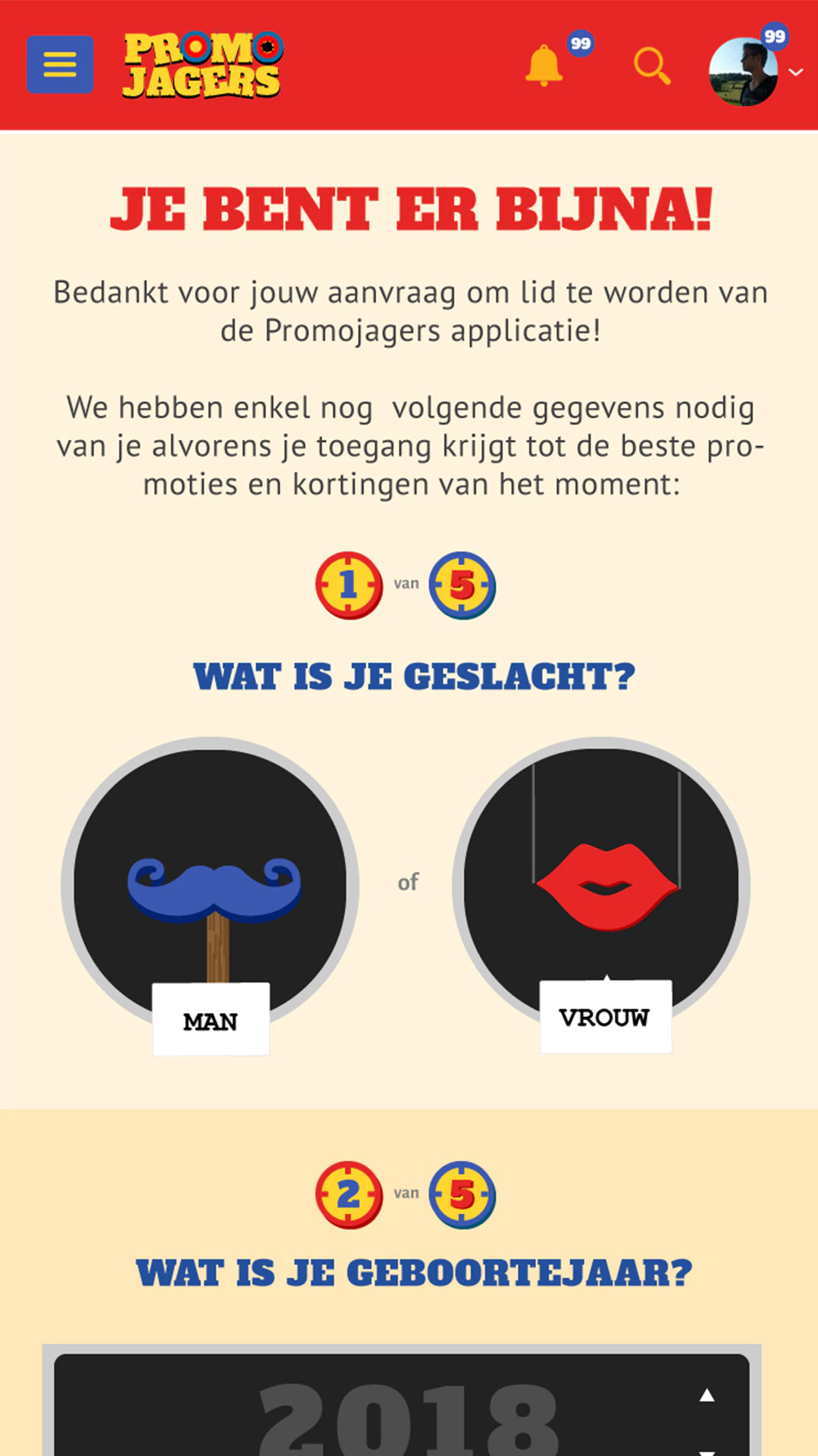
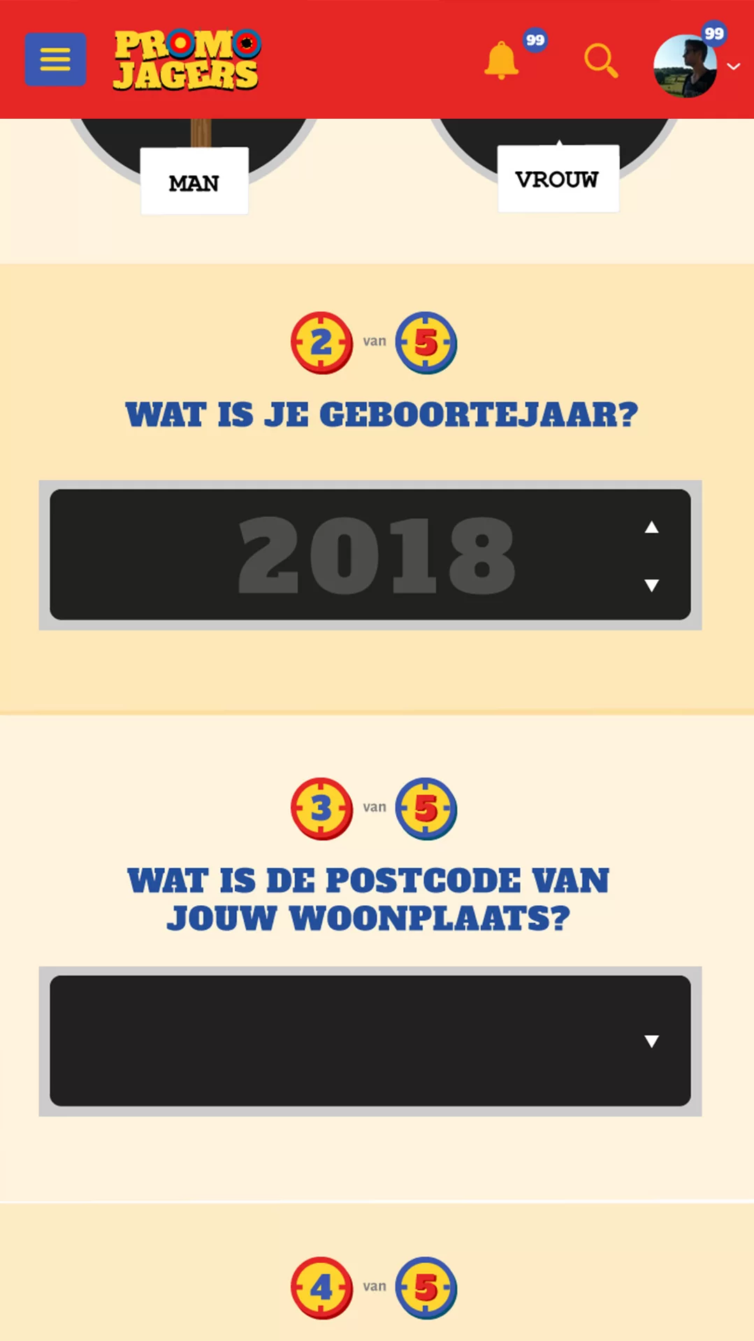
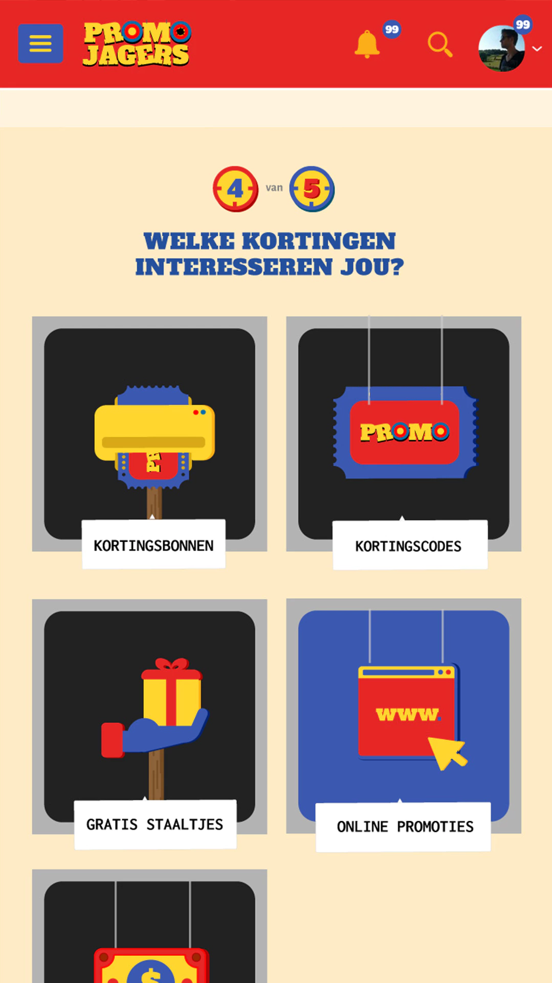
This is not easy, but it is the first thing you do when downloading the app. And the app had to be fun, that’s why we playfully approached the registration process by creating in-house made icons that are themed.
Practical Aspect
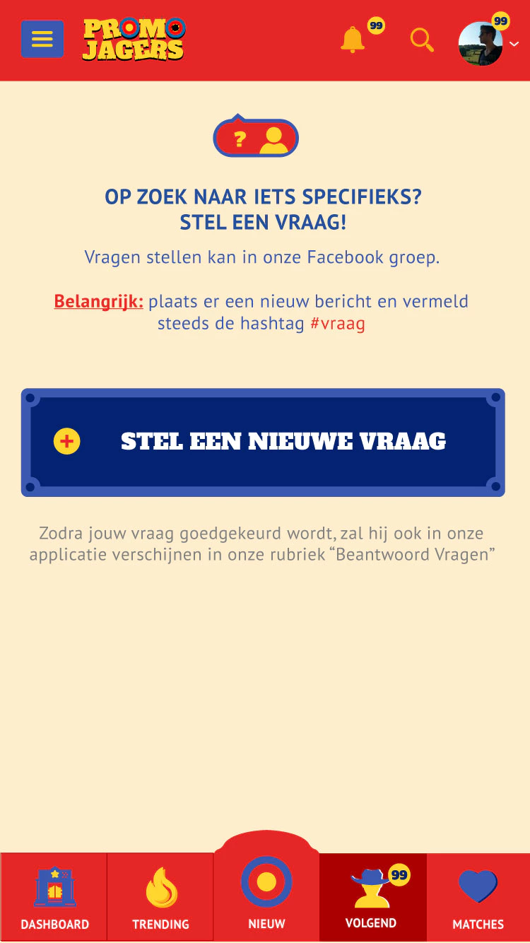
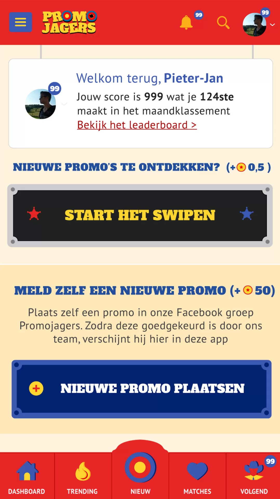
In addition to fun, the app and its interface are also very practical. The user had to have the ability to upload an action in the store. As users often do within the facebook group.
Just like with the registration, we have considered how we can make this form as accessible as possible while still collecting as much data as possible about the action
Gamification
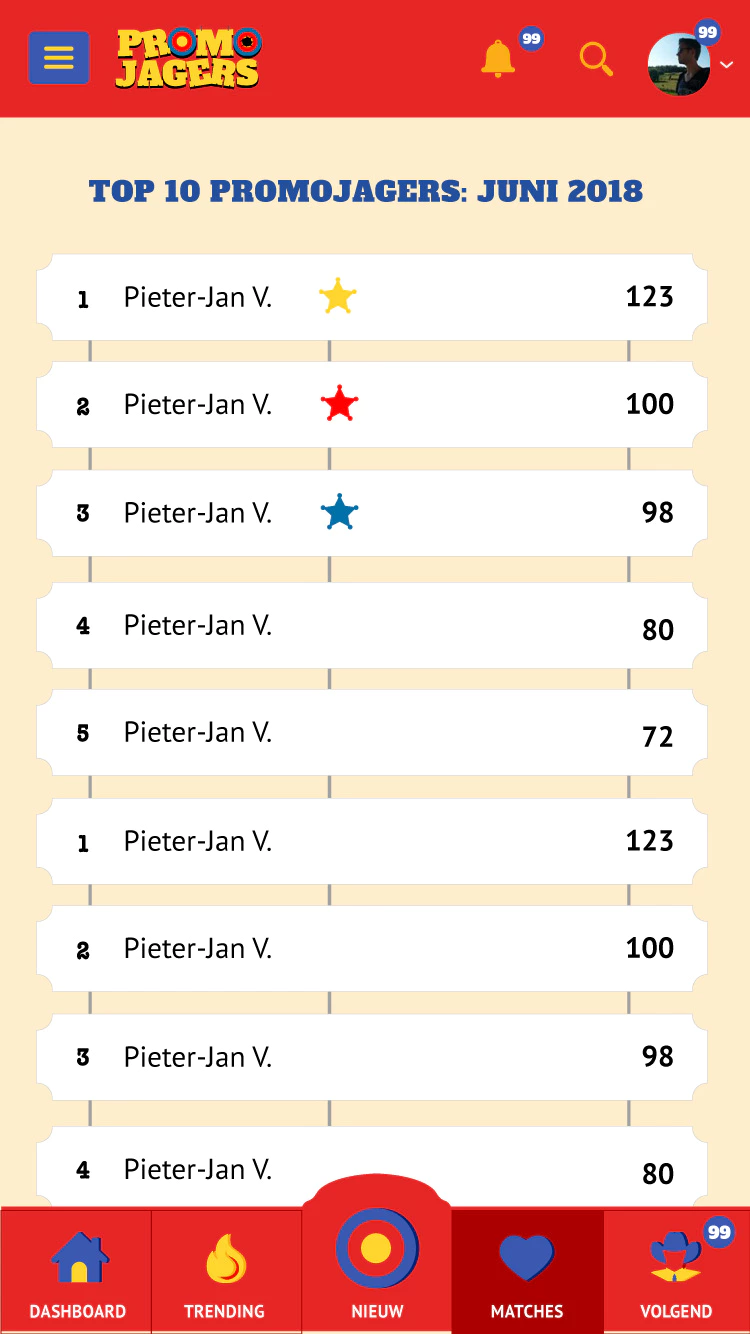
Swiping, adding promotions and general use of the app earns the user points. This puts the user on the leaderboard and the number one wins a nice prize.
Same experience on many different devices
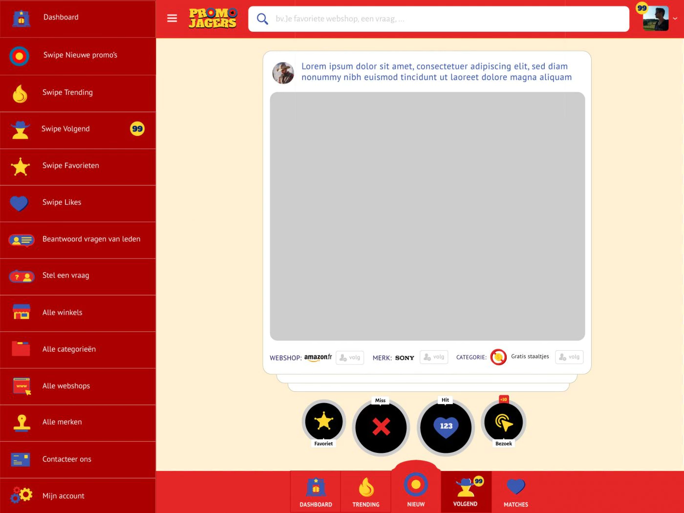
We have worked very hard to give the user a good app experience, regardless of the device and you could swipe on both desktop and smartphone.
Footnote
The company behind promojagers underwent a drastic restructuring.
However, if you’re familiar with promojagers you know that this isn’t currently their app branding. After the delivery of the app designed by us, it got stuck in a development hell.
While at the same time the popularity of the facebook group exploded. At the start of the project the number of members was already remarkable and 10000, but nothing compared to the +300000 members now.
Development of this version of the app was eventually halted and they opted to develop a more traditional website, which later also became their app. The existing branding elements, although very basic, were deemed too recognisable to rebrand.
The client made it clear to us that they were very satisfied with our work and quality of it. That the non-use was purely a financial necessity.

