TagCity is/was one of the largest discount code websites in Belgium. Studio Pixili offered them a total branding, web, image and character design package. We designed branding and integrated it into website, it all their marketing material such as newsletters, banners and social media campaigns. We also developed the website and all internal tools. Gave advice in web strategy.
TagCity’s journey was therefore a true saga, and Studio Pixili was there from day one. TagCity was our first client and six years and three versions later, we are still working on it.
TagCity has since become kortingscode.be. Now kortingscode.be is also project designed and developed by Studio Pixili. TagCity has also provided the collaboration with the biggest Belgian news magazines; Knack and Le Vif, this too is a project by Studio Pixili
Question
TagCity 2.0 came after TagCity 1.0 was a great success. The client saw the number of visitors grow month after month many web shops wanted to be on TagCity and a growing community of TagCityers emerged.
However, it was held back by the fact that the website in TagCity 1.0 was very simple.
The Approach
Company mascot(s)
Designing corporate mascots has always been one of our specialities. We think it is a lost skill, while there are many examples of why a corporate mascot is a good idea.
A mascot was obvious here, because the client wanted to tap into the “City” part of TagCity. And a city has inhabitants.
We first developed a female and male character. These would become the main mascots, but also form the basis of TagCity as a community. From that came Tagy and Tago.
Tagy is a male character with a very recognisable head. The shape is identical to the TagCity logo. Tagy is described as friendly, extroverted, creative and a born salesman. His general appearance is based on that of infomercial legends Anthony Sullivan, Vince Offer and Billy Mays.
Tago, whose name is based on Margo, has many of the same qualities. If anything, she is an even better salesman than Tagy, because besides all the natural qualities that make someone a good trader, she has charisma in abundance.
Both characters are deliberately designed to be straightforward. Tagy and Tago contain few references to race or origin. Their skin is orange because it is TagCity’s brand colour, but our a way of saying that skin colour does not matter in TagCity. Everyone is welcome.
One problem we encountered is that TagCity had a wide range of online shops, and so had no real target audience in mind. Tagy and Tago are the prototypes for all residents and users of TagCity.
After registration, every user becomes a TagCityer because these characters are also meant to be community symbols. You could design your own character based on your interests, from Geek to Foodie. This also gave us an idea of the new member’s interests, which gave us a good start in creating a customised TagCity experience for them.
Homepage
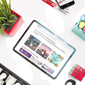
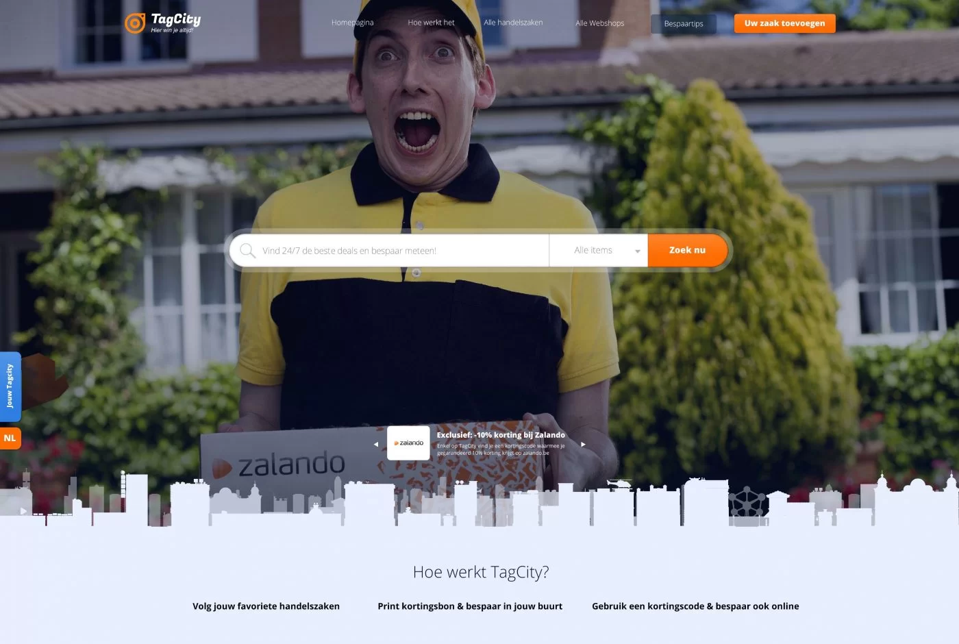
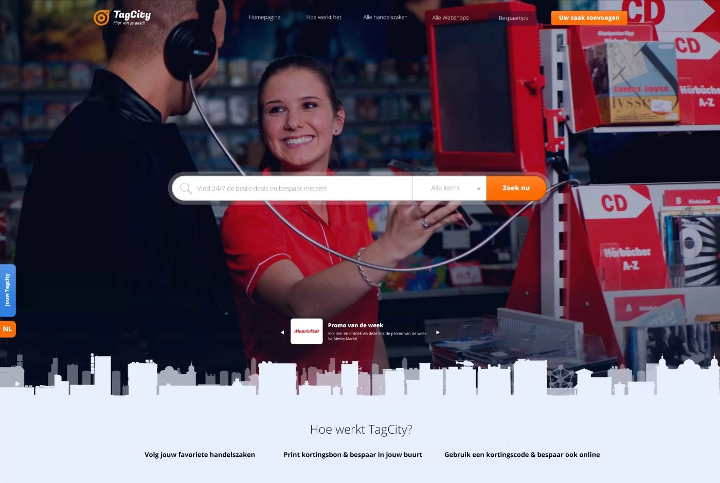
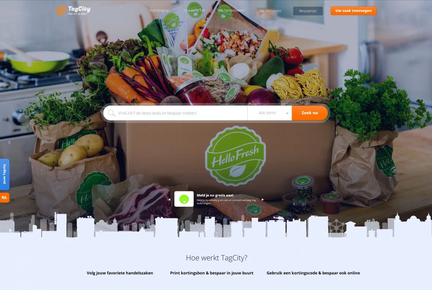
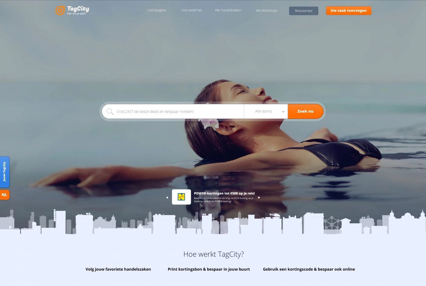
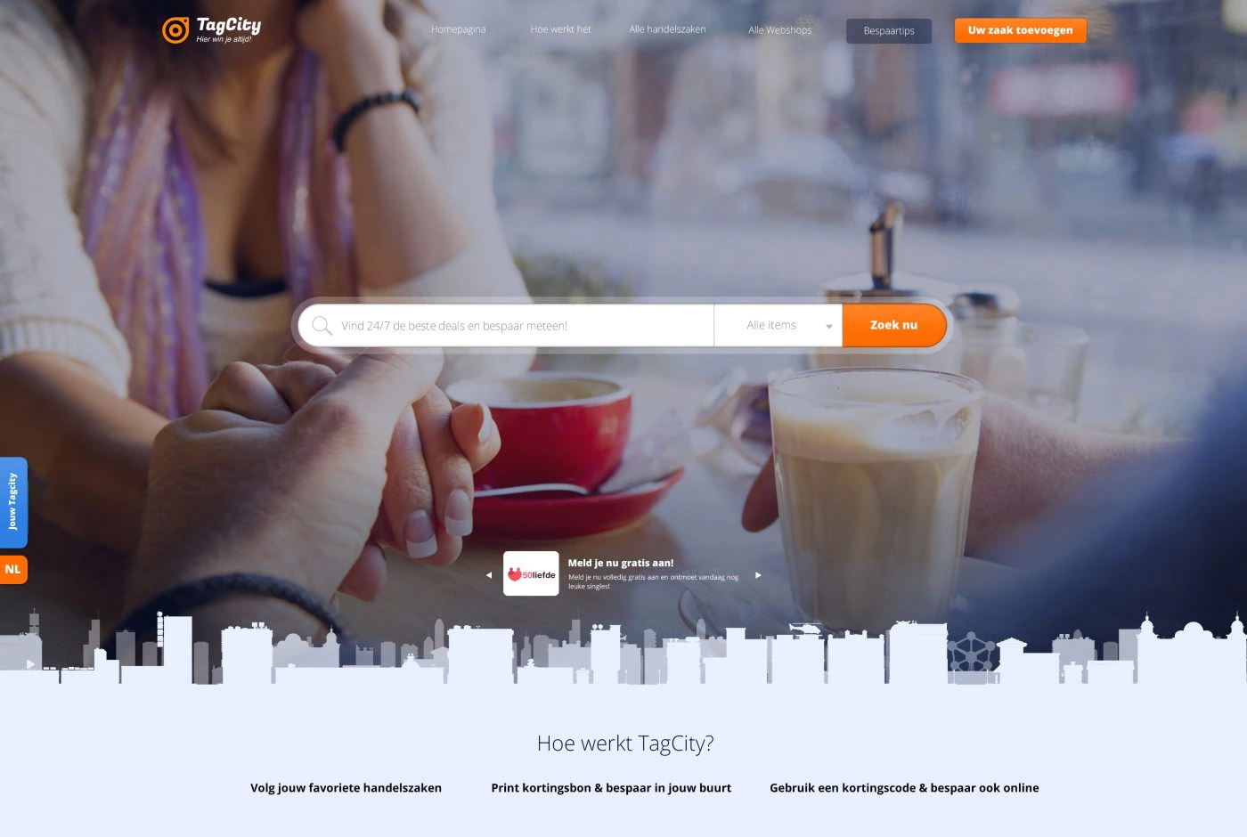
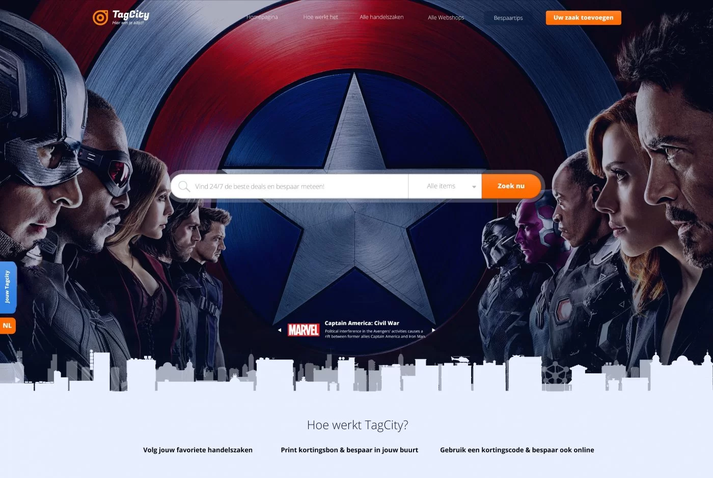
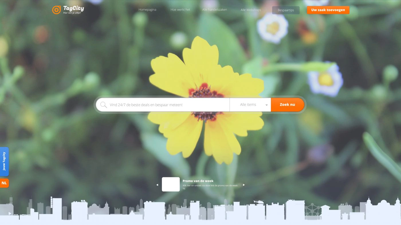
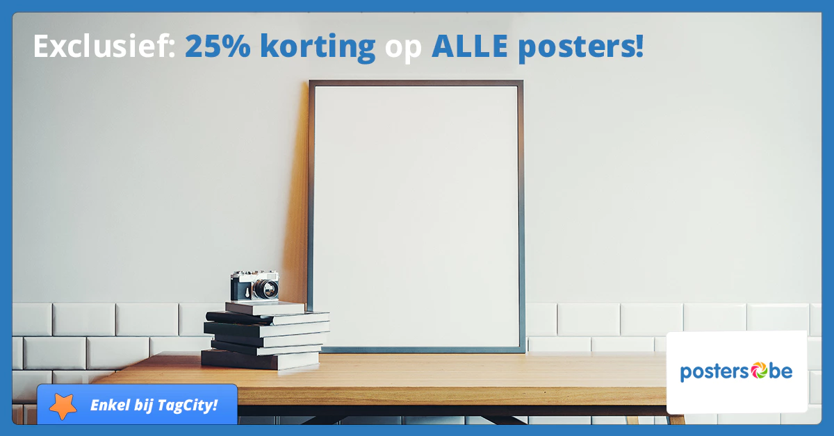
TagCity 1.0 was regularly requested by e-commerce sites to be able to promote deals more extensively. Indeed, this is an important source of revenue for them, and the ecommerce sites showed interest in a tag that could take over the website’s homepage banner. This banner had to be user-friendly, readable and fit within their brand without coming across as too commercial.
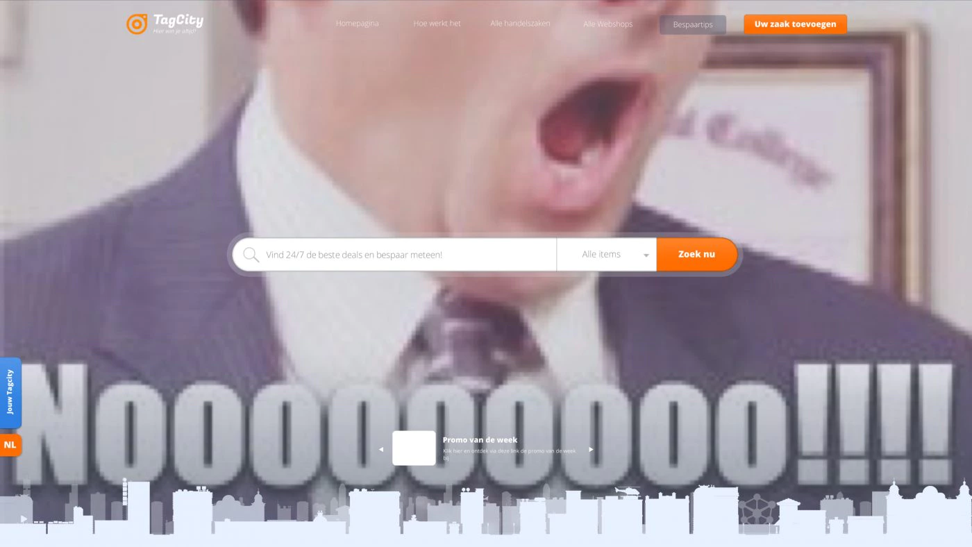
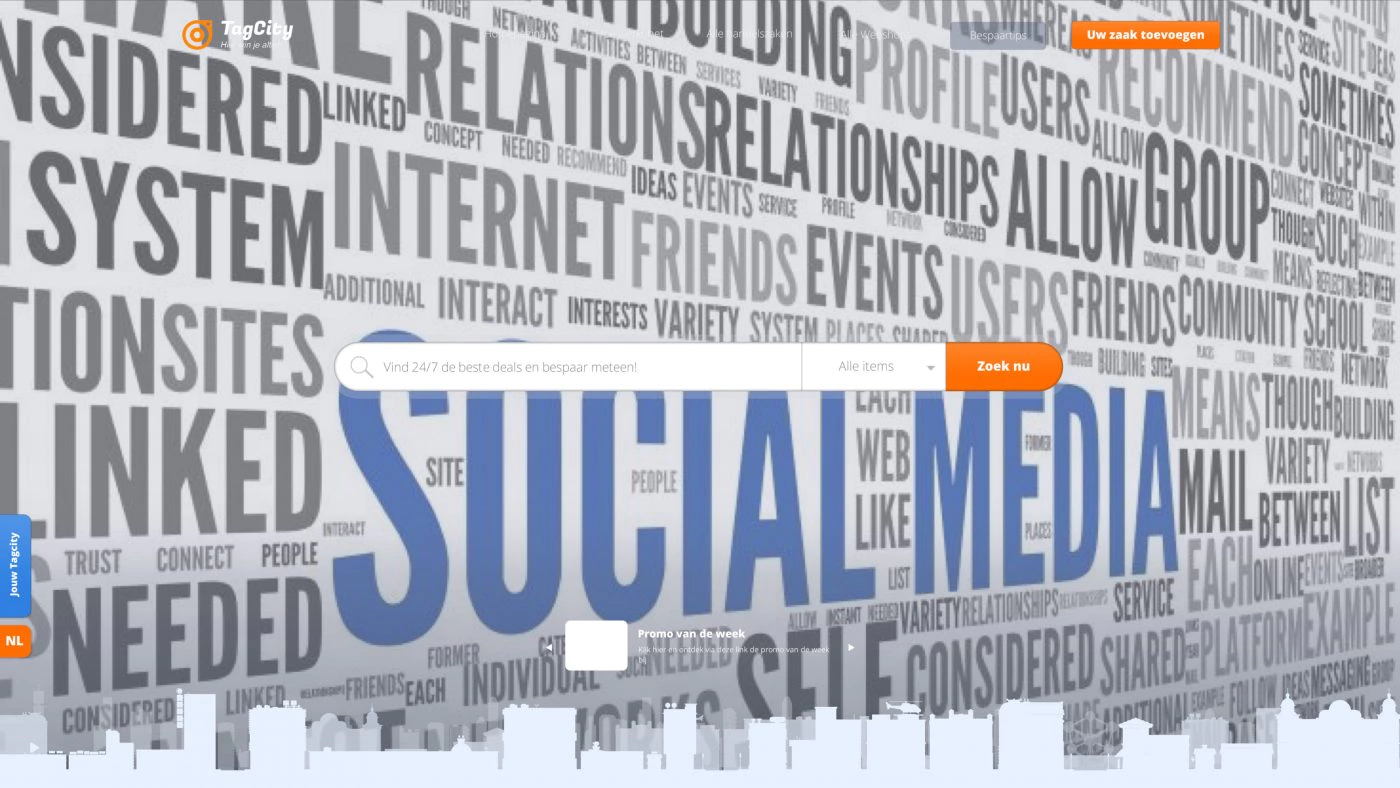
The webshops wanted customer exposure without compromising on TagCity’s user experience. To achieve this, we created a layout with an appropriate overlay. No matter what colour the font or logo is; the text will always be readable.
Furthermore, this is entirely possible in CSS (2) and does not require special effects such as blending modes that require Photoshop. This makes it banner, beautiful without expensive software or the intervention of a graphic designer. It is as simple as uploading an appropriate photo.
Finally, we have established some simple advertising rules to maintain the quality of our website. There should not be too much text in the photo and low-resolution photos are not recommended.
In addition, we have decided to help this webshop by offering a suitable image if the advertiser does not have an image or prefers to leave this to us.
Branding
The TagCity logo has remained largely the same since it was first designed in version 1.0. We have slightly modernised the logo we designed.
Social media
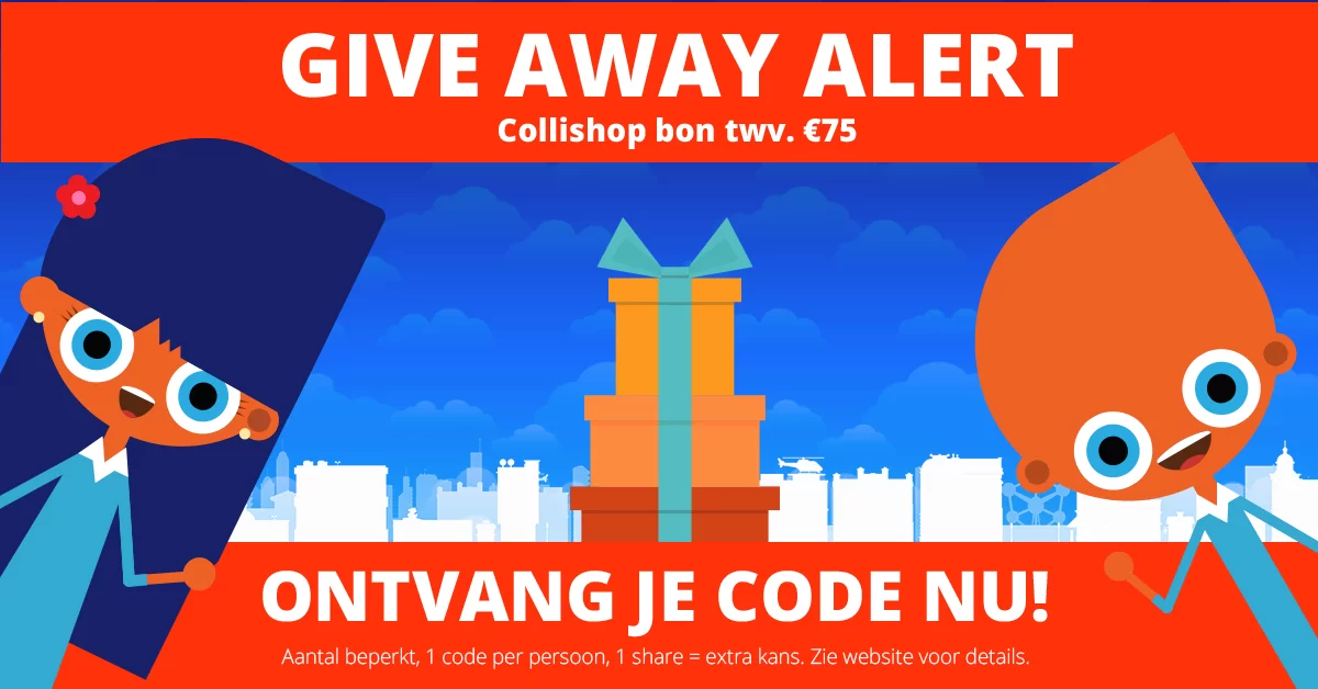
The client asked us to design a reusable layout for common Facebook messages. TagCity regularly participates in giveaways and contests. In TagCity 1.0 and 2.0, the client wanted to continue doing this, but also use it more on social media platforms.
In addition, TagCity also wanted to be able to promote special offers and/or events on Facebook. Studio Pixili developed the basic layout for the Facebook thumbnail, which had to remain the same at all times. This way, the page remained recognisable for TagCity’s followers.
The layout also had to be flexible. As can be seen in the carousel below, the basic layout can take many different forms. Extra attention was also paid to posts for holidays and action days.
Newsletters
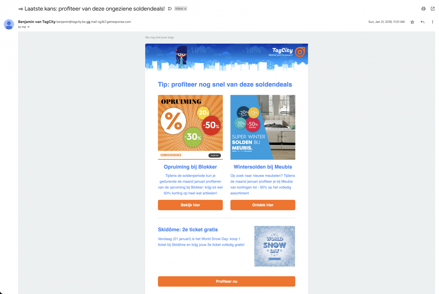
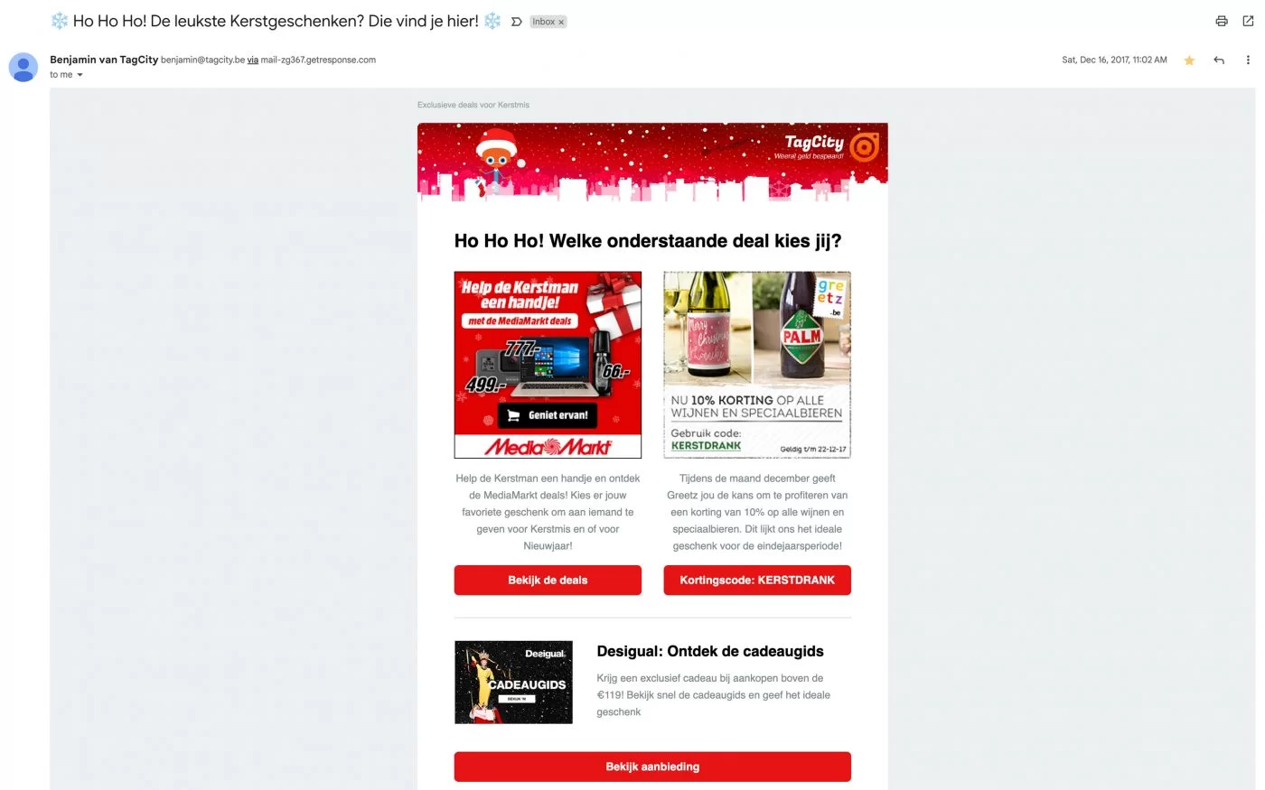
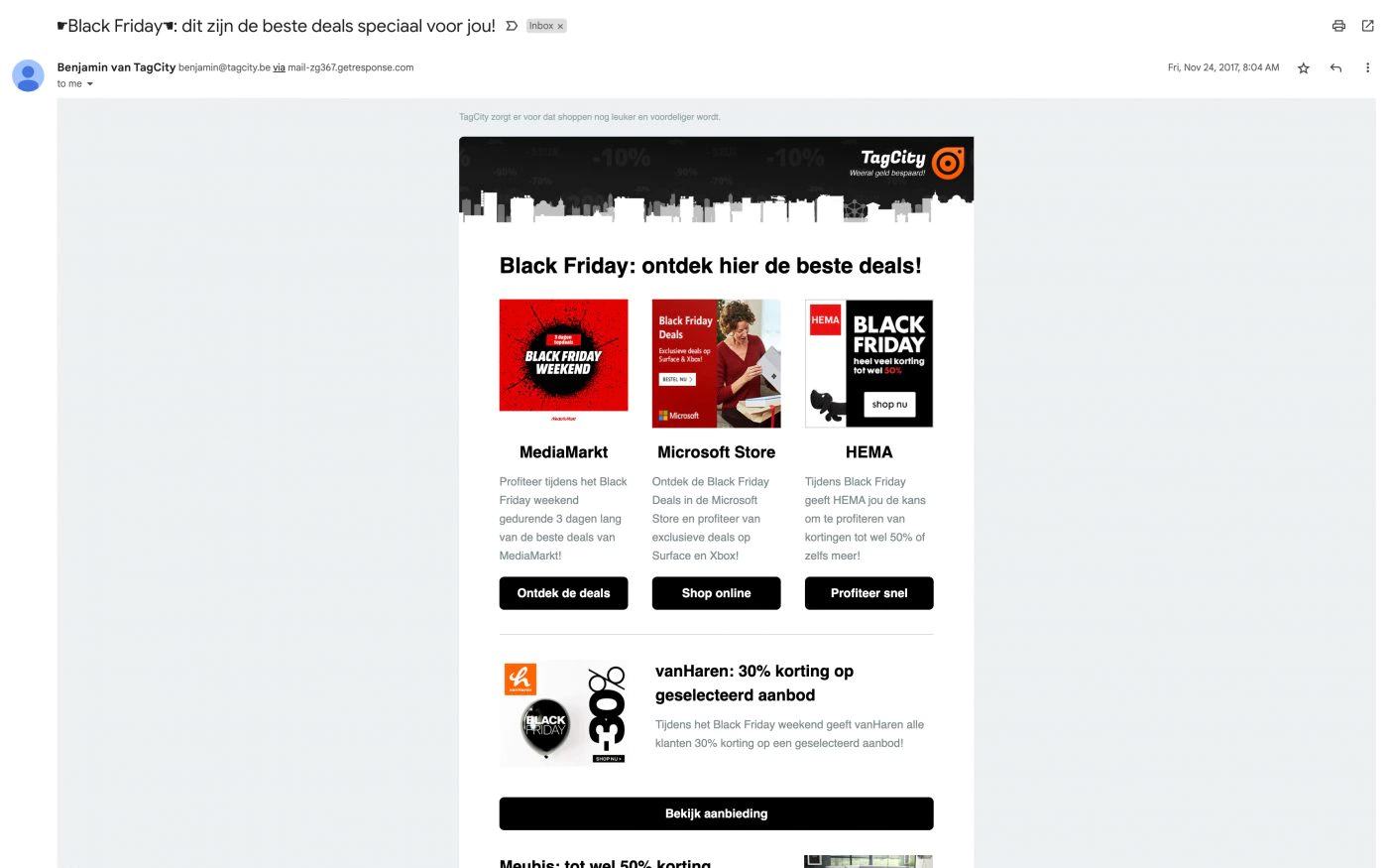
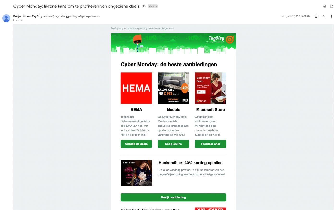
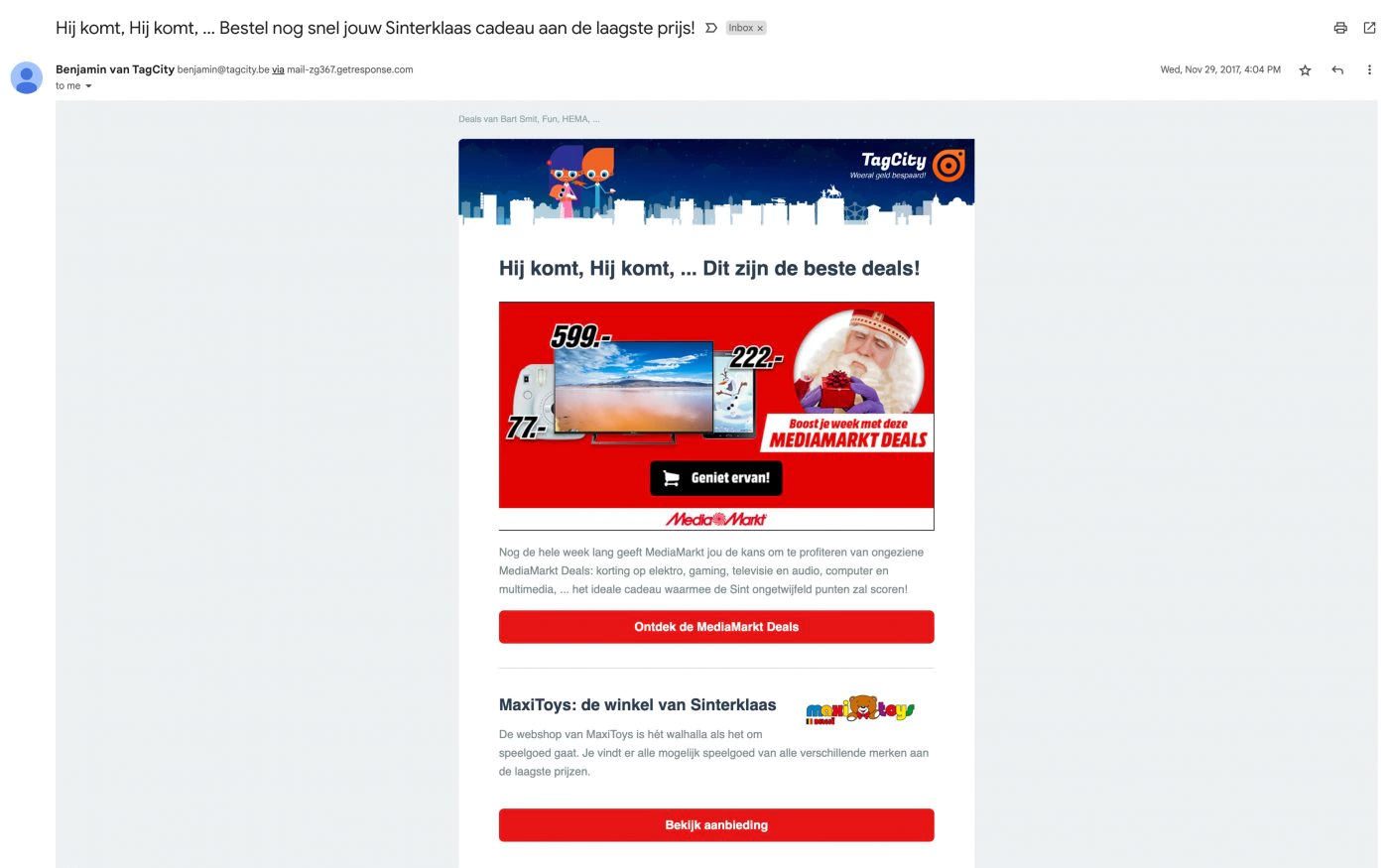
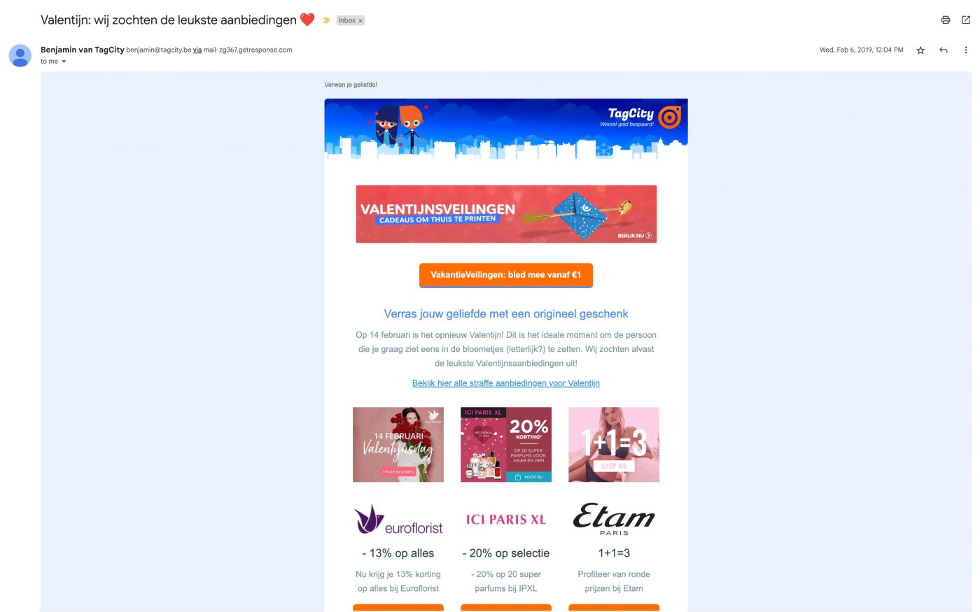
The client also asked us to design newsletters. As on Facebook, a flexible basic layout would come in handy.
There was also a technical challenge: to develop a newsletter that is fully dynamic and thus automatically sends the best matching tags to the person. This algorithm would base this on the web shops the user follows.
We also designed special versions for important days like Black Friday, Cyber Monday, Valentine’s Day, etc.
Company video
This is part of the initiative to give local traders a place on TagCity, which was previously only suitable for web shops. In addition to a completely separate backend, this involved a separate campaign aimed entirely at attracting traders.
Recruitment strategies
When developing the community part of TagCity, we faced a challenge. To find a natural way to convert more visitors to a TagCity member.
Intrusive banners, pop-ups and other ads were not an option. From tests, these were perceived as a negative user experience and increased the bounce rate and hardly brought in new members.
The visitor is then primarily on the website to find a discount. Pixili found a unique, effective solution to this and dramatically increased the number of sign-ups. How we did this is a great example of web strategy, where we put ourselves in the user’s shoes and think from that point of view how to achieve our goal. So below is a little masterclass in how we did this for them.
Exclusive Content Strategy
The concept of the exclusive content strategy is simple: users can only access exclusive content if they are a registered user.
This idea arose because of a trend among online shops to make their discounts exclusive by limiting their number. This also gave us a potential competitive advantage as we could offer more exclusive deals.
Optin Strategy
We found when someone is willing to sign up for our newsletter. That user had the exact right mindset to become a member.
Logical, because at this point, that user already wants to receive suitable discounts on a regular basis. And becoming a member only makes those discounts better and more relevant.
Getting the user voluntarily into the right mindset was key to seeing membership as something valuable.
That is extremely difficult to do in 1 go. A normal registration form was often ignored and didn’t fit smoothly into a layout either. That’s why we recommended the client to mainly push the newsletter on the website and not the user registration.
While that is our goal, we need to make the initial threshold as low as possible and never be greedy with how much data we ask from them. We ask for their data little by little and perhaps more importantly in a fun and entertaining way. An example of one of these cool ways was the TagCity passport.
Avatar strategy
In the first version of TagCity, we let users upload their own avatar. Even though this seems like the most obvious way to do this in reality, this had many drawbacks.
It required an extra effort and a certain knowledge and that threshold led to 80 per cent of users not having a profile picture. The 19 per cent of profiles that did have an avatar were often a profile picture adopted during their registration through Facebook and was rarely changed.
The remaining 1 procent were spammers and hackers. Who tried to post non-brand-safe material or tried to abuse the upload function to break the website.
Even though we fixed both by hiring a moderator and uploading directly to a CDN. It was not to be.
The final nail in the coffin of this default avatar system was that it contributed little to TagCity’s user experience.
When we came up with the idea for the new avatar system, the choice was quickly made. Because everyone instantly had a unique avatar, it was on brand and always brand safe. But above all, a fun way to get to know the user.
The idea behind the avatar was to automagically give each new resident a unique eye colour, clothing colour and hair colour randomly generated by the system. These characteristics could still be adjusted manually if one wanted to.
Now perhaps the most important aspect is that one could choose which type of TagCityer they were.
And each type gave us an idea about what categories this member might be interested in.
Overview of all types of TagCityers and their linked interests.
- The father/mother (Baby and children, flowers and gifts, erotica, home and garden, toys)
- Student (Books, Music, movies and games, Office and desk, Electronics, Toys, Dating)
- Geek (Printing and photography, Books, Music, films and games, Office and desk, Electronics, Toys, Dating )
- The Do-It-Yourselfer (Home and garden, Electronics)
- The Traveller (Holidays and travel, Health and care, Food and drink)
- Foodie (Food and drink, Holidays and travel)
- Entrepreneur (Business services, Hosting, Office and desk, Electronics)
- The Normie (Everything/I prefer not to share this preference with TagCity)
Keep innovating
TagCity was one of the first. If not the first! Discount code website with a community aspect. This was one of the ideas that clearly set them apart.
TagCity therefore wanted to keep innovating and the new goal of TagCity 2.0 was to be the first discount code site.
Which in addition to discount codes for online shops, would also collect discounts from local merchants. Which was unseen.
So we developed a completely separate recruitment strategy, community experience and backend for merchants.
Community experience
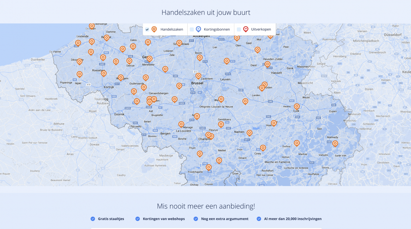
An interactive, digital map allowed users to filter shops for possible discount coupons or a sale. It was also possible to zoom in on their location via GPS .
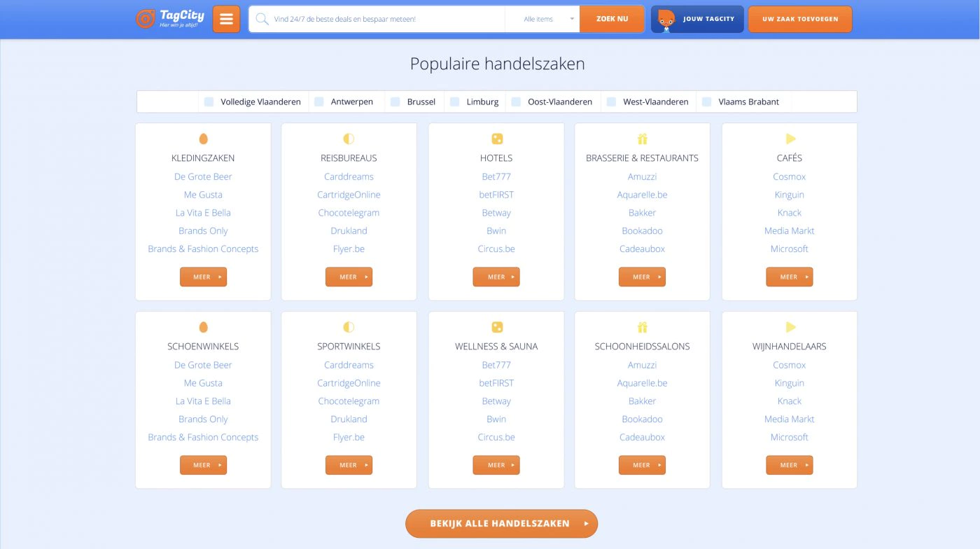
And as we did for the webshops, we also created an element that displays all the most popular merchants by category.
Merchant recruitment strategies
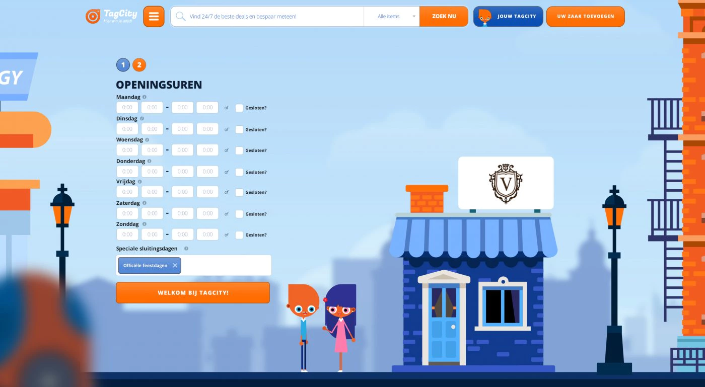
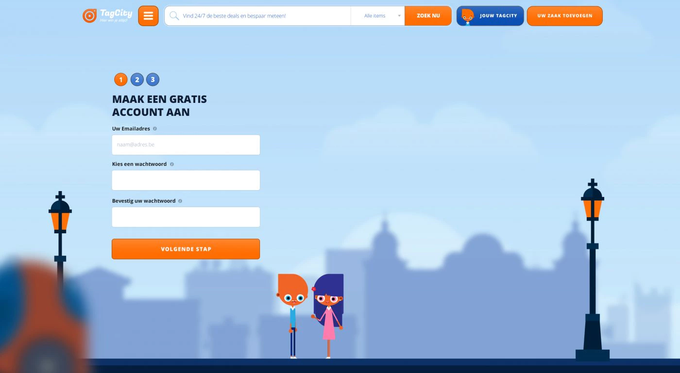
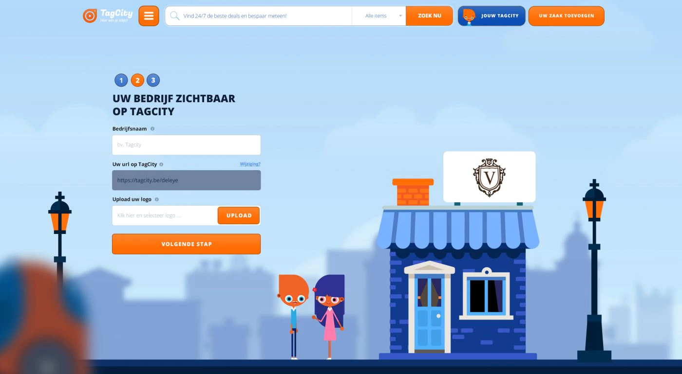
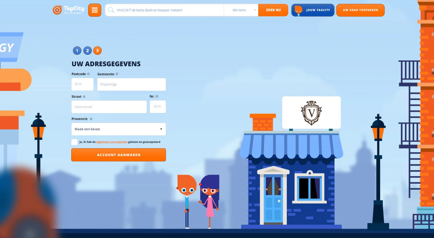
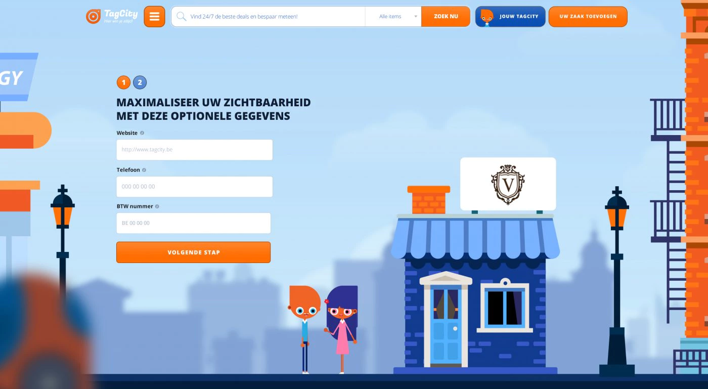
We split the registration process into steps and visually show the progress at each step.
For example, we move from step 1, an empty city, to step 2 a shop appears, but the sign above it is still empty. In this step, the name and logo are filled in, so when the user gets to step 3, the shop has been made recognizable.
In step 3, the location of the shop is requested, and the shop is given neighbors. After that, there are two optional steps that are not mandatory, but do complete the profile with useful information.
Backend
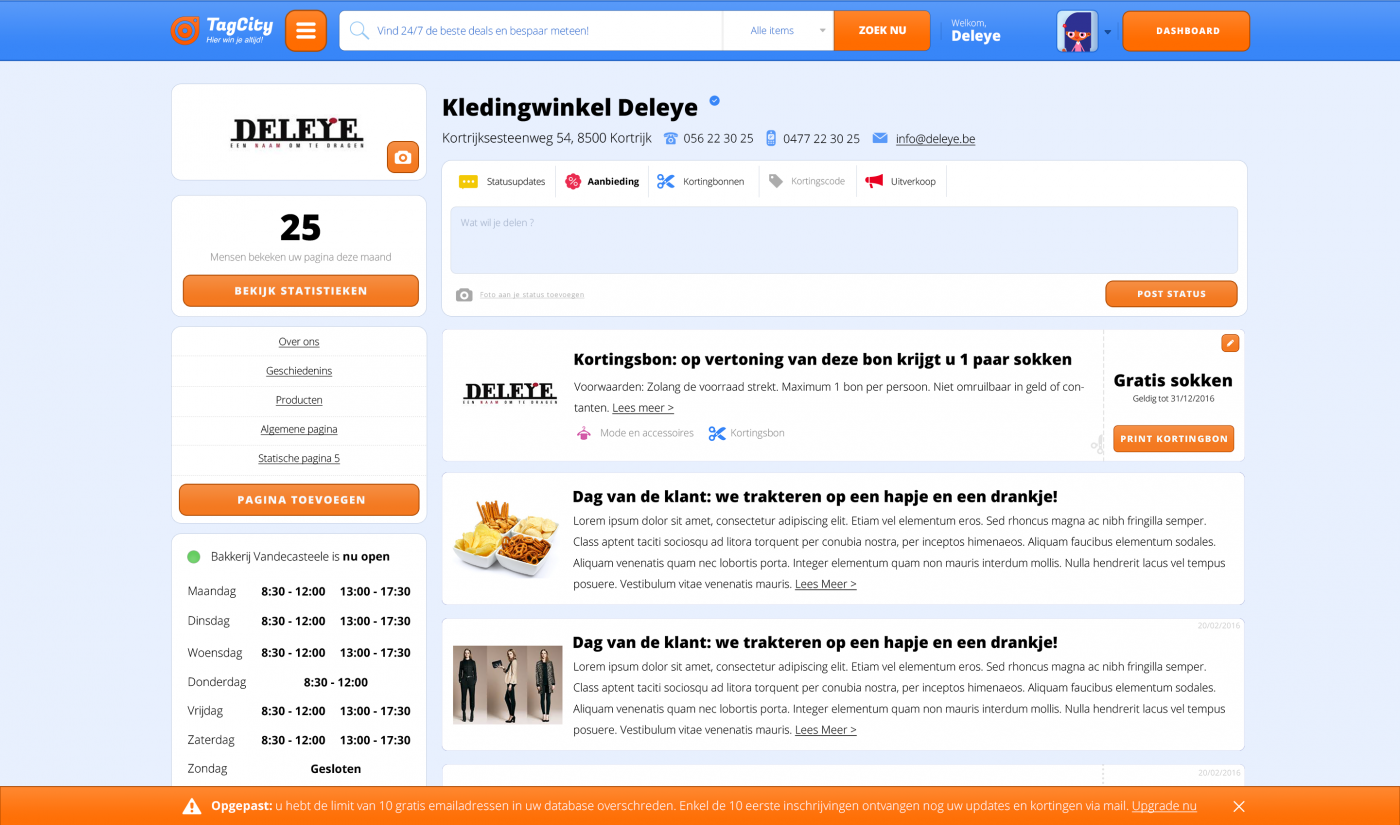
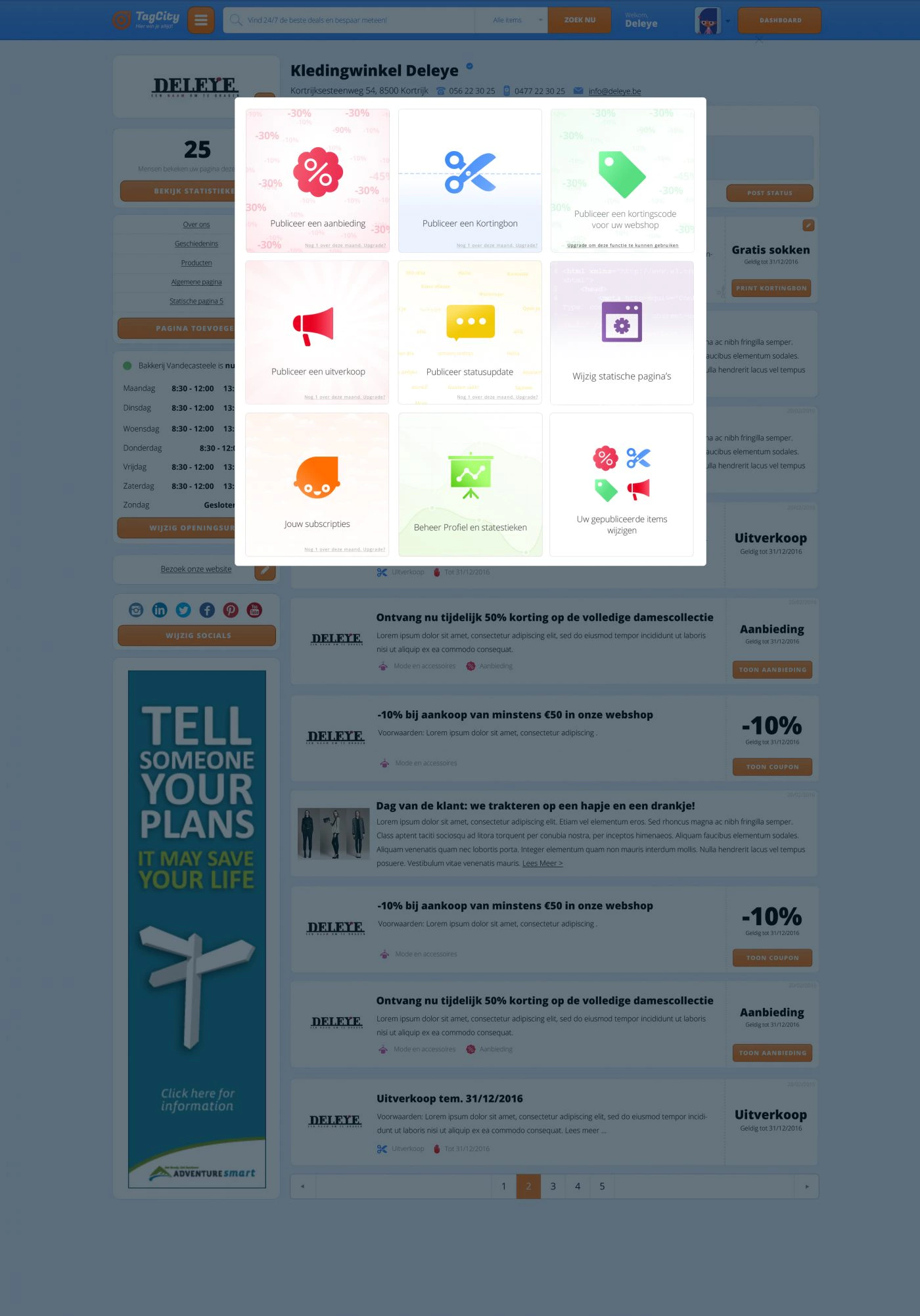
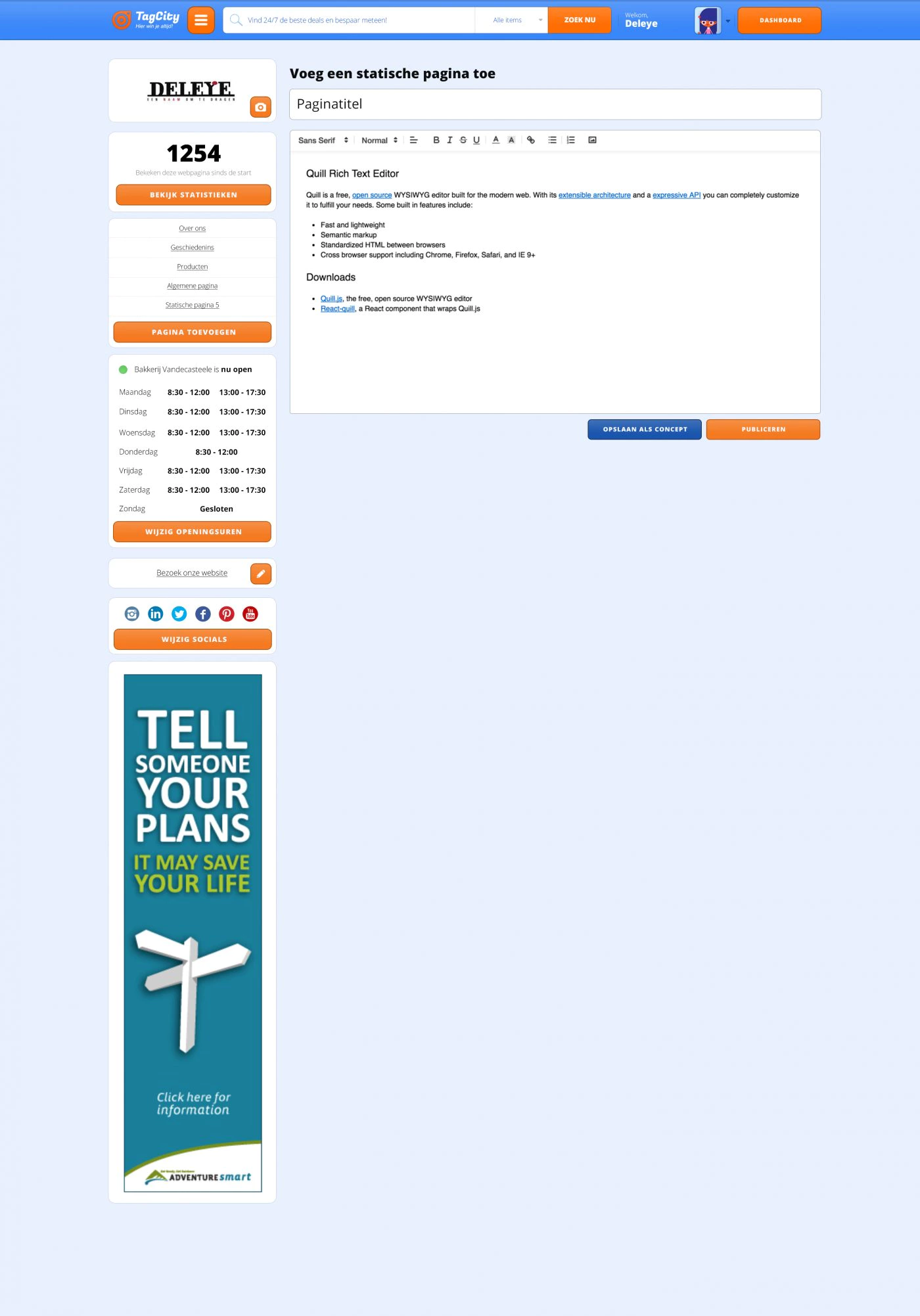
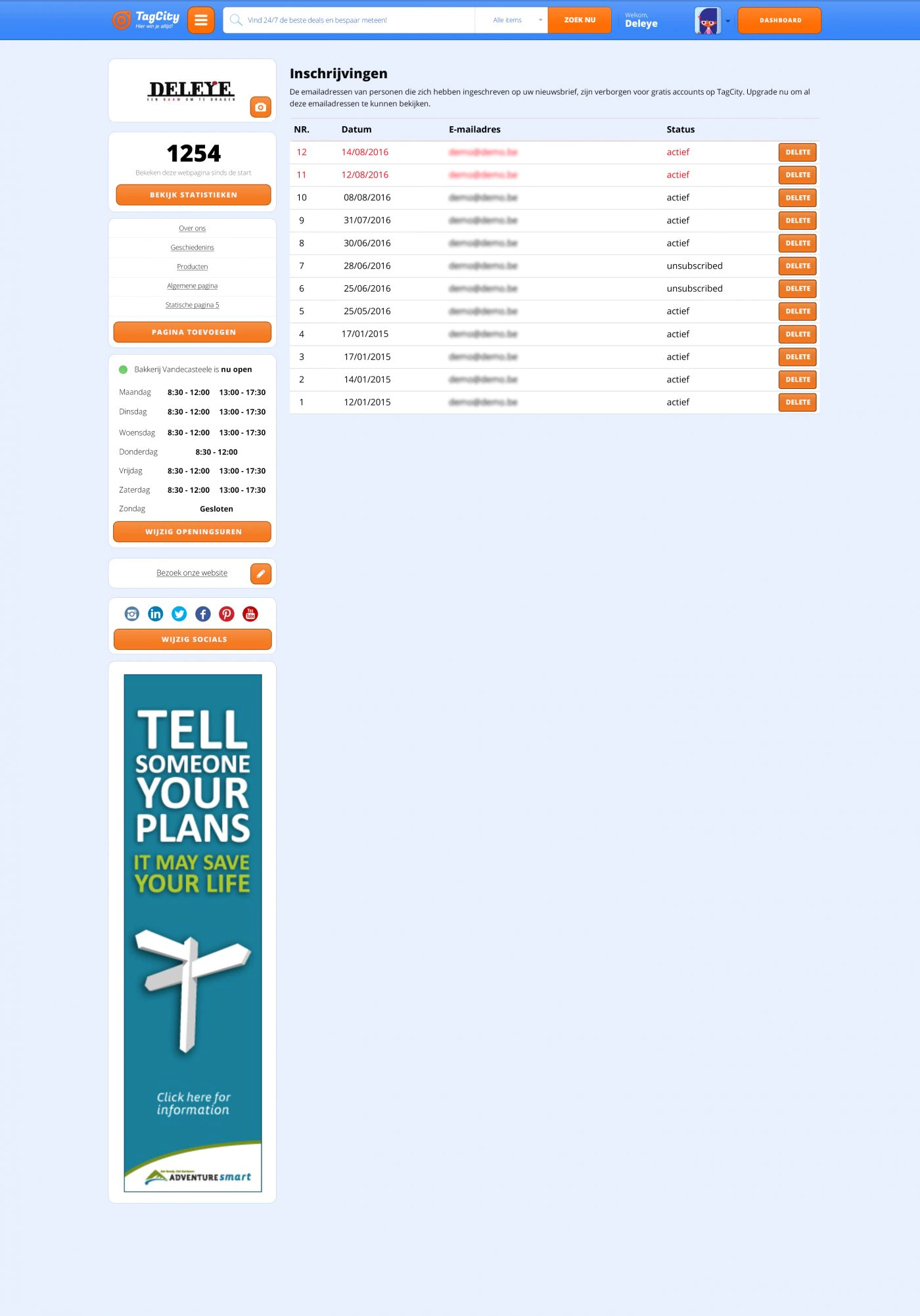
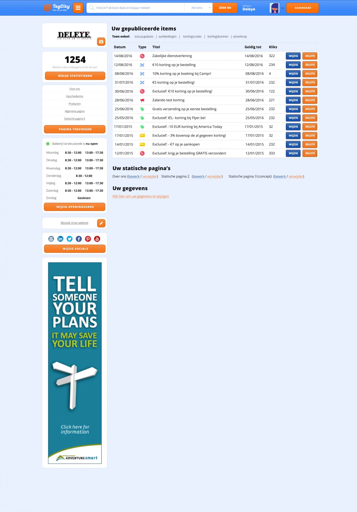
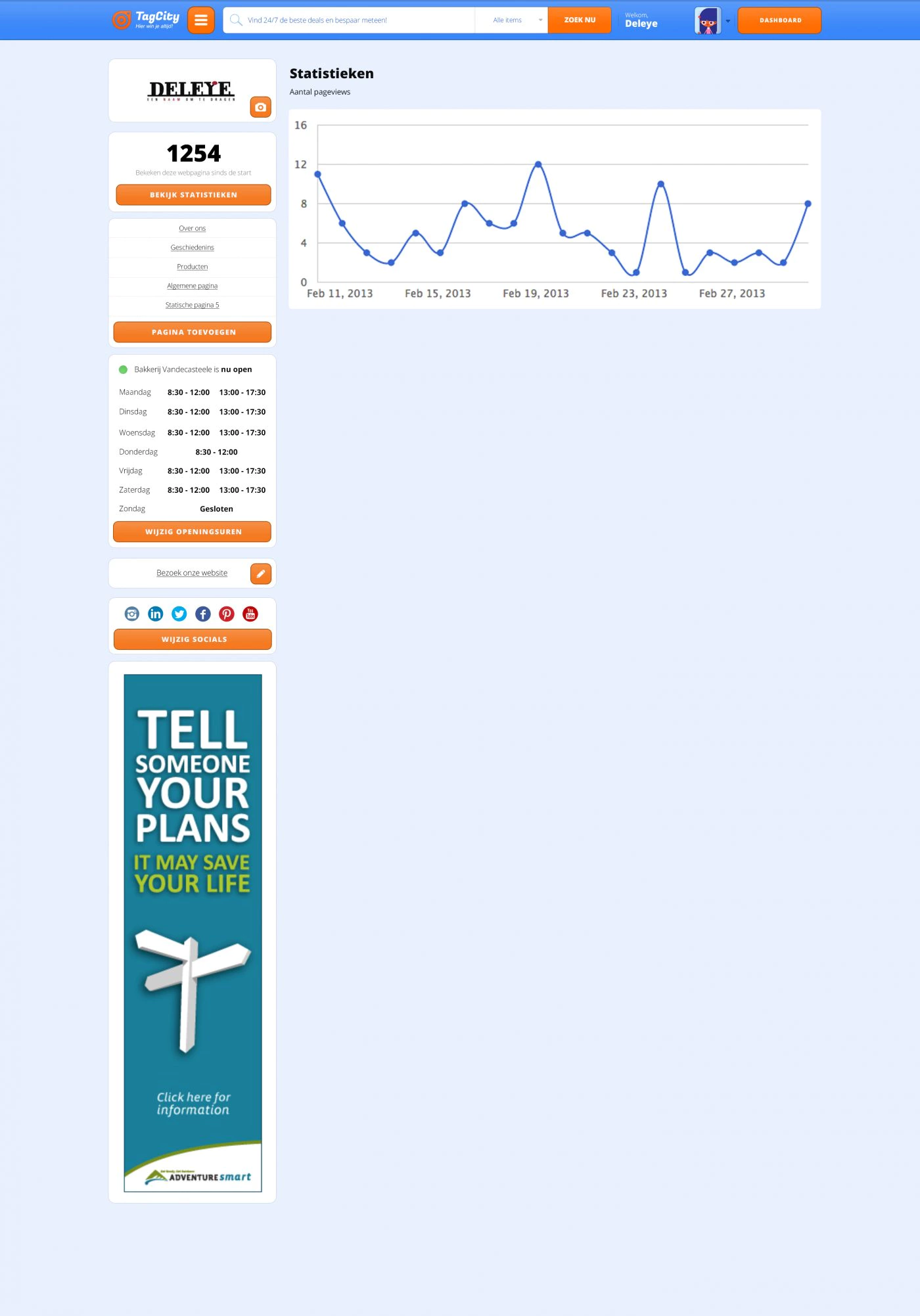
Merchants also had a fully customized backend. With this, they could completely manage their page on TagCity themselves.
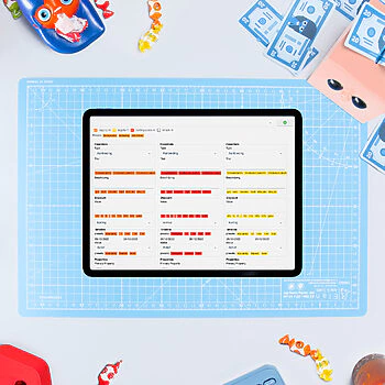
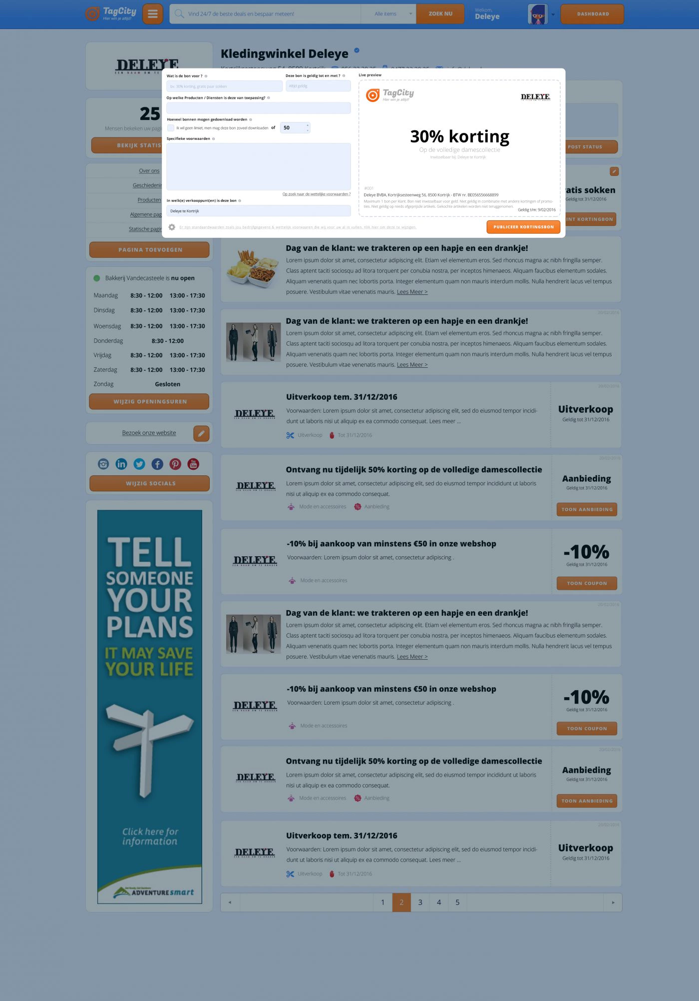
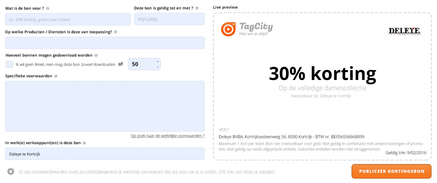
For instance, sellers could compile their own discount coupons with Live Preview.
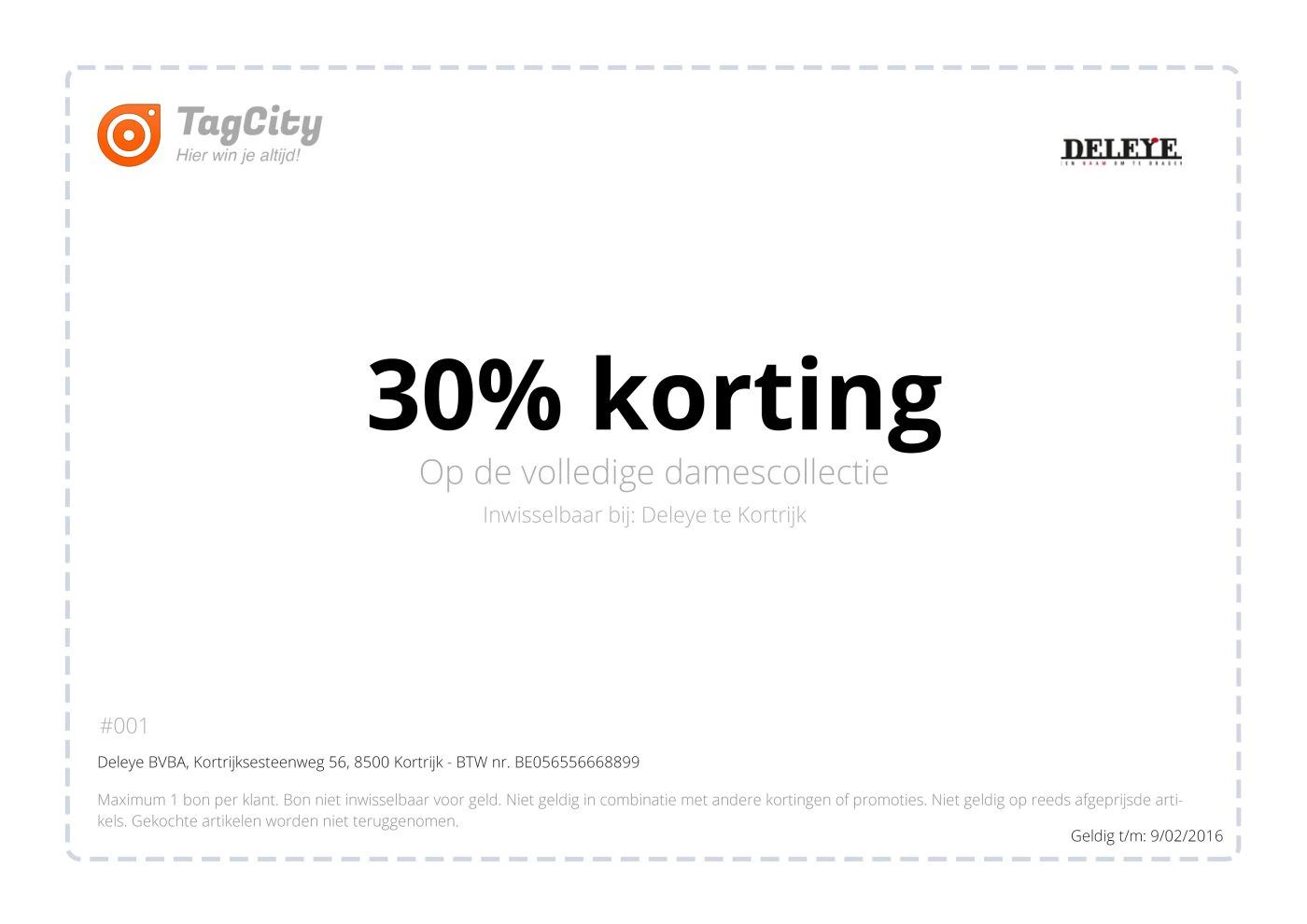
This voucher was then immediately available as a PDF download. We also provided extras such as limiting the number of discount vouchers and/or setting a limited validity period. On top of that, TagCity already sets conditions by default that prevent abuse.
There are also two more unique elements that only premium sellers have access to. The first element was announcing a clearance sale. This is unique because they can only be added a few times a year and are reserved for Premium members.
When a clearance sale is announced at a nearby shop, an email is automatically sent to all users near this shop.
There is also the option to let the merchant post updates. This leaves the merchant free to post whatever he wants.
Landing page
A separate homepage telling why merchants should become members of TagCity.


