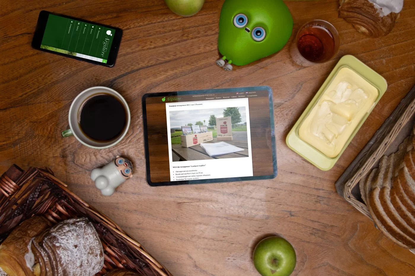
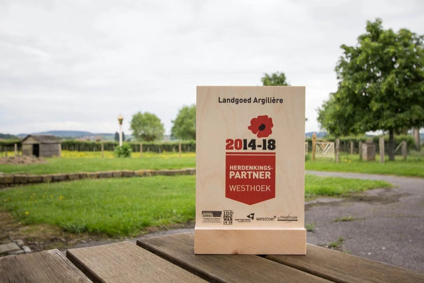
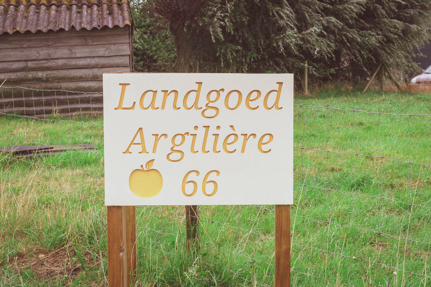
Bed and Breakfast Estate Argilière from Poperinge was one of our very first customers.
This website is now more than 10 years old, but still functions fine. This is because it has been regularly maintained over the years.
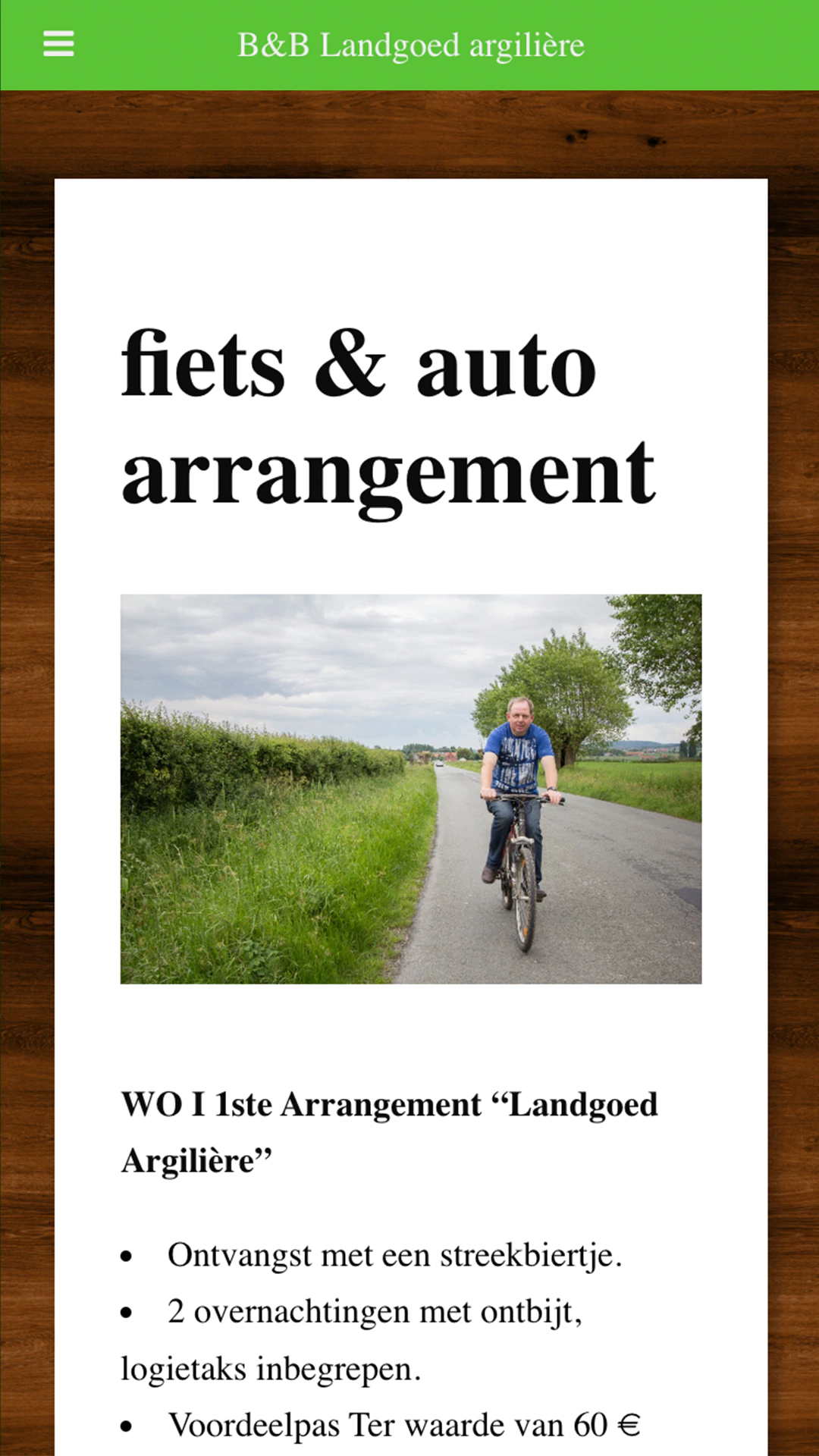
Nevertheless, this website has from day 1 been responsive. We strongly believed from the beginning that this was the future, now that everyone has a smartphone that seems only natural. But in 2012, hardly anyone had a smartphone and Adobe Flash was still the king. It was also a lot more work to make a website responsive, because many of the technologies that make it easier now didn’t exist yet.
Approach
The first thing we consider is what kind of website this is. Is this a business site with a blog? A location-based site? A catalogue of products?
A web design for a Bed and Breakfast is not the same as a web design for a store that sells office stuff.
It is therefore important to analyze your company and its needs before we start designing a website.
Bed and Breakfasts are usually smaller companies, but still have specific needs that are the same as those of, for example, a hotel.
Like a reservation system, which we provide to them at a fair and fixed price.
Design
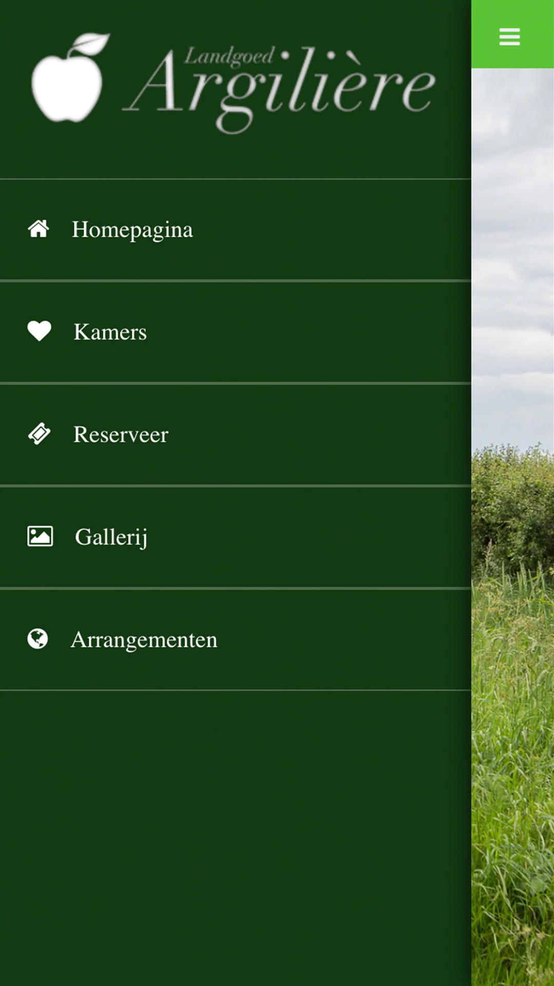
Argilière already had a logo, namely a beautiful apple. This apple symbolizes the Argilière apple variety that grows on the estate.
Not everyone knows that it is a green apple, which is why they wanted to include this in the logo and in the website.
Animation
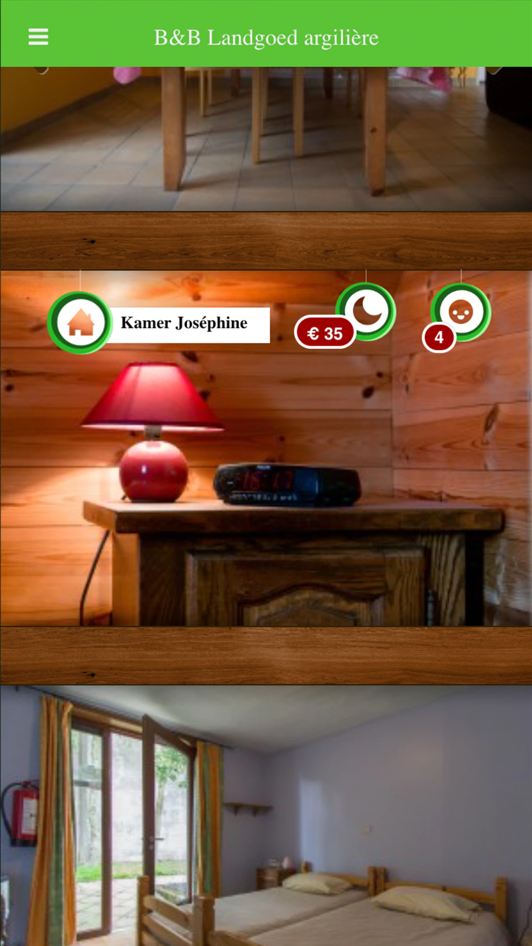
Even then, functional animation was important to us. That’s why while scrolling, cards fall down with a kind of yo-yo effect.
In 2012 skeuomorphism was still very much in, now less so. Since then, however, Pixili also focuses less on design trends and more on atmosphere and storytelling.
Photography
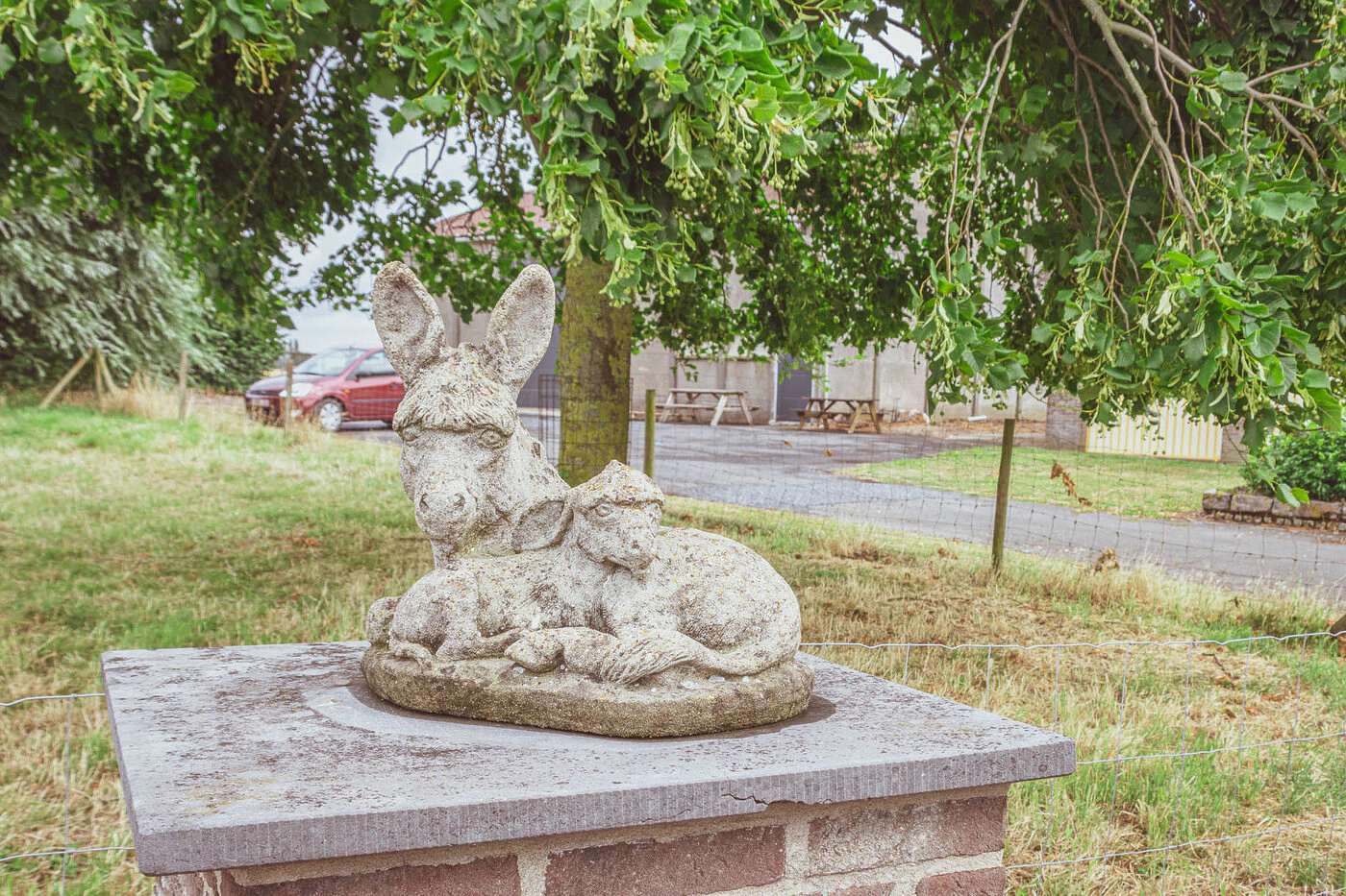
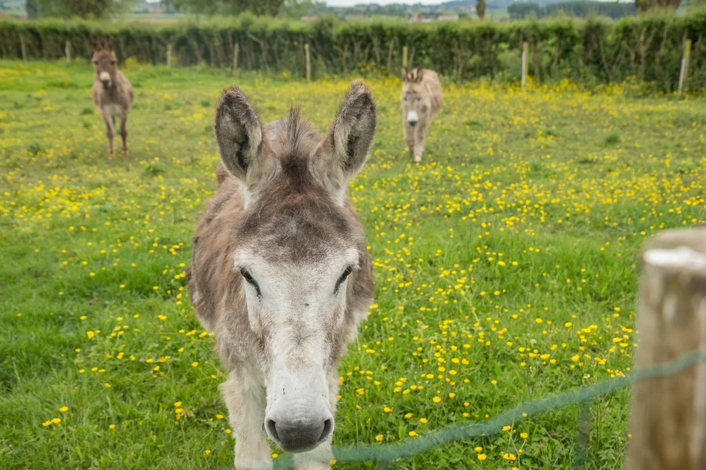
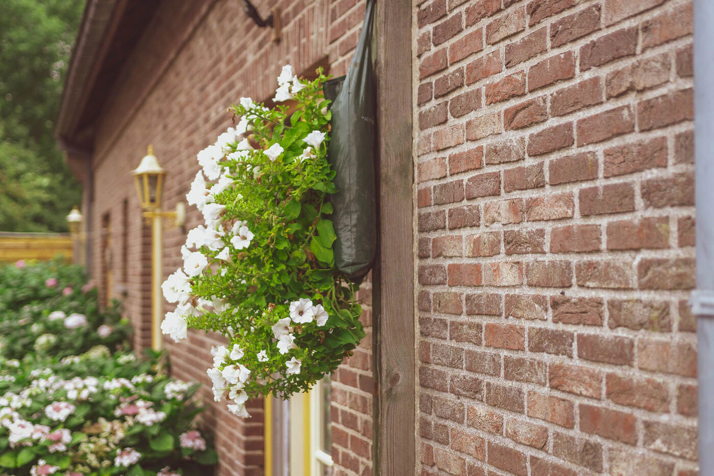
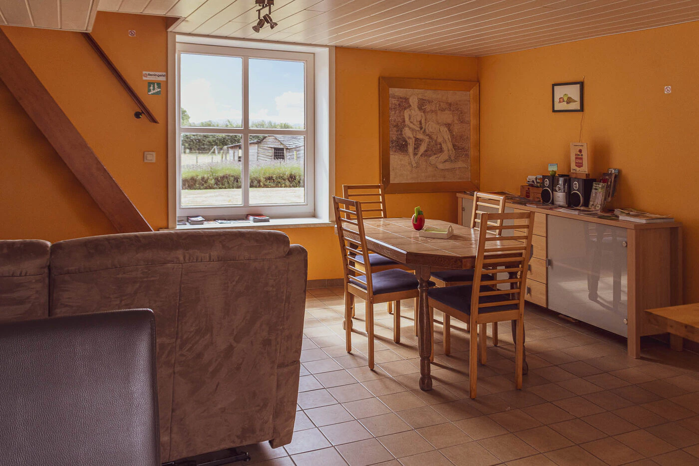
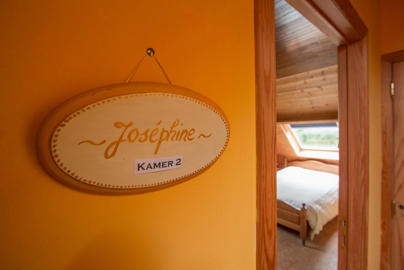
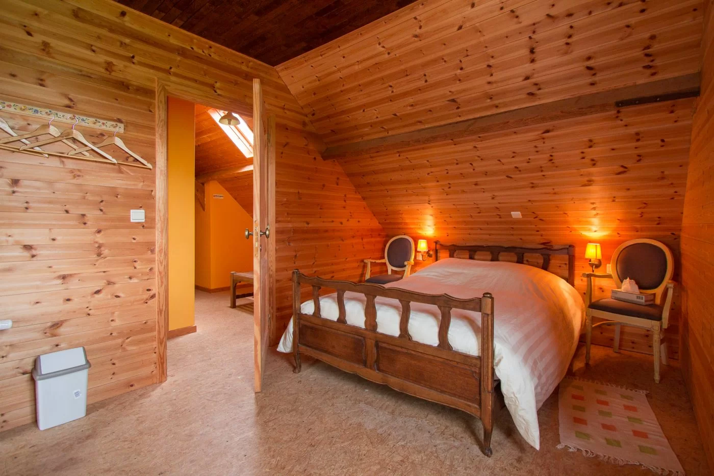
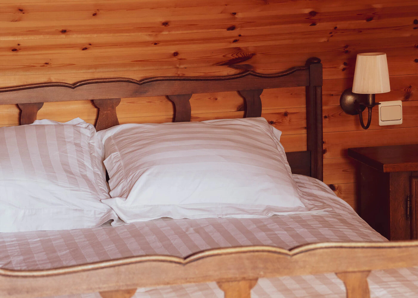
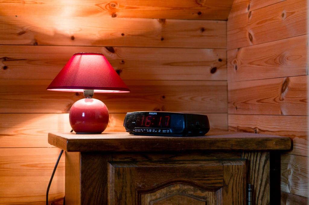
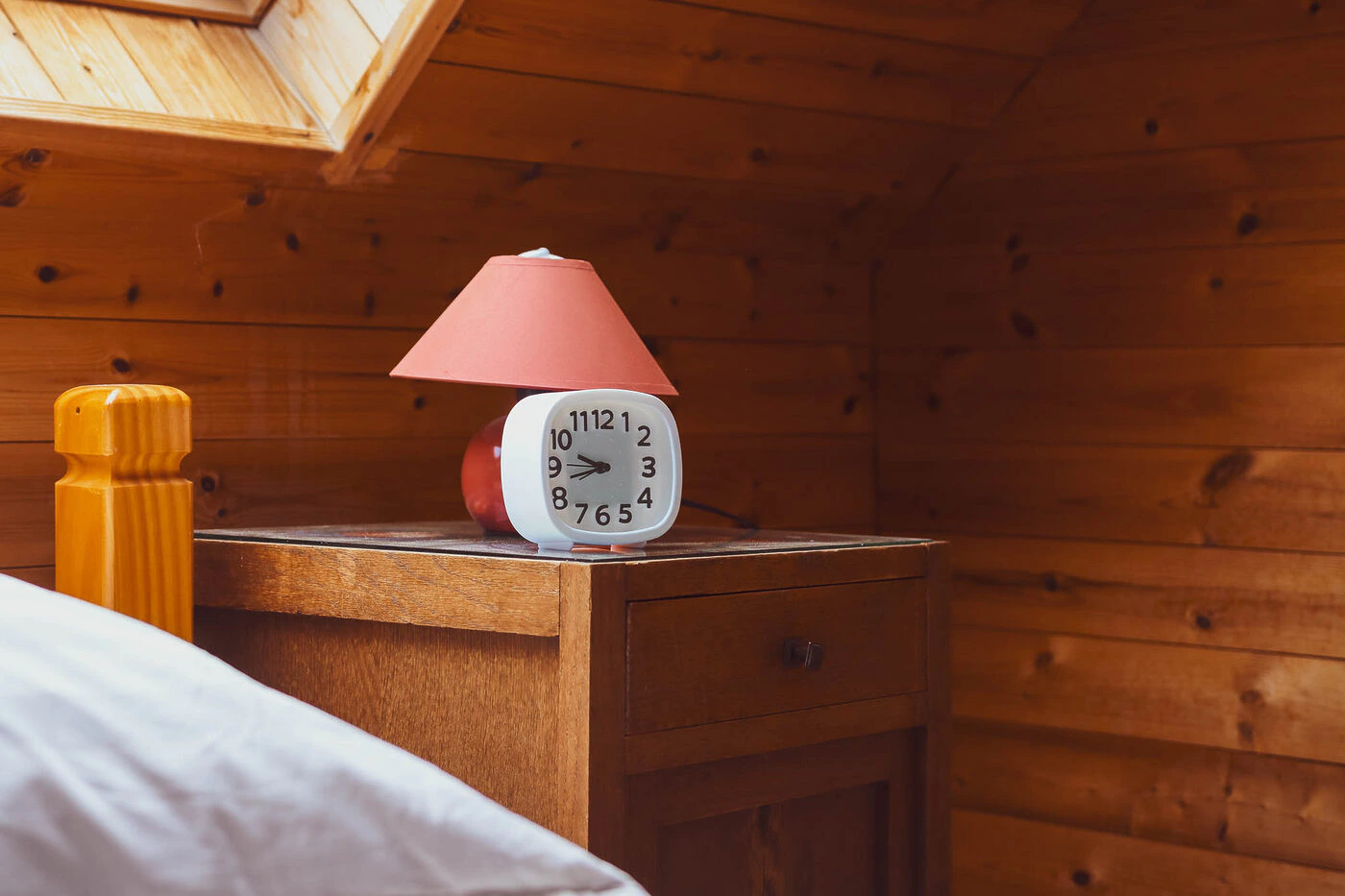
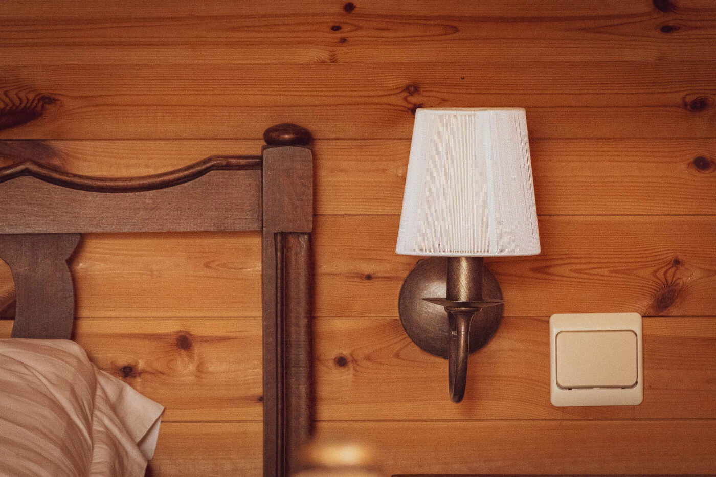
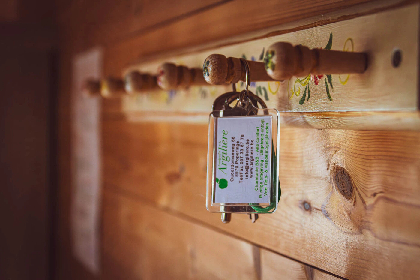
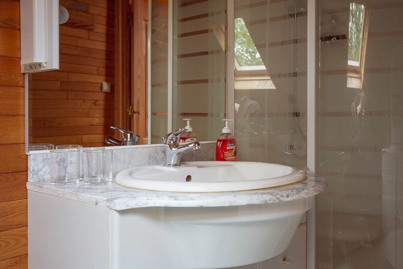
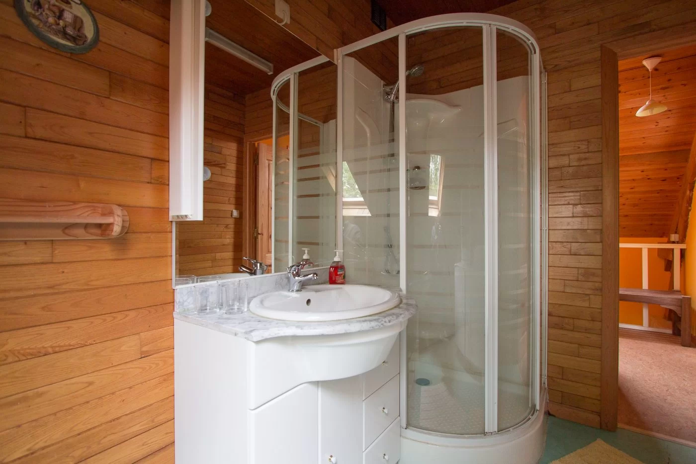
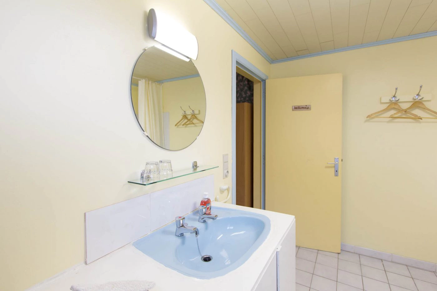
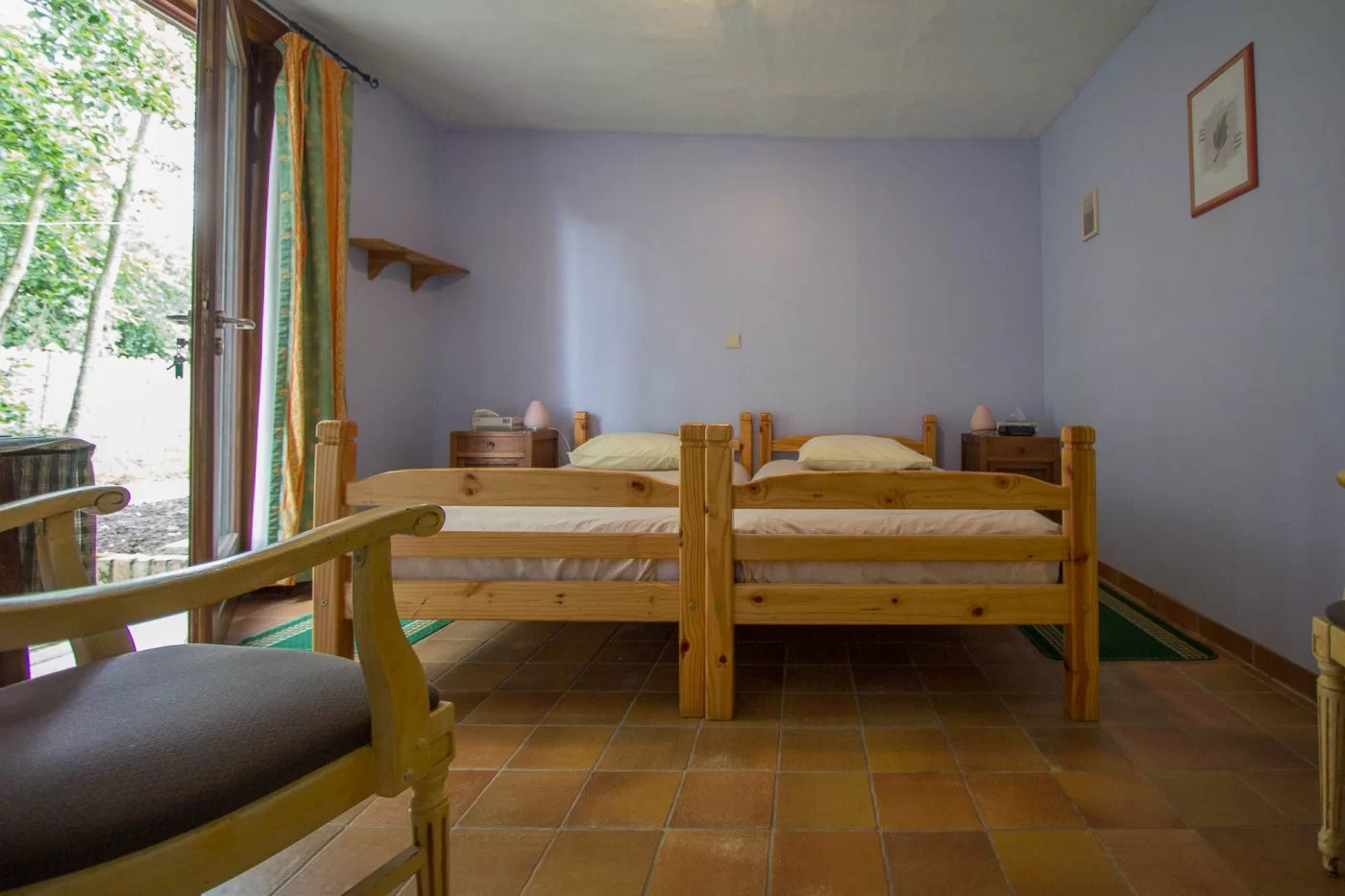
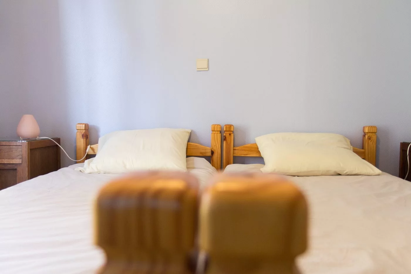
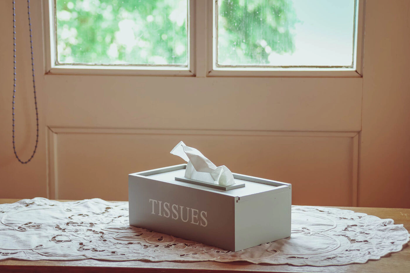
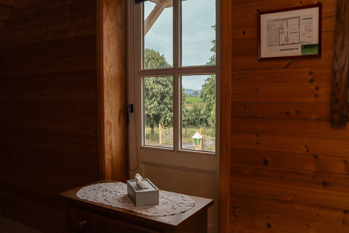
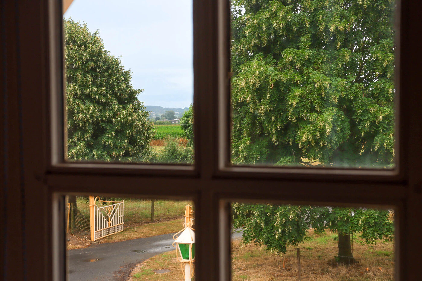
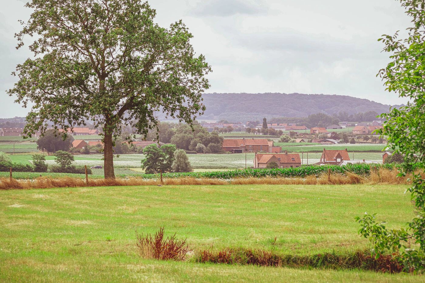
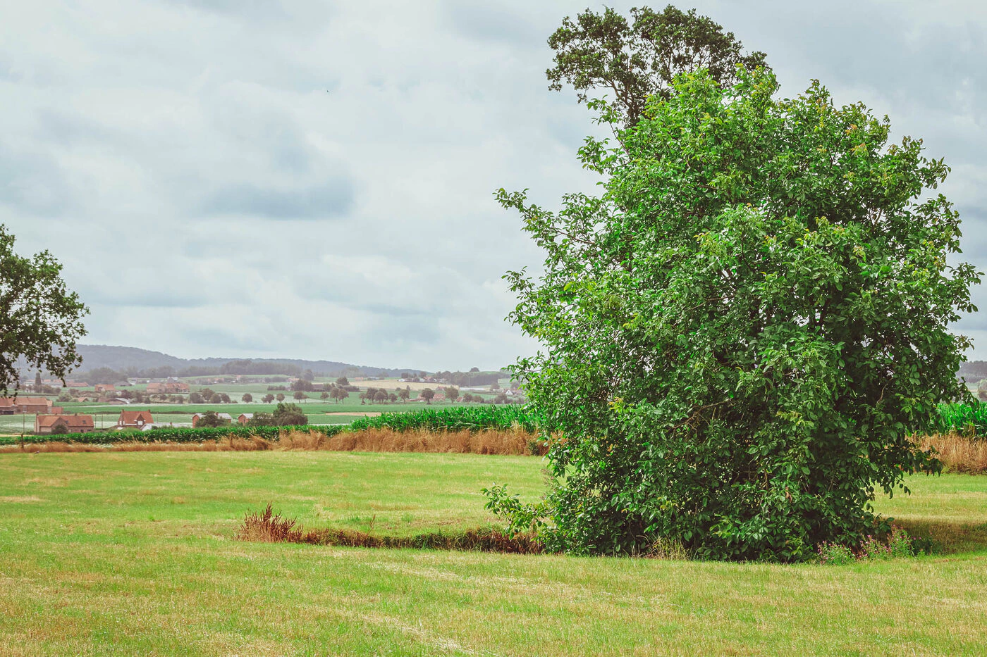
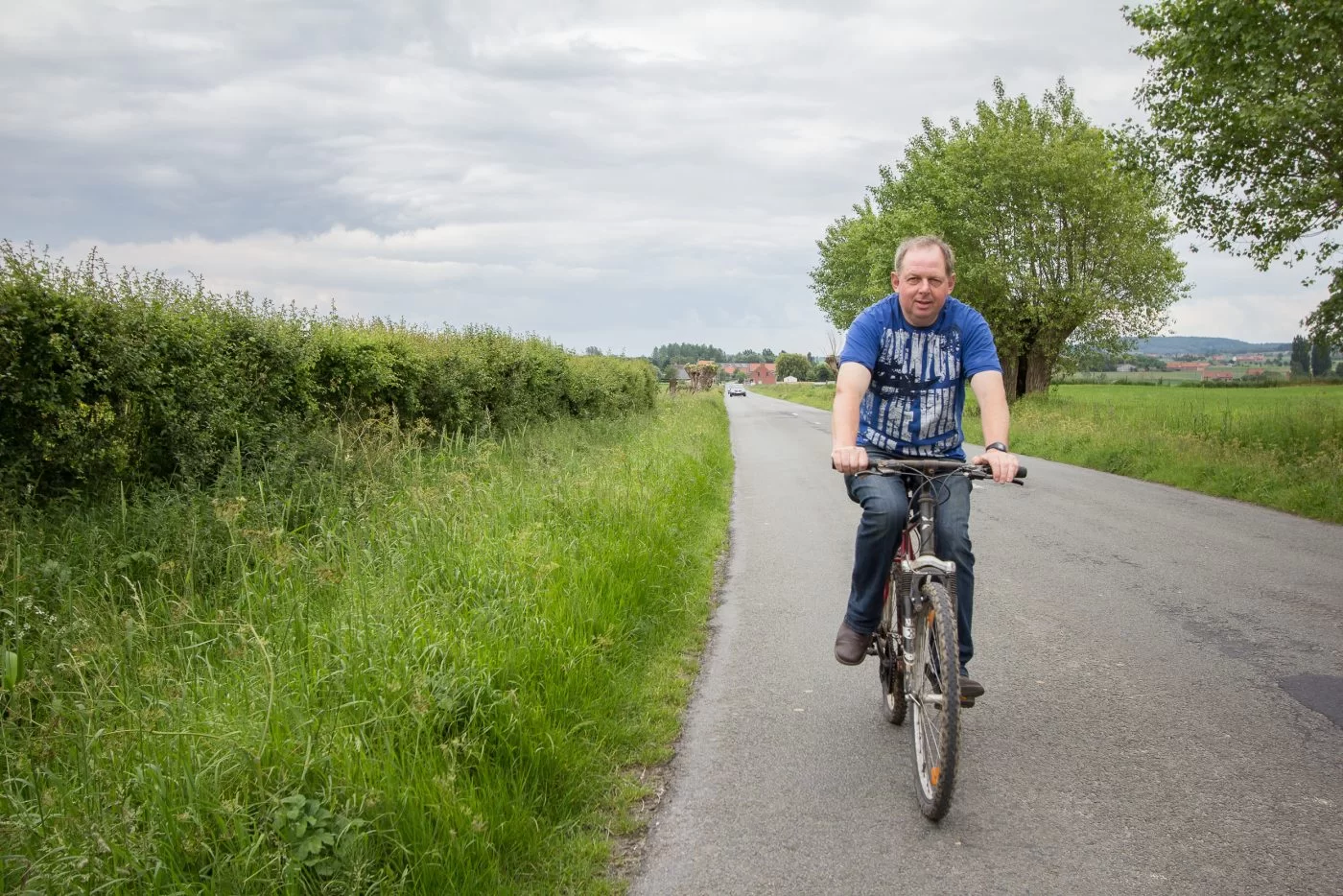
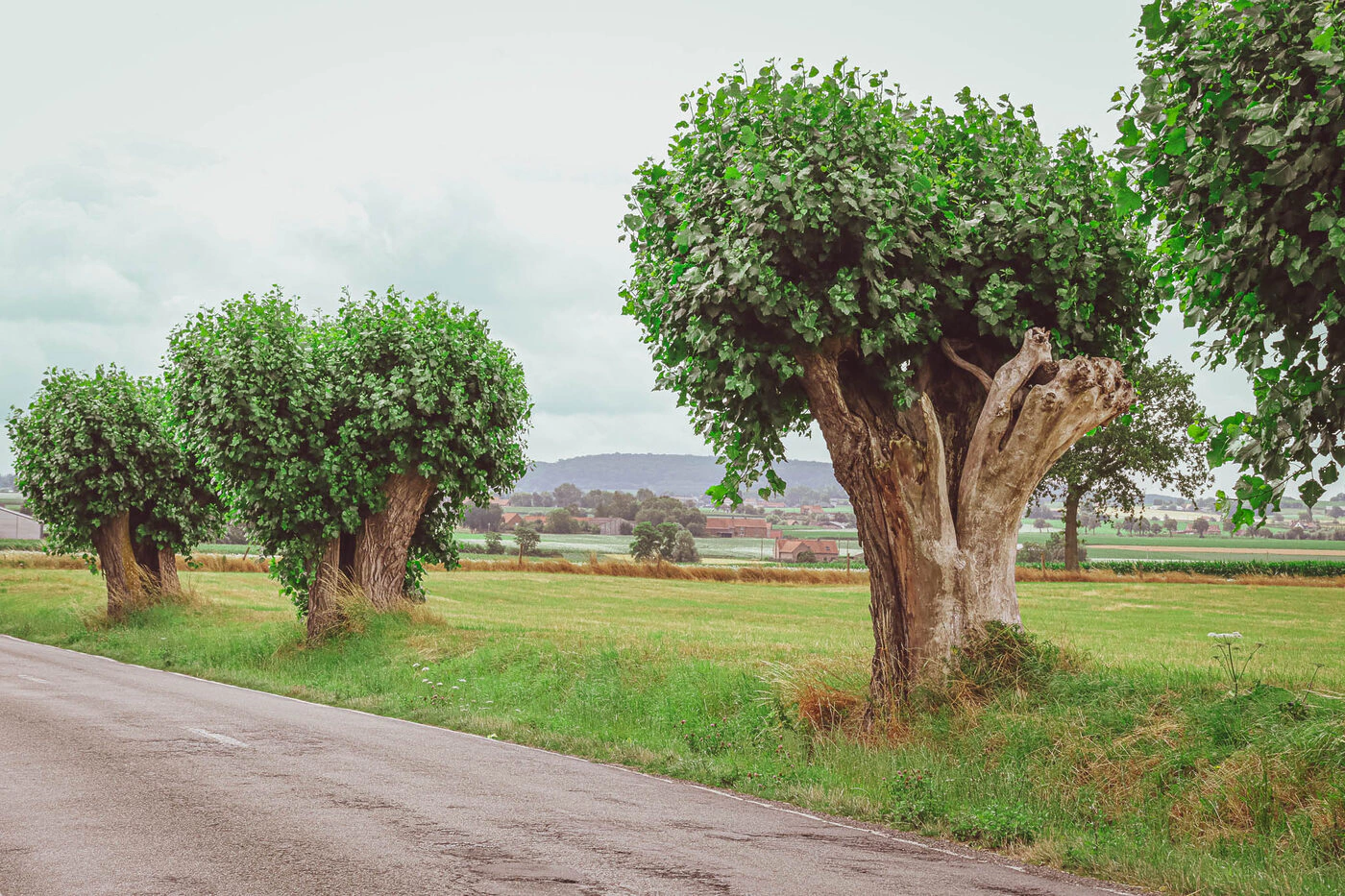
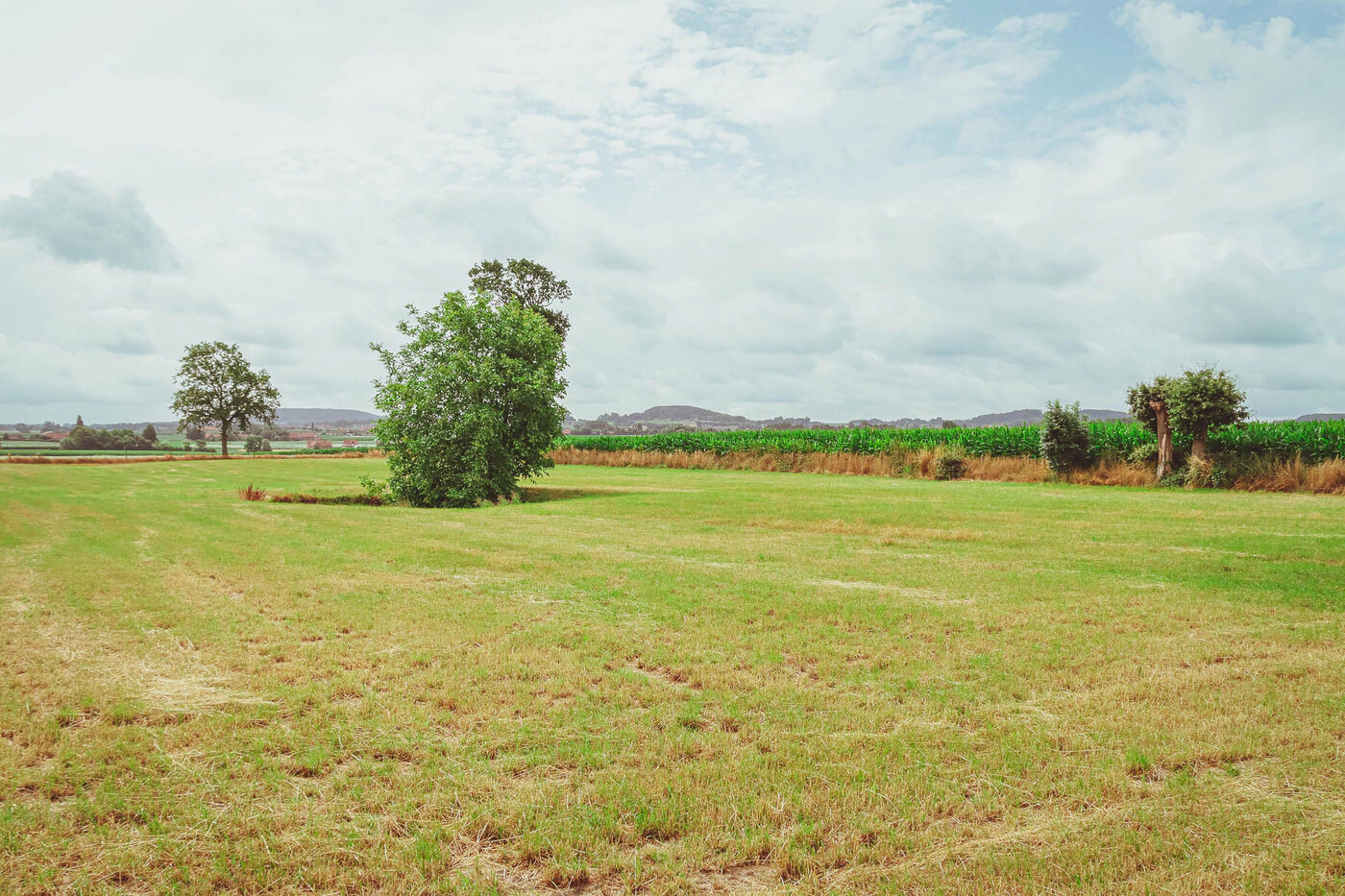
Pixili has taken all the photos on the website. Here’s a quick rundown of our favorite photos.


